This is not a duplicate as I am talking about responsive websites
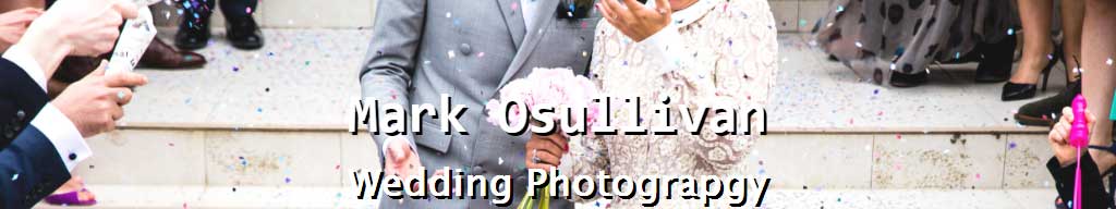
This is the header I want and I would like it to be responsive. What I want
However Instead of using it as an Image I would like to have the image and text separate. here is the original image file original image file
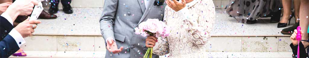
The Header image currently scales correctly for a responsive page however I would like the text positioned over the image like in my first image and have it scale according to the device the user uses.
I would like to accomplish this using html and css only.
HTML
<div id="header">
 <img src="images/Header.jpeg" alt=""/>
 <h1>Mark Osullivan</h1>
 <h2>Wedding Photograpgy </h2>
</div>
CSS
#header img {
 width: 100%;
 max-width: 1024px;
}

#header h1 {
 color: #FFFFFF;
 text-shadow: 3px 3px #000000;
 font-size: 50px;
}

#header h2 {
 color: #FFFFFF;
 text-shadow: 3px 3px #000000;
 font-size: 35px;
}