7

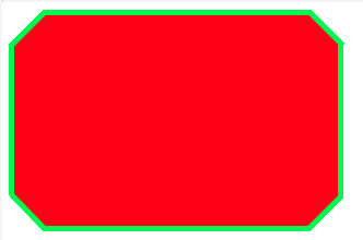
I need to add borders to this "shape". It's kinda difficult because the shape is made with the after and before pseudo-elements. I can't find the right way.

What I need to achieve:

enter image description here

The code I have so far:

https://jsfiddle.net/jimmyadaro/xfcjfz3d/

#octagon {
    width: 300px;
    height: 200px;
    background: red;
    position: relative;
    -webkit-box-sizing: content-box;
    -moz-box-sizing: content-box;
    box-sizing: content-box;
    display: block;
}

#octagon:before,
#octagon:after {
    content: "";
    position: absolute;
    left: 0;
    right: 0;
}

#octagon:before {
    top: 0;
    border-bottom: 30px solid red;
    border-left: 30px solid #fff;
    border-right: 30px solid #fff;
}

#octagon:after {
    bottom: 0;
    border-top: 30px solid red;
    border-left: 30px solid #fff;
    border-right: 30px solid #fff;
}

<div id="octagon"></div>

I tried with shadows and outlines without success.

Thanks for reading.

Note: I'll use a solid background color, if that matters.

andreas
  • 16,357
  • 12
  • 72
  • 76
Jimmy Adaro
  • 1,325
  • 15
  • 26
  • 2
    This link may help you http://stackoverflow.com/questions/34641588/how-do-i-give-a-css-octagon-shape-a-full-border – Geeky Oct 11 '16 at 19:04
  • Thanks @geeky, I've seen that but looks like it's not scalable. I mean, it can't be 600x200px. At least in the way that I tried. – Jimmy Adaro Oct 11 '16 at 19:17
  • Related - http://stackoverflow.com/questions/34644437/how-do-i-add-a-border-to-an-8-point-star-css-shape but SVG is optimal here. – Paulie_D Oct 11 '16 at 19:24
  • Hi, @paulie-d nice to see you here! (I've seen you around CSS-Tricks, where you helped me a couple times). I'm a little bit scared about the cross-browser support. I didn't try with SVG. The thing is, this shape is a container for other elements (text, images...), so I don't know if I can trust SVG. – Jimmy Adaro Oct 11 '16 at 19:32
  • If the solution does not involve SVG, the answers you will get are going to be pretty hacky. Like [**this**](https://jsfiddle.net/rickyruizm/m06pkejg/). You should really consider using SVG for this like @Paulie_D already suggested. – Ricky Ruiz Oct 11 '16 at 22:14
  • Right, understood. Now I need to find the way to make this with SVG and also be able to scale it. Thanks! – Jimmy Adaro Oct 11 '16 at 22:17
  • There might be a better shape, but for starters you can get one [here](http://leaverou.github.io/corner-shape/). Select corner-shape bevel. Right click on the the simulated svg and inspect element and there you go. `corner-shape` is a proposed level 4 CSS property that achieves exactly what you want, but I don't know if it will actually ever make it live. – Ricky Ruiz Oct 11 '16 at 22:31
  • If you're willing to have a solid background color, `border-image` is also worth a look. – darrylyeo Oct 11 '16 at 22:56

2 Answers2

6

Here's my solution. No solid background color is required. This may or may not suit your actual use case.

JSFiddle

#octagon {
    display: flex;
    justify-content: center;
    align-items: center;
    
    width: 300px;
    height: 200px;
    overflow: hidden;
    position: relative;
}

#octagon:before,
#octagon:after {
    content: "";
    display: block;
    width: 300px;
    padding-top: 100%;
    position: absolute;
    top: 50%;
    left: 50%;
    transform: translate(-50%, -50%) rotate(45deg);
    z-index: -1;
}
#octagon:before {
    background: red;
}
#octagon:after {
    background:
        linear-gradient(
      45deg,
      #0e0 calc(50% - 150px + 10px), transparent 0,
      transparent calc(50% + 150px - 10px), #0e0 0%),
     linear-gradient(
      -45deg,
      #0e0 calc(50% - 100px + 10px), transparent 0,
      transparent calc(50% + 100px - 10px), #0e0 0);
    box-shadow: 0 0 0 10px #0e0 inset;
}
<div id="octagon">Hello World!</div>
darrylyeo
  • 3,103
  • 20
  • 30
  • Wow @darrylyeo thanks for your dedication! I really appreciate it! If I need a thinner border (like 2px), how can I change that? – Jimmy Adaro Oct 11 '16 at 22:05
  • Glad to help, I enjoyed the challenge! See the last rule set, `#octagon:after`. The diagonals are controlled by `box-shadow` and the remaining sides are controlled by the percentages in the `linear-gradient`s. I sort of eyed it, but I'm sure there's a more mathematical way to compute those values (`calc()` would come in handy). – darrylyeo Oct 11 '16 at 22:49
  • Got it! You now have only to replace all instances of `10px`. – darrylyeo Oct 11 '16 at 23:05
  • That's amazing! Thanks again Darryl, you rock! haha I tried to change the fixed values to a percentage (100% of _n_ px container), but doesn't work as expected. The lateral "borders" doesn't show up. Also, looks like it can't auto-adjust to children elements height. https://jsfiddle.net/jimmyadaro/jrs7mxw1/4/ – Jimmy Adaro Oct 12 '16 at 14:58
2

Well, this is the only way I could think of approaching it in pure CSS:

JSfiddle here: https://jsfiddle.net/xfcjfz3d/7/

body {
    background:#fff;
}

#octagon {
  position:relative;
 width: 300px;
 height: 200px;
 background: green;
 position: relative;
 -webkit-box-sizing: content-box;
 -moz-box-sizing: content-box;
 box-sizing: content-box;
 display: block;
}

#octagon:before,
#octagon:after {
 content: "";
 position: absolute;
 left: 0;
 right: 0;
}

#octagon:before {
 top: 0;
 border-bottom: 30px solid green;
 border-left: 30px solid #fff;
 border-right: 30px solid #fff;
}

#octagon:after {
 bottom: 0;
 border-top: 30px solid green;
 border-left: 30px solid #fff;
 border-right: 30px solid #fff;
}

.tall {
  position:absolute;
  background:red;
  width:230px;
  height:190px;
  left:35px;
  top:5px;
  z-index:1;
}

.wide {
  position:absolute;
  background:red;
  width:290px;
  height:130px;
  left:5px;
  top:35px;
  z-index:1;
}

.corner {
  position:absolute;
  background:red;
  width:45px;
  height:43px;
  
  z-index:1;
  transform: rotate(45deg);
}

.topleft {
  left:14px;
  top:14px;
}

.topright {
  //background:black;
  left:241px;
  top:13px;
}

.bottomleft {
  background:red;
  left:13px;
  top:143px;
}

.bottomright {
  background:red;
  left:241px;
  top:143px;
}
<div id="octagon">
  <div class="tall"></div>
  <div class="wide"></div>
  <div class="corner topleft"></div>
  <div class="corner topright"></div>
  <div class="corner bottomleft"></div>
  <div class="corner bottomright"></div>
</div>
Varin
  • 2,354
  • 2
  • 20
  • 37
  • Thanks, @varin Nice approach but doesn't seems scalable. Also, I need to add elements inside the shape (text, images, etc.). Anyway, thank you very much. – Jimmy Adaro Oct 11 '16 at 20:10
  • Hmm. This could be made scalable I think, by using different units. If you need elements inside you could always add another div inside with content and higher z-index. – Varin Oct 11 '16 at 20:14