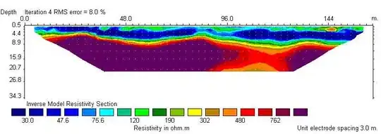
[ REVISION ]
(Please comment me if you know more suitable interpolation methods, especially not needing to cut under bottoms data.)
ggplot() needs long data form.
library(ggplot2)

# example data
max.depths <- c(1.1, 4, 4.7, 7.7, 8.2, 7.8, 10.7, 12.1, 14.3)
depth.list <- sapply(max.depths, function(x) seq(0, x, 0.2))
temp.list <- list()
set.seed(1); for(i in 1:9) temp.list[[i]] <- sapply(depth.list[[i]], function(x) rnorm(1, 20 - x*0.5, 0.2))
set.seed(1); dist <- c(0, sapply(seq(5, 40, 5), function(x) rnorm(1, x, 1)))
dist.list <- sapply(1:9, function(x) rep(dist[x], length(depth.list[[x]])))

main.df <- data.frame(dist = unlist(dist.list), depth = unlist(depth.list) * -1, temp = unlist(temp.list))

# a raw graph
ggplot(main.df, aes(x = dist, y = depth, z = temp)) +
  geom_point(aes(colour = temp), size = 1) +
  scale_colour_gradientn(colours = topo.colors(10))

# a relatively raw graph   (don't run with this example data)
ggplot(main.df, aes(x = dist, y = depth, z = temp)) +
  geom_raster(aes(fill = temp)) + # geom_contour() +
  scale_fill_gradientn(colours = topo.colors(10))
If you want a graph such like you showed, you have to do interpolation. Some packages give you spatial interpolation methods. In this example, I used akima package but you should think seriously that which interpolation methods to use.
I used nx = 300 and ny = 300 in below code but I think it would be better to decide those values carefully. Large nx and ny gives a high resolution graph, but don't foreget real nx and ny (in this example, real nx is only 9 and ny is 101).
library(akima); library(dplyr)

interp.data <- interp(main.df$dist, main.df$depth, main.df$temp, nx = 300, ny = 300)
interp.df <- interp.data %>% interp2xyz() %>% as.data.frame()
names(interp.df) <- c("dist", "depth", "temp")

# draw interp.df
ggplot(interp.df, aes(x = dist, y = depth, z = temp)) +
  geom_raster(aes(fill = temp)) + # geom_contour() +
  scale_fill_gradientn(colours = topo.colors(10))

# to think appropriateness of interpolation (raw and interpolation data)
ggplot(interp.df, aes(x = dist, y = depth, z = temp)) +
  geom_raster(aes(fill = temp), alpha = 0.3) +                 # interpolation
  scale_fill_gradientn(colours = topo.colors(10)) +
  geom_point(data = main.df, aes(colour = temp), size = 1) +  # raw
  scale_colour_gradientn(colours = topo.colors(10))

Bottoms don't match !!
I found ?interp says "interpolation only within convex hull!", oops... I'm worrid about the interpolation around the problem-area, is it OK ? If no problem, you need only cut the data under the bottoms. If not, ... I can't answer immediately (below is an example code to cut).
bottoms <- max.depths * -1

# calculate bottom values using linear interpolation
approx.bottoms <- approx(dist, bottoms, n = 300) # n must be the same value as interp()'s nx

# change temp values under bottom into NA
library(dplyr)
interp.cut.df <- interp.df %>% cbind(bottoms = approx.bottoms$y) %>%
  mutate(temp = ifelse(depth >= bottoms, temp, NA)) %>% select(-bottoms)

ggplot(interp.cut.df, aes(x = dist, y = depth, z = temp)) +
  geom_raster(aes(fill = temp)) +
  scale_fill_gradientn(colours = topo.colors(10)) +
  geom_point(data = main.df, size = 1)

If you want to use stat_contour
It is harder to use stat_contour than geom_raster because it needs a regular grid form. As far as I see your graph, your data (depth and distance) don't form a regular grid, it means it is much difficult to use stat_contour with your raw data. So I used interp.cut.df to draw a contour plot. And stat_contour have a endemic problem (see How to fill in the contour fully using stat_contour), so you need to expand your data.
library(dplyr)

# 1st: change NA into a temp's out range value (I used 0)
interp.contour.df <- interp.cut.df
interp.contour.df[is.na(interp.contour.df)] <- 0

# 2nd: expand the df (It's a little complex, so please use this function)
contour.support.func <- function(df) {
  colname <- names(df)
  names(df) <- c("x", "y", "z")
  Range <- as.data.frame(sapply(df, range))
  Dim <- as.data.frame(t(sapply(df, function(x) length(unique(x)))))
  arb_z = Range$z[1] - diff(Range$z)/20
  df2 <- rbind(df,
               expand.grid(x = c(Range$x[1] - diff(Range$x)/20, Range$x[2] + diff(Range$x)/20),
                           y = seq(Range$y[1], Range$y[2], length = Dim$y), z = arb_z),
               expand.grid(x = seq(Range$x[1], Range$x[2], length = Dim$x),
                           y = c(Range$y[1] - diff(Range$y)/20, Range$y[2] + diff(Range$y)/20), z = arb_z))
 names(df2) <- colname
 return(df2)
}

interp.contour.df2 <- contour.support.func(interp.contour.df)
# 3rd: check the temp range (these values are used to define contour's border (breaks))
range(interp.cut.df$temp, na.rm=T)        # 12.51622 20.18904

# 4th: draw ... the bottom border is dirty !!
ggplot(interp.contour.df2, aes(x = dist, y = depth, z = temp)) +
  stat_contour(geom="polygon", breaks = seq(12.51622, 20.18904, length = 11), aes(fill = ..level..)) +
  coord_cartesian(xlim = range(dist), ylim = range(bottoms), expand = F) + # cut expanded area
  scale_fill_gradientn(colours = topo.colors(10)) # breaks's length is 11, so 10 colors are needed

# [Note]
# You can define the contour's border values (breaks) and colors.
contour.breaks <- c(12.5, 13.5, 14.5, 15.5, 16.5, 17.5, 18.5, 19.5, 20.5)
    # = seq(12.5, 20.5, 1) or seq(12.5, 20.5, length = 9)
contour.colors <- c("darkblue", "cyan3", "cyan1", "green3", "green", "yellow2","pink", "darkred")
   # breaks's length is 9, so 8 colors are needed.

# 5th: vanish the bottom border by bottom line
approx.df <- data.frame(dist = approx.bottoms$x, depth = approx.bottoms$y, temp = 0)  # 0 is dummy value

ggplot(interp.contour.df2, aes(x = dist, y = depth, z = temp)) +
  stat_contour(geom="polygon", breaks = contour.breaks, aes(fill = ..level..)) +
  coord_cartesian(xlim=range(dist), ylim=range(bottoms), expand = F) +
  scale_fill_gradientn(colours = contour.colors) +
  geom_line(data = approx.df, lwd=1.5, color="gray50")

bonus: legend technic
library(dplyr)
interp.contour.df3 <- interp.contour.df2 %>% mutate(temp2 = cut(temp, breaks = contour.breaks))
interp.contour.df3$temp2 <- factor(interp.contour.df3$temp2, levels = rev(levels(interp.contour.df3$temp2)))

ggplot(interp.contour.df3, aes(x = dist, y = depth, z = temp)) +
  stat_contour(geom="polygon", breaks = contour.breaks, aes(fill = ..level..)) +
  coord_cartesian(xlim=range(dist), ylim=range(bottoms), expand = F) +
  scale_fill_gradientn(colours = contour.colors, guide = F) +   # add guide = F
  geom_line(data = approx.df, lwd=1.5, color="gray50") +
  geom_point(aes(colour = temp2), pch = 15, alpha = 0) +        # add
  guides(colour = guide_legend(override.aes = list(colour = rev(contour.colors), alpha = 1, cex = 5))) +  # add
  labs(colour = "temp")   # add
