I'm trying to make a 100% column appear beneath an element inside a coloumn of a bootstrap grid. Since it's easier to understand with pictures, here what I am trying to achieve:
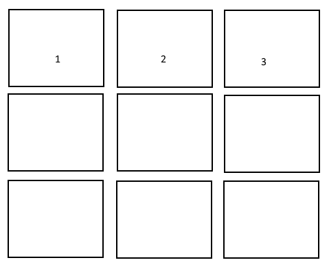
When selecting one of the images (1 to x), a hidden div (with each different content) should appear beneath the image in the full 12 column size:
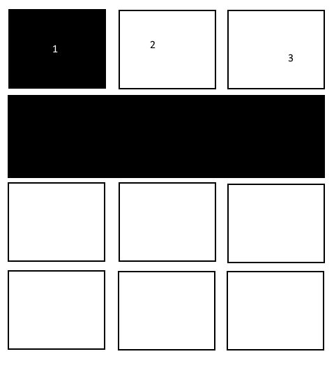

I managed to do this, however, when using a smaller resolution, this hidden div is displayed beneath the third element, and not beneath element 1. This is how it should be:

Would be glad for some help!
Here the code snippet of the actual version:
// hide all
 $('.descriptions .panel').hide();

  // handle img click
 $('#grid img').click(function() {

   // get index of the img that was clicked
   var idx = $(this).parent().parent().parent().index();

   var row = $(this).parent().parent().parent().parent().next('.row');

   // remove special style from all others
   $('#grid img').removeClass('highlight');

   // add a special style to the clicked image
   $(this).addClass('highlight');

   // hide all others
   $('.descriptions .panel').hide();

   // show desc for clicked img
   row.find('.descriptions .panel').eq(idx).show();

 });
<script src="https://ajax.googleapis.com/ajax/libs/jquery/2.1.1/jquery.min.js"></script>
<link href="https://maxcdn.bootstrapcdn.com/bootstrap/3.3.7/css/bootstrap.min.css" rel="stylesheet"/>
<style>
.img-responsive{
margin: 0 auto;
}
</style>
<!-- row 1 -->
<div class="row" id="grid">
<div class="col-sm-4 portfolio-item">
<figure class="gallery-item">
<div class="img-title-text">
<img class="img-responsive" src="http://placehold.it/250x250" style="opacity:0.1;" alt="">
<span style="position: absolute; top: 25%; text-align: center;width: 95%; font-size: 20px;">text</span>
</div>
</figure>
</div>
</div>
<!-- hidden row for images -->
<div class="row">
<div class="col-md-12 descriptions">
<div class="panel panel-default">
<div class="panel-body flex-grow">Content here for image 1.. Blah blah blah, blah blah. That is very interesting stuff. Aenean sit amet felis
dolor, in sagittis nisi. Sed ac orci quis tortor imperdiet venenatis. </div>
</div>
<div class="panel panel-default">
<div class="panel-body flex-grow">Content here for image 2.. Blah blah blah, blah blah. That is very interesting stuff. Aenean sit amet felis
dolor, in sagittis nisi. Sed ac orci quis tortor imperdiet venenatis. </div>
</div>
<div class="panel panel-default">
<div class="panel-body flex-grow">Content here for image 3.. Blah blah blah, blah blah. That is very interesting stuff. Aenean sit amet felis
dolor, in sagittis nisi. Sed ac orci quis tortor imperdiet venenatis. </div>
</div>
</div>
</div>
<!-- row 2 -->
<div class="row" id="grid">
<div class="col-sm-4 portfolio-item">
<figure class="gallery-item">
<div class="img-title-text">
<img class="img-responsive" src="http://placehold.it/250x250" style="opacity:0.1;" alt="">
<span style="position: absolute; top: 25%; text-align: center;width: 95%; font-size: 20px;">text</span>
</div>
</figure>
</div>
<div class="col-sm-4 portfolio-item">
<figure class="gallery-item">
<div class="img-title-text">
<img class="img-responsive" src="http://placehold.it/250x250" style="opacity:0.1;" alt="">
<span style="position: absolute; top: 25%; text-align: center;width: 95%; font-size: 20px;">text</span>
</div>
</figure>
</div>
<div class="col-sm-4 portfolio-item">
<figure class="gallery-item">
<div class="img-title-text">
<img class="img-responsive" src="http://placehold.it/250x250" style="opacity:0.1;" alt="">
<span style="position: absolute; top: 25%; text-align: center;width: 95%; font-size: 20px;">text</span>
</div>
</figure>
</div>
</div>
<!-- hidden row for images of row 2 -->
<div class="row">
<div class="col-md-12 descriptions">
<div class="panel panel-default">
<div class="panel-body flex-grow">Content here for image 1.. Blah blah blah, blah blah. That is very interesting stuff. Aenean sit amet felis
dolor, in sagittis nisi. Sed ac orci quis tortor imperdiet venenatis. </div>
</div>
<div class="panel panel-default">
<div class="panel-body flex-grow">Content here for image 2.. Blah blah blah, blah blah. That is very interesting stuff. Aenean sit amet felis
dolor, in sagittis nisi. Sed ac orci quis tortor imperdiet venenatis. </div>
</div>
<div class="panel panel-default">
<div class="panel-body flex-grow">Content here for image 3.. Blah blah blah, blah blah. That is very interesting stuff. Aenean sit amet felis
dolor, in sagittis nisi. Sed ac orci quis tortor imperdiet venenatis. </div>
</div>
</div>
</div>
[...]