5

I'm trying to create a page that has this effect:
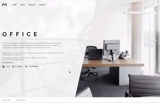
this effect.

I had it right, until I tried to implement a background to it. I'm used to photoshop (with layers and masks), but unfortunately html does not have masks.

Here is what I have.

The fiddle

jQuery:

$(document).ready(function() {
  // calculate screen size
  var pageHeight = $(window).height();
  var pageWidth = $(window).width();

  $(window).on('mousemove', function(event) {
    // horizontal offset
      // 100% = completely dependable on mouse position
    var differenceFactor = 5;
    var mouse_x = event.pageX + 1
    var mouse_xPercentage = 100 / (pageWidth / mouse_x);
    var transformX = (mouse_x * -1) / (100 / differenceFactor) - (pageWidth);
    var actualTransform = transformX;

    // vertical offset
    // base degrees
    var baseDeg = -23;
    // 100% = completely rotating
    var rotateFactor = 10;
    var mouse_y = event.pageY + 1;
    var mouse_yPercentage = 100 / (pageHeight / mouse_y);
    var deg = baseDeg + (((180 * (mouse_yPercentage / 100)) - 90) * (rotateFactor / 100));

    $('.article-bg').css({
      '-webkit-transform': 'translate(' + transformX + 'px, 0) scale(2) rotate(' + deg + 'deg)',
      'transform': 'translate(' + transformX + 'px, 0) scale(2) rotate(' + deg + 'deg)'
    });
    $('.actual-bg').css({
      '-webkit-transform': 'translate(' + 0 + 'px, 0) rotate(' + (-deg) + 'deg)',
      'transform': 'translate(' + 0 + 'px, 0) rotate(' + (-deg) + 'deg)'
    });
    })
  .on('resize', function() {
    var pageHeight = $(this).height();
    var pageWidth = $(this).width();
  });
});

I hope someone can complete this challenge!

Derk Jan Speelman
  • 11,291
  • 4
  • 29
  • 45

1 Answers1

2

lets say you have two <div> you want to overlap those with the one containing the background on top. then you can use a <svg> to clip the element. With a <clipPath> and a <polygon> you can create the shapes. Then bind it to the div you want to clip.

Check out this pen


HTML:

<div id="content">
    <article class="valign">
        <h1>The Article</h1>
        <p>Lorem ipsum dolor sit amet, consectetur adipiscing elit, sed do eiusmod tempor incididunt ut labore et dolore magna aliqua. Ut enim ad minim veniam, quis nostrud exercitation ullamco laboris nisi ut aliquip ex ea commodo consequat. Duis aute irure dolor in reprehenderit in voluptate velit esse cillum dolore eu fugiat nulla pariatur. Excepteur sint occaecat cupidatat non proident, sunt in culpa qui officia deserunt mollit anim id est laborum.</p>
    </article>
</div>
<div id="bg">
    <svg width="0" height="0">
      <clipPath id="clipPolygon">
        <polygon id="polygon">
        </polygon>
      </clipPath>
    </svg>
</div>

CSS:

#content,
#bg{
    position: absolute;
    left:0;
    top:0;
    height:100%;
    width:100%;
}
#content {
  background: #333;
  color: rgba(255, 255, 255, 0.87);
  padding: 20px;
}
#bg {
  background: url("http://res.cloudinary.com/derkjanspeelman/image/upload/v1474556599/diensten-main-bg_hv2aoc.jpg") center/cover no-repeat;
  background-size: cover;
  -webkit-clip-path: polygon(100% 100%, 100% 0%, 50% 0%, 50% 100%);
  clip-path: url("#clipPolygon");
}

When this is done just some Javascript magic and it should be functional I've made a pen http://codepen.io/iXshad0w/pen/zKwJaW, you can check it out there.

happy clipping :D

Derk Jan Speelman
  • 11,291
  • 4
  • 29
  • 45
Robin Knaapen
  • 606
  • 4
  • 12