There are so many questions on this, but they all seem to just want one item on the left and one on the right, or a button group. All of those are straightforward.
How can I achieve similar to this bootply
but instead of two buttons in the group on the right, two other elements - two divs, or two h3 for example?
Whatever I try these 2 elements always end up vertically stacked and not horizontally aligned in the right side of the footer.
EDIT
@Harinder88 provided this solution which, as you can see, does do what I asked and so I have accepted as the answer as I think in the vast majority of use cases, this is what most people are trying to achieve.
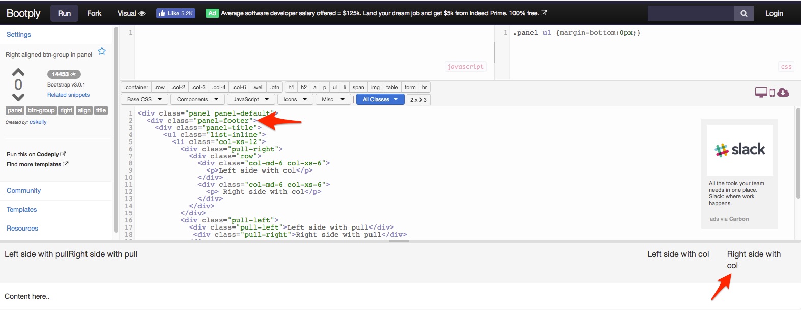
However, you can see that if the text is too long for the column, it gets wrapped and now everything is not on a single line. But I accept that is the compromise of having a responsive design. It just so happens that in my actual use case, that last item cannot be allowed to wrap, so I just have to give it a fixed width to solve that. Thanks @Harinder88.