27

In React Native iOS, I would like to slide in and out of a like in the following picture.

In the following example, when a button is pressed, the Payment Information view pops up from the bottom, and when the collapse button is pressed, it goes back down and disappears.

What would be the correct and proper way to go about doing so?

enter image description here

Thank you in advance!

EDIT

enter image description here

GollyJer
  • 23,857
  • 16
  • 106
  • 174
Jo Ko
  • 7,225
  • 15
  • 62
  • 120

5 Answers5

43

Basically, you need to absolute-position your view to the bottom of the screen. Then you translate its y value to equal its height. (The sub view must have a specific height in order to know how much to move it)

Code:

'use strict';

import React, {Component} from 'react';
import ReactNative from 'react-native';

const {
  AppRegistry,
  StyleSheet,
  Text,
  View,
  TouchableHighlight,
  Animated
} = ReactNative;


var isHidden = true;

class AppContainer extends Component {
  constructor(props) {
    super(props);
    this.state = {
      bounceValue: new Animated.Value(100),  //This is the initial position of the subview
      buttonText: "Show Subview"
    };
  }
  
  
  _toggleSubview() {    
    this.setState({
      buttonText: !isHidden ? "Show Subview" : "Hide Subview"
    });
    
    var toValue = 100;
    
    if(isHidden) {
      toValue = 0;
    }

    //This will animate the transalteY of the subview between 0 & 100 depending on its current state
    //100 comes from the style below, which is the height of the subview.
    Animated.spring(
      this.state.bounceValue,
      {
        toValue: toValue,
        velocity: 3,
        tension: 2,
        friction: 8,
      }
    ).start();
    
    isHidden = !isHidden;
  }
  
  render() {
    return (
      <View style={styles.container}>
          <TouchableHighlight style={styles.button} onPress={()=> {this._toggleSubview()}}>
            <Text style={styles.buttonText}>{this.state.buttonText}</Text>
          </TouchableHighlight>
          <Animated.View
            style={[styles.subView,
              {transform: [{translateY: this.state.bounceValue}]}]}
          >
            <Text>This is a sub view</Text>
          </Animated.View>
      </View>
    );
  }
}

var styles = StyleSheet.create({
  container: {
    flex: 1,
    justifyContent: 'center',
    alignItems: 'center',
    backgroundColor: '#F5FCFF',
    marginTop: 66
  },
  button: {
    padding: 8,
  },
  buttonText: {
    fontSize: 17,
    color: "#007AFF"
  },
  subView: {
    position: "absolute",
    bottom: 0,
    left: 0,
    right: 0,
    backgroundColor: "#FFFFFF",
    height: 100,
  }
});

AppRegistry.registerComponent('AppContainer', () => AppContainer);
Michel Floyd
  • 18,793
  • 4
  • 24
  • 39
Ahmad Al Haddad
  • 1,124
  • 10
  • 10
  • Thank you! will give it a try in a bit – Jo Ko Aug 25 '16 at 17:05
  • It works thank you so much! One more question though, one it comes up it will display a button, and once that is clicked, I would want the same subview to come up. How can I go about doing so? Thank you! – Jo Ko Sep 01 '16 at 07:30
  • @JoKo it's as easy as adding a new button with onpress mapped to a new function. – Ahmad Al Haddad Sep 01 '16 at 07:45
  • Made the attempt and the new/second subview slides up from the bottom but goes up too much (Update the original post with a screenshot. The pink is the second subview and black is the first subview, as shown slightly at the bottom). Turns out it has to do with `container style` not having `alignItems: 'center`. Is it possible to do it properly, with it being affixed to the bottom (Like the first subview) when it slides up from the bottom, without `alignItems: 'center'`? Because, the content in the second `subview` all gets aligned to the center and I don't want that. – Jo Ko Sep 01 '16 at 17:57
  • Just checking to see if you've seen my previous comment. Please let us know. – Jo Ko Sep 06 '16 at 02:07
  • @JoKo I'm sorry I can't visualize the problem. Can you share it on rnplay? – Ahmad Al Haddad Sep 08 '16 at 12:33
  • No worries! I actually worked around it and got it to work. Thank you so much Ahmed! I really need help on one more issue, could you please take a look? I will accept answer and upvote too. Just been working on it for days but no luck so far.. http://stackoverflow.com/questions/39277907/react-native-how-to-slide-in-and-out-a-view-from-top-that-replaces-status-ba Thanks again Ahmed – Jo Ko Sep 08 '16 at 20:37
  • @AhmedAlHaddad , Thank you for your answer . it is working like charm. Can you do me a favour , I have some buttons in subview. These buttons are not clickable when you perform animation , can you help me in this? Here is the link of question. https://stackoverflow.com/questions/52835054/in-react-native-buttons-are-not-clickable-when-i-applied-slide-up-animation – Tarun Oct 17 '18 at 05:59
  • It worked for me, actually I used top property instead and works perfectly too. Thanks! – Dasoga Dec 26 '18 at 19:12
  • 1
    Thank you so much this is the perfect answer! – Anshuman Pattnaik Jun 11 '19 at 00:37
14

I know it is a little bit late, but thought it might be useful for someone. You should try out a component called rn-sliding-out-panel. It works awesomely. https://github.com/octopitus/rn-sliding-up-panel

<SlidingUpPanel
    draggableRange={top: 1000, bottom: 0}
    showBackdrop={true|false /*For making it modal-like*/}
    ref={c => this._panel = c}
    visible={ture|false /*If you want it to be visible on load*/}
></SlidingUpPanel>

And you can even open it from an external button:

<Button onPress={()=>{this._panel.transitionTo(1000)}} title='Expand'></Button>

You can install it via npm: sudo npm install rn-sliding-out-panel --save on your react-native root directory.


I hope it helps someone :D

edvilme
  • 570
  • 7
  • 16
14

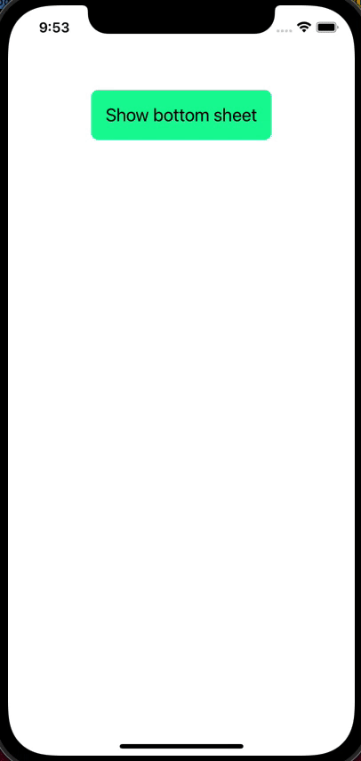
I've created a reusable BottomSheet component that accepts any content.

This is how it looks like:

enter image description here

Here's the code (in TypeScript) of the BottomSheet component:

import * as React from 'react'
import {
  Animated,
  Easing,
  Pressable,
  StyleSheet,
  useWindowDimensions,
  View,
} from 'react-native'

const DEFAULT_HEIGHT = 300

function useAnimatedBottom(show: boolean, height: number = DEFAULT_HEIGHT) {
  const animatedValue = React.useRef(new Animated.Value(0))

  const bottom = animatedValue.current.interpolate({
    inputRange: [0, 1],
    outputRange: [-height, 0],
  })

  React.useEffect(() => {
    if (show) {
      Animated.timing(animatedValue.current, {
        toValue: 1,
        duration: 350,
        // Accelerate then decelerate - https://cubic-bezier.com/#.28,0,.63,1
        easing: Easing.bezier(0.28, 0, 0.63, 1),
        useNativeDriver: false, // 'bottom' is not supported by native animated module
      }).start()
    } else {
      Animated.timing(animatedValue.current, {
        toValue: 0,
        duration: 250,
        // Accelerate - https://easings.net/#easeInCubic
        easing: Easing.cubic,
        useNativeDriver: false,
      }).start()
    }
  }, [show])

  return bottom
}

interface Props {
  children: React.ReactNode
  show: boolean
  height?: number
  onOuterClick?: () => void
}

export function BottomSheet({
  children,
  show,
  height = DEFAULT_HEIGHT,
  onOuterClick,
}: Props) {
  const { height: screenHeight } = useWindowDimensions()

  const bottom = useAnimatedBottom(show, height)

  return (
    <>
      {/* Outer semitransparent overlay - remove it if you don't want it */}
      {show && (
        <Pressable
          onPress={onOuterClick}
          style={[styles.outerOverlay, { height: screenHeight }]}
        >
          <View />
        </Pressable>
      )}
      <Animated.View style={[styles.bottomSheet, { height, bottom }]}>
        {children}
      </Animated.View>
    </>
  )
}

const styles = StyleSheet.create({
  outerOverlay: {
    position: 'absolute',
    width: '100%',
    zIndex: 1,
    backgroundColor: 'black',
    opacity: 0.3,
  },
  bottomSheet: {
    position: 'absolute',
    width: '100%',
    zIndex: 1,
    // Here you can set a common style for all bottom sheets, or nothing if you
    // want different designs
    backgroundColor: 'dodgerblue',
    borderRadius: 16,
  },
})

I put this code in a file named BottomSheet.tsx.

This is how you use the BottomSheet:

import * as React from 'react'
import {
  Pressable,
  SafeAreaView,
  StatusBar,
  StyleSheet,
  Text,
  View,
} from 'react-native'
import { BottomSheet } from './src/BottomSheet'

const App = () => {
  const [showBottomSheet, setShowBottomSheet] = React.useState(false)

  const hide = () => {
    setShowBottomSheet(false)
  }

  return (
    <SafeAreaView style={styles.safeAreaView}>
      <StatusBar barStyle={'dark-content'} />
      <View style={styles.container}>
        <Pressable
          onPress={() => {
            setShowBottomSheet(true)
          }}
          style={styles.showButton}
        >
          <Text style={styles.buttonText}>Show bottom sheet</Text>
        </Pressable>
      </View>

      <BottomSheet show={showBottomSheet} height={290} onOuterClick={hide}>
        <View style={styles.bottomSheetContent}>
          <Text style={styles.bottomSheetText}>Hey boys, hey girls!</Text>
          <Pressable onPress={hide} style={styles.bottomSheetCloseButton}>
            <Text style={styles.buttonText}>X Close</Text>
          </Pressable>
        </View>
      </BottomSheet>
    </SafeAreaView>
  )
}

const styles = StyleSheet.create({
  safeAreaView: {
    flex: 1,
  },
  container: {
    flex: 1,
  },
  showButton: {
    marginTop: 48,
    padding: 16,
    backgroundColor: 'mediumspringgreen',
    alignSelf: 'center',
    borderRadius: 8,
  },
  buttonText: {
    fontSize: 20,
  },
  bottomSheetContent: {
    padding: 40,
    alignItems: 'center',
  },
  bottomSheetText: {
    fontSize: 24,
    marginBottom: 80,
  },
  bottomSheetCloseButton: {
    padding: 16,
    backgroundColor: 'deeppink',
    borderRadius: 8,
  },
})

export default App

Notes:

  • I've put an outer semitransparent overlay, but you can get rid of it by deleting it.
  • I've chosen to close the modal when you click on the outer semitransparent overlay. This is done with the onOuterClick callback, which is optional - don't pass it if you don't want to do anything.
  • I've put some styling (blue background + border radius) that applies to all bottom sheets, but you can remove it if you want to have different styles.
Albert Vila Calvo
  • 15,298
  • 6
  • 62
  • 73
1

After a quite long search I found very good library called react-native-swipe-down with MIT licence. It will help you make a slider <View /> with no effort.

I Hope this library help you out.

import SwipeUpDown from 'react-native-swipe-up-down';

<SwipeUpDown        
    itemMini={<ItemMini />} // Pass props component when collapsed
    itemFull={<ItemFull />} // Pass props component when show full
    onShowMini={() => console.log('mini')}
    onShowFull={() => console.log('full')}
    onMoveDown={() => console.log('down')}
    onMoveUp={() => console.log('up')}
    disablePressToShow={false} // Press item mini to show full
    style={{ backgroundColor: 'green' }} // style for swipe
/>
Hamza Hmem
  • 502
  • 5
  • 11
0

To achieve above type of requirement, we can take help of some great libraries

  1. @gorhom/bottom-sheet
  2. react-native-raw-bottom-sheet

But if we want to do it natively, please find code shown below, I'll try to justify the answer:)

For some animation effects I'll take reference from blow site how-to-create-moving-animations-in-react-native

import React, { useState } from 'react'
import { SafeAreaView, View, ScrollView, Text, Dimensions, TouchableOpacity, Animated } from 'react-native'


const App = () => {

    const { height, width } = Dimensions.get('window')
    const SCREEN_HEIGHT = Math.round(height)
    const SCREEN_WIDTH = Math.round(width)
    // Animation
    const startValue = new Animated.Value(Math.round(height + height * 0.3))
    const endValue = Math.round(height - height * 0.3)
    const duration = 1000


    const _showBottomView = (key) => {

        const toValue = key === 'HIDE' ? height : endValue

        Animated.timing(startValue, {
            toValue,
            duration: duration,
            useNativeDriver: true,
        }).start()

    }

    return (
        <SafeAreaView style={{ flex: 1, backgroundColor: 'rgba(0,0,0,0.1)' }}>

            {/* Header */}
            <View style={{ flex: 1, alignItems: 'center', justifyContent: 'center', borderWidth: 1, borderColor: 'black', margin: 5 }}>
                <Text>
                    Header
                </Text>
            </View>

            <View style={{ flex: 9, borderWidth: 1, borderColor: 'black', margin: 5 }}>
                <ScrollView
                    style={{ flex: 1 }}>

                    {/* Title View */}
                    <View style={{ height: SCREEN_HEIGHT * 0.1, width: '95%', borderColor: 'black', borderWidth: 1, marginLeft: '2.5%', marginTop: SCREEN_HEIGHT * 0.01, alignItems: 'center', justifyContent: 'center', }}>
                        <Text>
                            Content ONE
                        </Text>
                    </View>

                    <View style={{ height: SCREEN_HEIGHT * 0.5, width: '95%', borderColor: 'black', borderWidth: 1, marginLeft: '2.5%', marginTop: SCREEN_HEIGHT * 0.01, alignItems: 'center', justifyContent: 'center', }}>
                        <Text>
                            Content TWO
                        </Text>

                    </View>

                    <View style={{ height: SCREEN_HEIGHT * 0.2, width: '95%', borderColor: 'black', borderWidth: 1, marginLeft: '2.5%', marginTop: SCREEN_HEIGHT * 0.01, alignItems: 'center', justifyContent: 'center', }}>
                        <TouchableOpacity
                            activeOpacity={0.85}
                            onPress={() => _showBottomView()}
                            style={{ height: SCREEN_HEIGHT * 0.065, width: '75%', borderRadius: 5, borderWidth: 1, borderColor: 'green', alignItems: 'center', justifyContent: 'center', }}>
                            <Text>
                                SHOW BOTTOM VIEW
                            </Text>
                        </TouchableOpacity>
                    </View>

                    <View style={{ height: SCREEN_HEIGHT * 0.3, width: '95%', borderColor: 'black', borderWidth: 1, marginLeft: '2.5%', marginTop: SCREEN_HEIGHT * 0.01, alignItems: 'center', justifyContent: 'center', marginBottom: SCREEN_HEIGHT * 0.01 }}>
                        <Text>
                            ...REST_CONTENT...
                        </Text>
                    </View>
                </ScrollView>
            </View>

            {/* Bottom view */}

            <Animated.View
                style={[
                    {
                        position: 'absolute',
                        height: height * 0.3,
                        width: width,
                        backgroundColor: 'white',
                        alignItems: 'center', justifyContent: 'center',
                        borderTopRightRadius: 23, borderTopLeftRadius: 23,
                        transform: [
                            {
                                translateY: startValue
                            },
                        ],
                    },
                ]} >

                <TouchableOpacity
                    activeOpacity={0.85}
                    onPress={() => _showBottomView('HIDE')}
                    style={{ height: SCREEN_HEIGHT * 0.065, width: '75%', borderRadius: 5, borderWidth: 1, borderColor: 'green', alignItems: 'center', justifyContent: 'center', }}>
                    <Text>
                        HIDE BOTTOM VIEW
                    </Text>
                </TouchableOpacity>

            </Animated.View>

        </SafeAreaView>
    )
}

export default App

Demo

enter image description here

marc_s
  • 732,580
  • 175
  • 1,330
  • 1,459
Hardik Desai
  • 1,089
  • 12
  • 20