2

i'm sorry for my english.

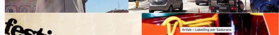
It's many days that i try to figure out an issue that i see trying to create a responsive fullwidth grid of images. To create this grid I'm using Isotope with Masonry Layout (http://isotope.metafizzy.co/) or Packery (http://packery.metafizzy.co/layout.html). I have tried both and in both i have the same issue. For some resolution of my browser i see a 1px gap between images (as you can see in the images below).

enter image description here

enter image description here

I have read about this problem in many post (for example https://github.com/metafizzy/packery/issues/42) but no solution works for me. Anyone can help me?

At the moment my code is:

jQuery(window).load(function() {

var container = document.querySelector('.grid');
var pckry;
// using imagesLoaded http://desandro.github.io/imagesloaded
imagesLoaded( container, function() {
  pckry = new Packery( container, {
    itemSelector: '.grid-item',
    rowHeight: '.grid-sizer',
    percentPosition: true
  });
});
});

I attach the final grid that i would like to have:

enter image description here

Manuel Ragazzini
  • 919
  • 1
  • 10
  • 24

1 Answers1

4

After many days of work i have been able to solve my issue thanks to DeSando, the plugins's author.

As he explain in this post http://metafizzy.co/blog/beyonce-seamless-fluid-image-masonry/ the gaps occur due to pixel rounding differences between JavaScript and CSS.

In my case i have a grid based on four columns and when the width of the browser wasn't divisible per 4 the gaps were born. So, as DeSandro suggests here, a workaround is to set container of images a little bit more smaller and cover the gaps with images a little bit more bigger. So, in my website:

HTML

<div class="grid">
   <div class="grid-item" ><a href="#"><img src="..." title="" class="lazy"></a></div>
   <div class="grid-item grid-item--width2 " ><a href=#"><img src="..." title="" class="lazy"></a></div>
   <div class="grid-item grid-item--width2 "><a href="#"><img src="..." title="" class="lazy"></a></div>
   <div class="grid-item" ><a href="#"><img src="..." title="" class="lazy"></a></div>
   <div class="grid-item" ><a href="#"><img src="..." title="" class="lazy"></a></div>
   ... 
</div>

CSS

.grid {
   margin: 0 auto;
   width: 100.4%;
   margin-bottom: 0px !important;
}
.grid-sizer,.grid-item {
   width: 24.9%;
   display: block;
   float: left;
   margin: 0;
   padding: 0;
   border: 0;
   font-size: 100%;
   font: inherit;
   vertical-align: baseline;
   list-style: none!important;
}
/* 2 columns wide */
.grid-item--width2 {
   width: 49.8%;
   display: block;
   float: left;
}
.grid-item img{
   display:block;
   width: 100.4%;
   max-width: 100.4% !important;
}

JS

// init Packery
var grid = jQuery('.grid').packery({
    itemSelector: '.grid-item',
    percentPosition: true
});
// layout Packery after each image loads
grid.imagesLoaded().progress( function() {
   grid.packery();
});

I'm sorry for my english. I hope this could be useful for many of us.

Manuel Ragazzini
  • 919
  • 1
  • 10
  • 24