0

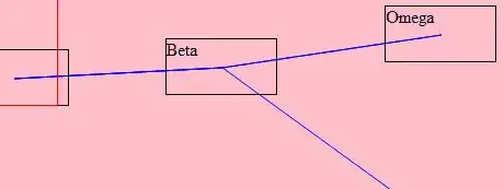
I am creating a Box Plot(also known as box and whisker plot)through SSRS and I came across a question by Pavan Keerthi. Somehow his example gave me a vision of how I wanted my report to be. What I wanted to do is to create a line similar to the ones on his example below wherein there is a line passing through the mean of his box plot chart.

enter image description here

enter image description here

As per my observation he made use of a scatter chart to create the line which he combined with the box plot chart. Upon trying mine didn't show any line but a single dot instead. I was wondering if I was missing something. Here is my example:
enter image description here

enter image description here

Michelle Santos
  • 257
  • 4
  • 20

1 Answers1

2

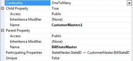
Upon further research I have found that the line I needed to add on my chart is called the threshold line. It is created by adding a Strip line by accessing the chart properties.

enter image description here

Set the interval Offset where you want to place the threshold line. Take note that you may set the value dynamically by using Expression. After that you may customize the threshold line's appearance by altering the border color and style.

enter image description here

Michelle Santos
  • 257
  • 4
  • 20