I want to achieve a look like this (from the material design specs) for my switch when it's in the off state:
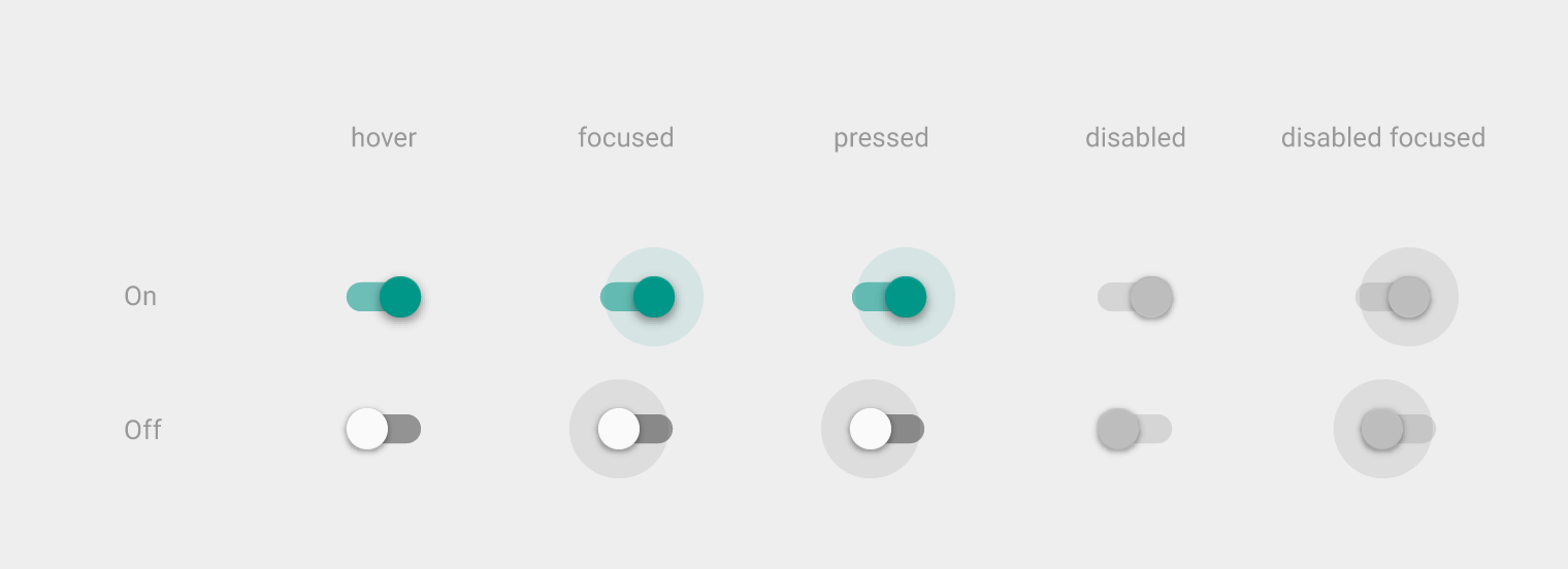
notice that the thumb is white and has a black outline with a slight shadow. I haven't been able to replicate this at all - much less to replicate the "focused" and "pressed" states with the halo around the thumb. What is the correct way of doing this? Do I need to work with 9-patches or is there a way to do it just using themes and xml? I want to support api 16 and up, but I noticed that Switch supports 14 and up so that shouldn't in itself be an issue.
Code for my current switch:
                        <Switch
                        android:id="@+id/mySwitch"
                        android:layout_width="wrap_content"
                        android:layout_height="25dp"
                        android:layout_alignParentRight="true"
                        android:layout_alignParentEnd="true"
                        android:layout_marginRight="16dp"
                        android:layout_marginEnd="16dp"
                        />
In my app Styles.xml:
    <item name="colorControlActivated">@color/myColor</item>

    <item name="colorSwitchThumbNormal">@android:color/white</item>

    <item name="android:colorForeground">@android:color/white</item>