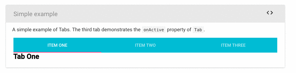
How I can change the color of the active tab?
I mean, this pink line, look at the pic.
How I can change the color of the active tab?
I mean, this pink line, look at the pic.
You can try this material UI latest version support TabIndicatorProps through which you can pass style key.
<Tabs TabIndicatorProps={{style: {background:'ANY_COLOR'}}}>......
Hi if anyone is still having issues with changing the color, following worked for me:
<Tabs
  value={value}
  onChange={this.handleChange}
  TabIndicatorProps={{
    style: {
      backgroundColor: "#D97D54"
    }
  }}
>
...
</Tabs>
Well, you have two options:
You could customize the theme:
http://www.material-ui.com/#/customization/themes
But the easiest way would be using the inkBarStyle property.
You can see it in the docs..
Example:
<Tabs inkBarStyle={{background: 'blue'}}>...
@Risa's solution works just fine and should be the accepted answer. My example of her explanation looks like this:
<Tabs
  fullWidth
  centered
  classes={{
    indicator: classes.indicator
  }}>
    <Tab />
    <Tab />
</Tabs>
and the styles:
const styles = theme => ({
  indicator: {
    backgroundColor: 'white',
  },
})
try this
import { makeStyles} from '@mui/styles';

    const useStyles = makeStyles({
  tabs: {

    "& .MuiTabs-indicator": {
      backgroundColor: "orange",
      height: 3,
    },
    "& .MuiTab-root.Mui-selected": {
      color: 'red'
    }
  }
})
and then
const classes = useStyles();
<Tabs
    value={value}
    onChange={handleChange}
    // textColor="secondary"
    // indicatorColor="secondary"
    aria-label="secondary tabs example"
    className={classes.tabs}
    // TabIndicatorProps={{
    //   style: { background: "green", height: 3}
    // }}
  >
  <Tab label={<span className={styles.tabs}>{ABOUT_US}</span>} component={Link} to="/about-us" />
  <Tab label={<span className={styles.tabs}>{ABOUT_HANBANABORINA}</span>} component={Link} to="/about-hanbanaborina" />
  <Tab label={<span className={styles.tabs}>{DOWNLOAD_APPLICATION}</span>} component={Link} to="/download" />
  <Tab label={<span className={styles.tabs}>{HOME}</span>} component={Link} to="/" />
  </Tabs>
I put here a end of 2019's update because I didn't found my answer here. A lot of answers are depreciated.
The best way to override without having too much pain seems to use the makeStyle and withStyles of material-ui.
Here is an exemple with tabs.
you need to import makeStyles
    import { makeStyles } from '@material-ui/core/styles'
    import Tabs from '@material-ui/core/Tabs'
here are my customs classes using makeStyles()
     const useStyles = makeStyles((theme) => ({
     customOne: {
        padding: '3rem 15rem',
        flexGrow: 1,
        backgroundColor: theme.palette.background.paper,
        fontFamily: 'Open Sans',
     },
     customTwo: {
        padding: '0rem',
        color: '#484848',
        backgroundColor: 'white',
        fontFamily: 'Open Sans',
        fontSize: '1rem',
    },
   }))
For more overrides you can also create a function that use props using by material ui (root, etc.) using withStyles() :
    const TabStyle = withStyles((theme) => ({
    root: {
       padding: '1rem 0',
       textTransform: 'none',
       fontWeight: theme.typography.fontWeightRegular,
       fontSize: '1.2rem',
       fontFamily: [
           '-apple-system',
           'BlinkMacSystemFont',
           'Roboto',
       ].join(','),
       '&:hover': {
          backgroundColor: '#004C9B',
          color: 'white',
          opacity: 1,
       },
      '&$selected': {
          backgroundColor: '#004C9B',
          color: 'white',
          fontWeight: theme.typography.fontWeightMedium,
      },
  },
  tab: {
      padding: '0.5rem',
      fontFamily: 'Open Sans',
      fontSize: '2rem',
      backgroundColor: 'grey',
      color: 'black',
      '&:hover': {
          backgroundColor: 'red',
          color: 'white',
          opacity: 1,
      },
  },
  selected: {},
  }))((props) => <Tab {...props} />)
in my component I define : const classes = useStyles() that permit to change my useStyles props in classes.
I use my custom classes whenever I want like this : className={classes.customOne}
    export default function TabsCustom({ activeTabIndex, onChange, values }) {
    const classes = useStyles()
    const [value, setValue] = React.useState(0)

    const handleChange = (event, newValue) => {
       setValue(newValue)
  }


    return (
        <div className={classes.customOne}>
            <Tabs
                className={classes.customTwo}
                variant="fullWidth"
                value={activeTabIndex}
                onChange={onChange}
                aria-label="tabs"
            >
                <TabStyle
                    value="updateDate"
                    icon={(<Icon>insert_invitation</Icon>)}
                    label={i18n.perYear}
                />

            </Tabs>
    </div>
   )
 }
Hope it help. Personnaly I would have gained a lot of time (and pain) if I had found this explanation.
You can use the sx prop in Material UI v5 instead of inline styles. To declare a custom color:
<Tabs
  {...}
  TabIndicatorProps={{
    sx: {
      backgroundColor: 'red',
    },
  }}
>
Many of the sx properties are also theme aware. To use one of the colors from the palette:
<Tabs
  {...}
  TabIndicatorProps={{
    sx: {
      backgroundColor: 'secondary.main',
    },
  }}
>
Or if you want to change the indicator color globally:
const theme = createTheme({
  components: {
    MuiTabs: {
      styleOverrides: {
        indicator: {
          backgroundColor: 'orange',
          height: 3,
        },
      },
    },
  },
});

Example one:
Js:
<Tabs indicatorColor="primary" classes={{ indicator: classes.indicator }}>
style:
indicator:{
      backgroundColor: 'green'
    }
Example two:
<Tabs TabIndicatorProps={{style: {background:'green'}}} >
For material-ui version 1.0.0-beta.36, the following worked for me:
<Tabs indicatorColor={'HEX_COLOR'}>
inkBarStyle must've been deprecated/replaced by indicatorColor in v1.0
EDIT: Link to v1.0 docs: https://material-ui-next.com/api/tabs/
EDIT: Following the stable release of v1.0, it appears the previous solution no longer works.
Here are remaining solutions:
indicator class. Link to docs on overrides. Link to docs Tab component with CSS API classes at bottom.primary or secondary color intentions. You may then specify your desired primary or secondary color to be used with the indicatorColor attribute mentioned above. Link to Docs.Classes overrides may be the easier option. You need to use the withStyles component in order to inject your custom style classes. The reason being that the library's styling will override your classes or styled-components. The docs linked above provide a great example.
Met this question just, hope help your guys;
          <Tabs classes={{ indicator: `your classes like underline` }} >
            <Tab
              classes={{ selected: `your classes like underline` }}
            />
            <Tab
              classes={{ selected: classes.selectedTab }}
            />
          </Tabs>
Whoever is using Mui v5+, and wants to config this as components styles Override with custom theme:
MuiTab: {
  styleOverrides: {
    root: {
      '&.Mui-selected': {
        color: theme.menuSelected
      }
    }
  }
},
MuiTabs: {
  styleOverrides: {
    indicator: {
      backgroundColor: theme.menuSelected
    }
  }
}
MuiTab refers to the to <Tab /> component and MuiTabs to <Tabs />.
You can now use the TabIndicatorProps to style the active indicator with the current version of MUI (4.10.02). Docs available here.
There are 2 ways to do this:
METHOD 1: using style
import React from "react";
import PropTypes from "prop-types";
import { Tabs, Tab, makeStyles } from "@material-ui/core";

const TabsIndicator = () => {
  const [value, setValue] = React.useState(0);

  const handleChange = (event, newValue) => {
    setValue(newValue);
  };

  return (
    <React.Fragment>
       <Tabs
         value={value}
         onChange={handleChange}
         TabIndicatorProps={{
           style: { background: "cyan", height: "10px", top: "35px" }
         }}
       >
         <Tab label="TEST1" value={0} />
         <Tab label="TEST2" value={1} />
         <Tab label="TEST3" value={2} />
         <Tab label="TEST4" value={3} />
       </Tabs>
    </React.Fragment>
  );
};

export default TabsIndicator;
Method 2: using classes
import React from "react";
import PropTypes from "prop-types";
import { Tabs, Tab, makeStyles } from "@material-ui/core";

const useStyles = makeStyles(theme => ({
  indicator: {
    backgroundColor: "green",
    height: "10px",
    top: "45px"
  }
}));

const TabsIndicator = () => {
  const classes = useStyles();

  const [value, setValue] = React.useState(0);

  const handleChange = (event, newValue) => {
    setValue(newValue);
  };

  return (
    <React.Fragment>
        <Tabs
          value={value}
          onChange={handleChange}
          TabIndicatorProps={{ className: classes.indicator }}
        >
          <Tab label="TEST1" value={0} />
          <Tab label="TEST2" value={1} />
          <Tab label="TEST3" value={2} />
          <Tab label="TEST4" value={3} />
        </Tabs>
    </React.Fragment>
  );
};

export default TabsIndicator;
You can also check out my sandbox here. Hope this helps!
MUI v5.2.0
Since the props of the Tabs component are also available on TabList we can use TabIndicatorProps with the TabList and sx prop for styling
<TabList TabIndicatorProps={{ sx: { backgroundColor: 'green'} }} >
sx prop is a shortcut for defining a custom style that has access to the theme.
You can use indicatorColor and textColor properties of Tabs if you want to switch colors from Material UI.
<Tabs
   value={selectedTab}
   indicatorColor="secondary"
   textColor="secondary"
   className="w-full h-64"
>
 ...
</Tabs>
For anyone with the new version, most of those above won't work. To customize the colors, visit the documentation
https://mui.com/material-ui/customization/palette/
import * as React from 'react';
import {
  createTheme,
  ThemeProvider
} from '@mui/material/styles';
import {
  purple
} from '@mui/material/colors';
import Button from '@mui/material/Button';

const theme = createTheme({
  palette: {
    primary: {
      // Purple and green play nicely together.
      main: purple[500],
    },
    secondary: {
      // This is green.A700 as hex.
      main: '#11cb5f',
    },
  },
});

export default function Palette() {
  return ( <
    ThemeProvider theme = {
      theme
    } >
    <
    Button > Primary < /Button> <
    Button color = "secondary" > Secondary < /Button> <
    /ThemeProvider>
  );
}
Although this is a fairly old question, it still getting some attention and for those of us who are using multiple and heavily customized themes, this is a hassle. I have a better solution that will allow you to customize it in different colors according to the theme
First, create a class you can hook to by adding it to the Tabs component this way
<Tabs
   onChange={this.handleChange}
   value={this.state.slideIndex}
   className="dashboard-tabs"> //this is what you need
       <Tab label="Main" value={0}/>
       <Tab label="Analytics" value={1}/>
       <Tab label="Live Widgets" value={2}/>
</Tabs>
Keep in mind, my tabs and your tabs may be different so pay attention to only the className line. You can name it whatever you want. 1. If you want to have different tabs having a different underline, name it something meaningful like dashboard-tabs if the tabs are in the dashboard or quickpanel-tabs if they are part of a quickpanel, etc. 2. if your tabs will be essentially the same, name it more globally like material-tabs and now you can use that class anywhere and your css will work without having to create this again.
Now, use this class as a hook class and use specificity to reach the underline, like this
.dashboard-tabs > div{
    background-color: #333 !important;
}
.dashboard-tabs > div:nth-child(2) > div{
    background-color: #ddd !important;
}
Don't worry about the !important. The tabboo that using !important is bad, is all nothing but a big tabboo. You'll be fine.
Here is a SCSS sample
.dashboard-tabs{
    > div{
        background-color: $bg-color-meddark !important;
        &:nth-child(2){
            > div{
                background-color: $brand-info !important;
            }
        }
    }
}
This solution would be extremely helpful if you were using multiple themes because, (assuming you are theming correctly), you should have a dynamic theme class being appended above in your code somewhere that changes your UI from one color to the next. So, say you have 2 themes. 1 is light and uses the theme class light-theme and 2 is a dark theme and uses the dark-theme class
Now, you can do this as follows:
.light-theme .dashboard-tabs > div{
    background-color: #fff !important;
}
.light-theme .dashboard-tabs > div:nth-child(2) > div{
    background-color: #333 !important;
}
.dark-theme .dashboard-tabs > div{
    background-color: #333 !important;
}
.dark-theme .dashboard-tabs > div:nth-child(2) > div{
    background-color: #ddd !important;
}
Makes sense?
Why am I against the InkBarStyle solution? Because you'd be replacing one background color for another and still not able to change it across themes
Good luck everyone!
Here is a theme template to use in your projects:
'use strict';

Object.defineProperty(exports, "__esModule", {
  value: true
});

let _colors = require('material-ui/styles/colors');
let _colorManipulator = require('material-ui/utils/colorManipulator');
let _spacing = require('material-ui/styles/spacing');
let _spacing2 = _interopRequireDefault(_spacing);

function _interopRequireDefault(obj) {
  return obj && obj.__esModule ? obj : {default: obj};
}

exports.default = {
  spacing: _spacing2.default,
  fontFamily: 'Roboto, sans-serif',
  borderRadius: 2,
  palette: {
    primary1Color: _colors.grey50,
    primary2Color: _colors.cyan700,
    primary3Color: _colors.grey600,
    accent1Color: _colors.lightBlue500,
    accent2Color: _colors.pinkA400,
    accent3Color: _colors.pinkA100,
    textColor: _colors.fullWhite,
    secondaryTextColor: (0, _colorManipulator.fade)(_colors.fullWhite, 0.7),
    alternateTextColor: '#303030',
    canvasColor: '#303030',
    borderColor: (0, _colorManipulator.fade)(_colors.fullWhite, 0.3),
    disabledColor: (0, _colorManipulator.fade)(_colors.fullWhite, 0.3),
    pickerHeaderColor: (0, _colorManipulator.fade)(_colors.fullWhite, 0.12),
    clockCircleColor: (0, _colorManipulator.fade)(_colors.fullWhite, 0.12)
  }
};
As of 2021 and version 4.11.1, you can do this:
import Tabs from '@material-ui/core/Tabs';
import { withStyles } from '@material-ui/core/styles';

const StyledTabs = withStyles({
  indicator: {
    backgroundColor: 'orange'
  }
})(Tabs);
and then use StyledTabs, instead of Tabs.
Link to docs:
You could make a pink div that is animated with JavaScript of JQuery. It would be held inside a green div the same color as the tabs.