10

I'm trying to create a partial shadow on a skewed div, as close as I can get to this creative.

enter image description here

Right now I've been trying to do this with pseudo elements (before specifically) but I found that those elements behave strangely whenever I skew the element they are applied to. The pseudo element keeps appearing on top of my div, even though the z-index is set to -1. No matter what I do with z-index, it will stay on top of it. I want it to be behind the div it's applied to, and in front of the div below, like in the creative.

enter image description here

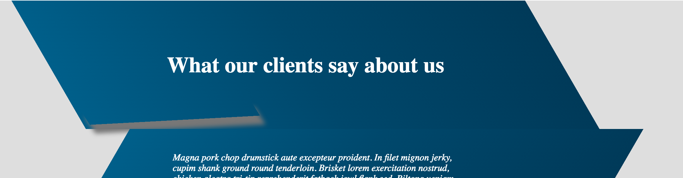
Here's my ::before code and a link to the codepen

CSS

/*! Shadows */
#test-title {
  position: relative;
}

#test-title:before {
  z-index: -1;
  position: absolute;
  content: "";
  bottom: 15px;
  left: 10px;
  width: 50%;
  top: 80%;
  max-width:300px;
  box-shadow: 0 15px 10px #777;
  -webkit-transform: rotate(-3deg);
  -moz-transform: rotate(-3deg);
  -o-transform: rotate(-3deg);
  -ms-transform: rotate(-3deg);
  transform: rotate(-3deg);
}

http://codepen.io/kathryncrawford/pen/WwWEma

Gildas.Tambo
  • 22,173
  • 7
  • 50
  • 78
Kathryn Crawford
  • 611
  • 1
  • 10
  • 27

4 Answers4

10

Skew the parent then unskew the child at the same degree.

* {
  box-sizing: border-box
}
body {
  padding: 40px 0
}
section {
  width: 60vw;
  clear: both;
  overflow: hidden;
  min-height: 100px;
  margin: 0 auto;
  position: relative;
  background: #035076
}
section article {
  width: 60%;
  padding: 20px;
  color: white;
  margin: 0 auto
}
section:nth-child(even) {
  transform: skew(-45deg) translate(5vw);
  box-shadow: inset 0 0 2px 0 black;
}
section:nth-child(odd) {
  transform: skew(45deg);
}
section:nth-child(even) article {
  transform: skew(45deg) translate(5vw);
}
section:nth-child(odd) article {
  transform: skew(-45deg);
}
section:before,
section:after {
  content: '';
  position: absolute;
}
section:nth-child(even):before {
  width: 100%;
  height: 0;
  bottom: 100%;
  left: 0;
  z-index: 6;
  opacity: 1;
  transform: rotate(-10deg) translateY(-30px);
  box-shadow: 0px 0px 64px 30px rgba(0, 0, 0, 0.8);
}

section:nth-child(odd):not(:first-child):before {
  width: 100%;
  height: 0;
  bottom: 100%;
  right: 0;
  z-index: 6;
  opacity: 1;
  transform: rotate(10deg) translateY(-30px);
  box-shadow: 0px 0px 64px 30px rgba(0, 0, 0, 0.8);
}
<section>
  <article>What our clients say About Us</article>
</section>
<section>
  <article>Read More!</article>
</section>
<section>
  <article>Read More!</article>
</section>
<section>
  <article>Read More!</article>
</section>
Gildas.Tambo
  • 22,173
  • 7
  • 50
  • 78
2

The easier approach would be to put the drop shadow at the top of each box after the first. This will solve all sorts of z-index issues, since each box sits 1 level higher than the box above it.. and it allows the shadow to sit inside the container instead of outside of it.

I've also changed your shadow styling to use a radial gradient* instead of a box shadow, as it is a bit easier to control in this situation, and is also closer to your design. I also did a bit of positioning to make it look a bit better too, and get the separate sides for skew1 and skew2

I've changed your last ruleset to this:

.test-info:before {
  position: absolute;
  content: "";
  width: 100%;
  left: 0;
  top: 0;
  height: 30px;
}

.test-info.skew1:before {
  background: radial-gradient(ellipse farthest-side at 30% top, rgba(0,0,0,0.5) 0%, rgba(0,0,0,0) 100%);
}
.test-info.skew2:before {
  background: radial-gradient(ellipse farthest-side at 70% top, rgba(0,0,0,0.5) 0%, rgba(0,0,0,0) 100%);
}

See Demo

* note: You may want to check/add additional browser support on the gradient that I put in before using it.

Blake Mann
  • 5,440
  • 23
  • 37
0

I have tried, it's not perfect, but, it is closer to desired look, imho:

<div id="test-title">
            <h3>What our clients say about us</h3>
        </div>
        <div id="shadow1"></div>

So, i've added new html element(shadow), rather than using pseudo-elements... Now, i've set z-indexes and positions properly, to hide rotated shadow div behind first div, and added this css:

#shadow1 {
  position:absolute;
  width:50%;
  height:150px;
  background:black;
  top:50px;
  left:11%;
  z-index:6;
  opacity:1;
 transform: rotate(-5deg);
box-shadow: 15px 56px 50px -12px rgba(0,0,0,0.80);

}

Demo: http://codepen.io/anon/pen/vGwNqY

You can play with rotation, box-shadow, position, height... but, this could be a good start (maybe). P.S. Similar logic could be applied to second div.

sinisake
  • 11,240
  • 2
  • 19
  • 27
0

try to make box shadow for the second element using :before pseudo https://jsfiddle.net/0andpzsp/

.cont {
   width: 1000px;
   height: 500px;
}

div[class^="d"] {
   width: 70%;
   height: 50%;
   position: relative;
   margin-left: 40px;
   margin-top: 50px;
}

.d0 {
   background: linear-gradient(to right, #005f8a 0%,#00486c 50%,#003a59 100%);;
   transform: skew(20deg)
}

.d1 {
   background: linear-gradient(to right, #005f8a 0%,#00486c 50%,#003a59 100%);;
   overflow: hidden;
   top: -50px;
   left: 20%;
   transform: skewX(-20deg);
   z-index: -1
}

.d1:before {
   content: '';
   border-radius: 30%;
   position: absolute;
   display: block;
   width: 600px;
   height: 70px;
   z-index: 9999;
   top: -100px;
   left: -70px;
   box-shadow: -50px 60px 90px 0px #000;
   transform: rotate(-5deg)
}
<div class="cont">
  <div class="d0"></div>
  <div class="d1">
  </div>
</div>