I am trying to visualise multivariate data model by reading them from multiple input files. I am looking for a simple solution to visualise multiple category data read from multiple input csv files. The no. Of rows in inputs range from 1 to 10000s in individual files. The format is same of all the inputs with 4 columns csv files.
Input 1
tweetcricscore 34 51 high
Input 2
tweetcricscore 23 46 low
tweetcricscore 24  12 low
tweetcricscore 456 46 low
Input 3
tweetcricscore 653  1 medium
tweetcricscore 789 178 medium
Input 4
tweetcricscore 625  46 part
tweetcricscore 86  23 part
tweetcricscore 3  1 part
tweetcricscore 87 8 part
tweetcricscore 98 56 part
The four inputs are each of different category and col[1] and col[2] are pair results of some kind of classification. All the inputs here are the outputs of the same classification. I want to visualise them in better way to show all the categories in one plot only. Looking for a python or pandas solutions for the same. Scatter plot or any best approach to plot.
I have already posted this query in Data analysis section of stack exchange and I have no luck hence trying here. https://datascience.stackexchange.com/questions/11440/multi-model-data-set-visualization-python
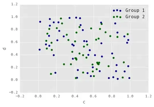
May be something like below image where every class has its own marker and color and can be categorized or any better way to show the pair values together.
code: Edit 1: I am trying to plot a scatter plot with above input files.
import numpy as np
import matplotlib.pyplot as plt
from pylab import*
import math
from matplotlib.ticker import LogLocator
import pandas as pd

df1 = pd.read_csv('input_1.csv', header = None)

df1.columns = ['col1','col2','col3','col4']
plt.df1(kind='scatter', x='col2', y='col3', s=120, c='b', label='Highly')

plt.legend(loc='upper right')
plt.xlabel('Freq (x)')
plt.ylabel('Freq(y)')
#plt.gca().set_xscale("log")
#plt.gca().set_yscale("log")
plt.show()
Error:
Traceback (most recent call last):
  File "00_scatter_plot.py", line 12, in <module>
    plt.scatter(x='col2', y='col3', s=120, c='b', label='High')
  File "/usr/lib/pymodules/python2.7/matplotlib/pyplot.py", line 3087, in scatter
    linewidths=linewidths, verts=verts, **kwargs)
  File "/usr/lib/pymodules/python2.7/matplotlib/axes.py", line 6337, in scatter
    self.add_collection(collection)
  File "/usr/lib/pymodules/python2.7/matplotlib/axes.py", line 1481, in add_collection
    self.update_datalim(collection.get_datalim(self.transData))
  File "/usr/lib/pymodules/python2.7/matplotlib/collections.py", line 185, in get_datalim
    offsets = np.asanyarray(offsets, np.float_)
  File "/usr/local/lib/python2.7/dist-packages/numpy/core/numeric.py", line 514, in asanyarray
    return array(a, dtype, copy=False, order=order, subok=True)
ValueError: could not convert string to float: col2
Expected Output Plotting- Pandas


