Example: 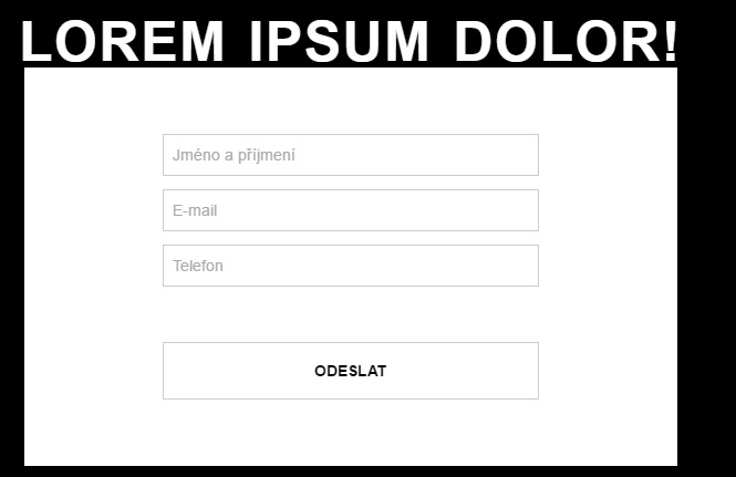 http://www.jpeg.cz/images/2016/05/04/uEf8S.jpg
Hello, is it possible to make font-size same width as element and make it responsive or it must be fixed on every resolution ?
HTML:
<h1>Lorem ipsum dolor!</h1>
<div id="form-wrapper">
    <form action="#" method="post">
        <input type="text" name="fullname" placeholder="Jméno a příjmení" />
        <input type="email" name="email" placeholder="E-mail" />
        <input type="tel" name="tel" placeholder="Telefon" />
        <input type="submit" value="ODESLAT" />
    </form>
</div>
CSS:
@media only screen and (max-width: 767px) {
    section h1 {
        font-size: xx;
    }
    #form-wrapper {
        width: 320px;
    }
}

@media (min-width: 768px) {
    section h1 {
        font-size: xx;
    }
    #form-wrapper {
        max-width: 425px;
    }
}

@media (min-width: 1200px) {
    section h1 {
        font-size: 50px;
        font-size: 3.125rem;
    }

    /* form */
    #form-wrapper {
        max-width: 590px;
    }
}