I'm trying to create a website that has fullpage background images. I have gotten it work on desktop versions but when I push it to github and view it on my phone the background image is just a long image at the top. I'm using the background-size: cover in my css. Screen shots below.
How can I make it so on mobile it takes up the whole space? Thanks :)
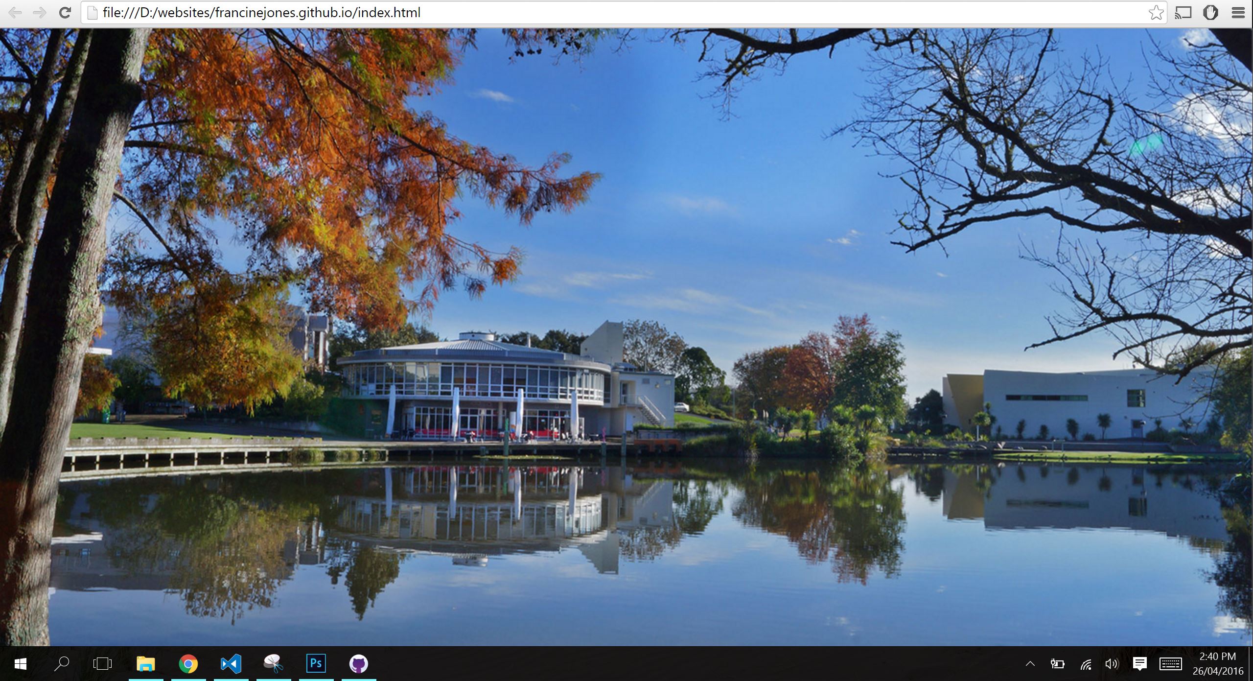
Desktop version:
Mobile version:

.background1
 {
 /* Location of the image */
 background-image: url(images/background-photo.jpg);

 /* Image is centered vertically and horizontally at all times */
 background-position: center center;

 /* Image doesn't repeat */
 background-repeat: no-repeat;

 /* Makes the image fixed in the viewpoint so that it doesn't move when
 the content height is greater than the image height */
 background-attachment: fixed;

 /* This is what makes the background image
 rescale based on itscontainer's size */
 background-size: cover;

/* Pick a solid background color that will
be displayed while the background image is loading */
background-color:#464646;
}
Html is as follows
<head>
<script src="https:
//ajax.googleapis.com/ajax/libs/jquery/1.12.0/jquery.min.js"</script>
<script
src="https://cdn.jsdelivr.net/lodash/4.11.2/lodash.min.js"></script>
</head>
<meta charset="utf-8">
<title>Color</title>
<link rel="stylesheet" href="style.css">
<link href="animate.css" rel="stylesheet">
</header>

<body id="bodyID" class="background1">
</body>

<script src="javascript.js"></script>