How do I lower the opacity of text in div, like so:
How do I lower the opacity of text in div, like so:
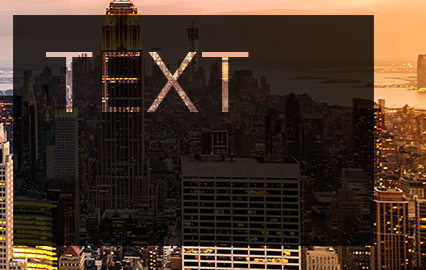
The CSS mix-blend-mode property will give you the effect you're looking for (it can't be achieved using only opacity). SVG is not required if you don't need Internet Explorer support. This solution is compatible with Chrome, Firefox, Safari, Opera, and others (see the compatibility table here).
Live Demo:
html, body {
  margin: 0;
}

.mix {
  position: absolute;
  top: 0;
  left: 0;
  width: 140px;
  height: 100px;
  font-size: 80px;
  color: white;
  padding: 20px;
  margin: 10px;
  background-color: black;
  mix-blend-mode: multiply;
  opacity: 0.8;
}
<img src="http://i.imgur.com/5LGqY2p.jpg?1">
<div class="mix">
Text
</div>
Add opacity for parent div and the text inside the div will also carry the opacity. In your example the parent container has background and then then another container inside it with the text with different color, different from div background.
.main {
  width: 350px;
  height: 250px;
  background-image: url(https://i.stack.imgur.com/GgQ5e.jpg);
}
.container {
  opacity: 0.5;
  background-color: black;
  width: 300px;
  height: 200px;
}
p {
  font-size: 100px;
  color: white;
  opacity: .3;
}
<div class="main">
<div class="container">
<p>
TEXT
</p>
</div>
</div>
This apparently can be done in css using text masking. (see https://css-tricks.com/how-to-do-knockout-text/) It is more cross-browser friendly to do it with SVG though.
<svg>
  <pattern id="pattern" patternUnits="userSpaceOnUse" width="750" height="800">
    <image width="750" height="800" xlink:href="image.jpg"></image>
  </pattern>
  <text x="0" y="80" class="headline" style="fill:url(#pattern);">background-clip: text | Polyfill</text>
</svg>
from the css-tricks website
What you're asking for doesn't seem possible with only opacity. By decreasing the opacity of the text, what ends up showing through is the parent element and whatever is behind the parent element depending on the parent opacity, and so on. However, you seem to want the full transparency to reach the parent of the parent while having the parent hold onto its own different opacity outside of the text.
For this, you'll need to use clip-path.
The best cross-browser support seems to be for SVG clip-path for SVG elements. But check out the CodePen/CSS-Tricks article for yourself to see other options you have for this effect.
Check out the code below:
.item--svg-clip-path-svg image {
  clip-path: url(#clipping);
}
.demo,
#clipping,
#masking text {
  font: bold italic 7em/1.5 Georgia;
}
/* Common
------------------------------------------- */

BODY {
  font: 12px/1.4"Trebuchet MS", Arial, sans-serif;
}
A {
  color: tomato;
}
H1,
H2,
H3,
H4 {
  margin-bottom: 1rem;
  font-family: Georgia, serif;
  line-height: 1.4;
}
H1 {
  position: relative;
  margin-bottom: 2rem;
  padding-bottom: 1rem;
  border-bottom: 1px solid #CCC;
  text-align: center;
  text-shadow: 1px 1px 0 white, 2px 2px 0 #555;
  font-size: 4em;
  font-style: italic;
}
H1:after {
  content: "Live demo";
  position: absolute;
  margin-left: 5px;
  padding: 1px 5px;
  vertical-align: top;
  border-radius: 5px;
  background: paleturquoise;
  white-space: nowrap;
  text-shadow: none;
  font-size: 1rem;
  color: #FFF;
}
H2 {
  padding-bottom: .3rem;
  border-bottom: 1px solid #333;
  font-size: 2.8em;
  color: #333;
}
H3 {
  text-shadow: 1px 1px 0 white, 2px 2px 0 #CCC;
  font-size: 2.5em;
  font-style: italic;
  color: #777;
}
H4 {
  font-size: 1.6em;
  font-style: italic;
  color: #999;
}
code {
  display: block;
  position: relative;
  margin-bottom: 1rem;
  overflow: auto;
  max-width: 90%;
  padding: 35px 10px 7px;
  border-radius: 5px;
}
.comment code {
  display: inline-block;
  margin: 0;
  padding: 2px 5px;
  vertical-align: middle;
  background: #EEE;
  color: #777;
}
code:before {
  left: 0;
  right: 0;
  top: 0;
  height: 25px;
  line-height: 25.2px;
  padding-left: 10px;
  position: absolute;
  font-weight: bold;
  font-style: italic;
}
.comment code:before {
  content: none;
}
.code--css {
  background: #f7edba;
}
.code--css:before {
  content: "CSS";
  background: #f2e18c;
  color: #8a750f;
}
.code--svg {
  background: #e6f4be;
}
.code--svg:before {
  content: "SVG";
  background: #d6ec93;
  color: #678217;
}
.svg-defs {
  position: absolute;
  width: 0;
  height: 0;
}
.wrapper {
  width: 90%;
  min-width: 500px;
  max-width: 800px;
  margin: 0 auto;
  padding: 2rem 0;
  conter-reset: mylist;
}
.wrapper:after {
  content: '';
  display: table;
  width: 100%;
  clear: both;
}
.item {
  position: relative;
  margin-bottom: 2em;
  padding-bottom: 2em;
  padding-right: 3em;
  border-bottom: 1px solid #DDD;
  counter-increment: mylist;
}
.item:before {
  content: counter(mylist);
  position: absolute;
  right: 0;
  top: 0;
  font: 2rem/1 Georgia, serif;
  color: #EEE;
}
.item:after {
  content: '';
  display: table;
  width: 100%;
}
.demo {
  position: relative;
  float: left;
  margin-right: 30px;
}
.demo:before {
  content: '';
  display: block;
  position: absolute;
  z-index: -2;
  top: 0;
  right: 0;
  bottom: 0;
  left: 0;
  background: url(http://img-fotki.yandex.ru/get/5607/5091629.6b/0_612e6_b9039c0d_M.jpg) no-repeat;
  opacity: 0;
  transition: .7s;
}
.item:hover .demo:before {
  opacity: .4;
}
.text {
  padding-left: 230px;
}
/* Browsers
------------------------------- */

.browsers {
  margin-top: 1.5rem;
}
.browser {
  display: inline-block;
  opacity: .2;
}
.has-support {
  opacity: 1;
}
.browser:before {
  content: "";
  display: inline-block;
  width: 24px;
  height: 24px;
  margin-right: 7px;
  background: url(http://yoksel.github.io/assets/img/sprite-browsers.png) 0 0 no-repeat;
  vertical-align: middle;
}
.firefox:before {
  background-position: 0 0;
}
.chrome:before {
  background-position: -30px 0;
}
.safari:before {
  background-position: -60px 0;
}
.ie8:before {
  background-position: -90px 0;
}
.ie9:before {
  background-position: -90px 0;
}
.opera-13:before {
  background-position: -120px 0;
}
.opera-12:before {
  background-position: -150px 0;
}
.opera-mob:before {
  background-position: -150px 0;
}
.opera-mini:before {
  background-position: -150px 0;
}
<svg class="svg-defs">
<defs>
<clipPath id="clipping">
<polygon id="Star-1" points="98.4999978 153.75 38.2520165 185.424245 49.7583542 118.337123 1.01670635 70.8257603 68.3760155 61.037872 98.5000012 1.1379786e-14 128.624005 61.0378871 195.98331 70.8258091 147.241642 118.337136 158.747982 185.424247" />
<text x="0" y="3.2em">Text</text>
</clipPath>
<image xlink:href="http://img-fotki.yandex.ru/get/5607/5091629.6b/0_612e6_b9039c0d_M.jpg" width="200" height="300" />
</defs>
</svg>
<div class="item item--svg-clip-path-svg">
<div class="demo">
<svg width="200" height="300">
<image xlink:href="http://img-fotki.yandex.ru/get/5607/5091629.6b/0_612e6_b9039c0d_M.jpg" width="200" height="300" />
</svg>
</div>
<div class="text">
<h3>SVG clip-path for SVG elements</h3>
<a href="http://www.w3.org/TR/SVG11/masking.html#EstablishingANewClippingPath">Specification</a>
<br />
<br />
<code class="code--svg"><pre><clipPath id="clipping">
<polygon points="98.4999978 153.75..."/>
</clipPath></pre></code>
<code class="code--css"><pre>.item {
clip-path: url(#clipping);
}</pre></code>
<ul class="browsers">
<li class="browser chrome has-support"></li>
<li class="browser safari has-support"></li>
<li class="browser opera-13 has-support"></li>
<li class="browser firefox has-support"></li>
<li class="browser ie9 has-support"></li>
<li class="browser opera-12 has-support"></li>
</ul>
</div>
</div>Reference: css-tricks