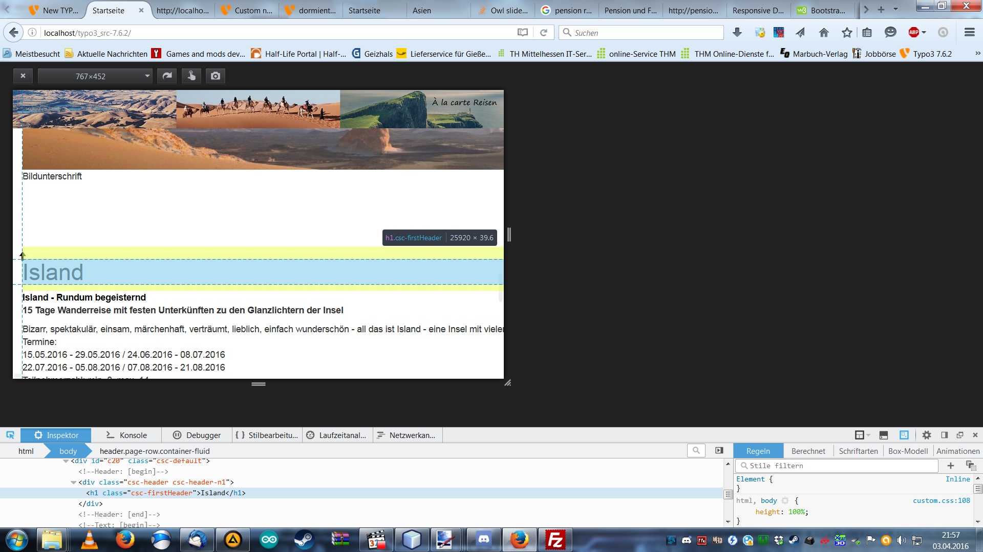
i´m in trouble with getting the owl_slider extension (2.3.3 via TER on typo3 7.6.2) to work properly. I managed to get the slider working but when i change the browser width below 768 pixel my header and footer images are displayed way too big and the content (slider,text, etc.) does not fit into the content area any more (bootstrap container). When i dont have a slider on the page, resizing works without trouble.
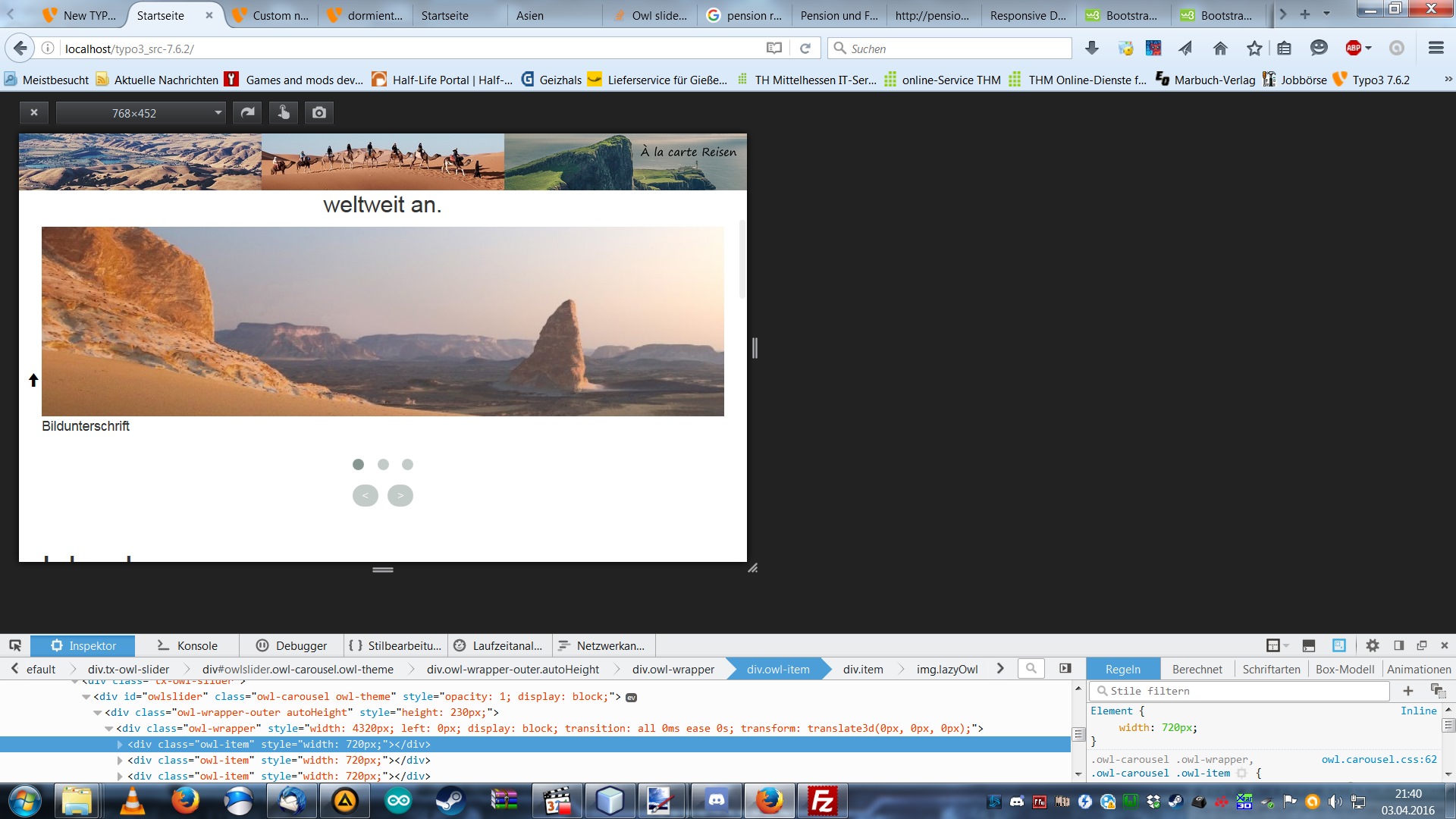
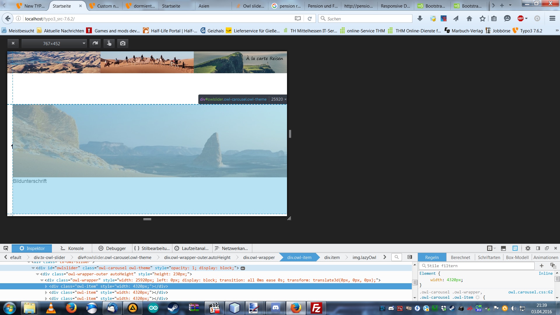
When i inspect the owl slider items i can see the width changing with my browser width, below 768 it calculates strange values (screenies attached, which should be the reason for not displaying properly). Any ideas ?
Edit: Just tried a template only with {content}, the slider had no function, then i put it inside a container and it worked. Why this behaviour ?
template:
<header class="page-row container-fluid">
<div style="position:fixed;top:0px;z-index:20;" >
<img class="img-responsive" src="fileadmin/user_upload/slider_top_text.png" width="100%"/>
</div>
<img src="fileadmin/user_upload/slider_top_text.png" width="100%" />
</header>
<main class="page-row page-row-expanded" >
<div class="container" style="margin-top:8px;">
<div >
<div style="float:left;">
<f:cObject typoscriptObjectPath="lib.breadcrumb" />
</div>
<div style="float:right;">
<f:format.raw>{PRINTVIEW}</f:format.raw>
</div>
</div>
<div style="clear: both;padding-top:6px;"><f:format.raw>{content}</f:format.raw>
<div class="toTop">
<a href="#top"><span class="glyphicon glyphicon-arrow-up"></span></a>
</div>
<div class="toTop2" style="width:80px;height:100px;background-color: white;"></div>
</div>
</div><!-- /.container -->
</main>
<footer class="page-row footer container-fluid" >
<div class="footer-bg" style="">
<div class="container" >
<div class="row">
<div class="col-md-12">
<p style="">some text</br>
<a href="http://localhost/typo3_src-7.6.2/index.php?id=6">Impressum</a>  <a href="http://localhost/typo3_src-7.6.2/index.php?id=8">Sitemap</a>  <a href="http://localhost/typo3_src-7.6.2/index.php?id=7">AGB</a>
</p>
</div>
</div>
</div>
</div>
</footer>
css
body {
  display: table;
  margin:0;
  padding:0;
  width: 100%;
}

.page-row {
  display: table-row;
}

.page-row-expanded {
    height: 100%;
}

.footer p {
    margin-top: 20px;
    text-align:center;
}

.footer-bg{
    background-image:linear-gradient(180deg, white 10%,transparent 15%),url(http://localhost/typo3_src-7.6.2/fileadmin/user_upload/sand-181273_1920.jpg);
    background-size:100%;
    background-position: center;
    background-repeat:no-repeat;
}

tr{
  vertical-align: top;
  border-top:1px solid;
}

.toTop {
    z-index: -1;
    position: fixed;
    bottom: 40%; left: 1%;
}

.toTop2 {
    z-index: -1;
    position: absolute;
    bottom: 40%; left: 1%;
}

html, body{
  height:100%; /* needed for container min-height */
}

th, td, caption{
  padding: 8px;
}

table{
  width:100%;
}


.element2cols { overflow:hidden;}
.col1, .col2 { width:48%; float:left; }
.col1 { margin-right:2%; }
.col2 { margin-left: 2%; }
typoscript
page = PAGE
page {
    config {
            metaCharset = utf-8
            additionalHeaders = Content-Type:text/html;charset=utf-8
            index_enable = 1
    }

/* Bootstrap 3 automatic responsive, do i need it ?
        meta{
            name = viewport
            content = width=device-width, initial-scale=1.0
        }
*/

    includeCSS.bootstrap = EXT:spif_distribution/Resources/Public/Bootstrap/css/bootstrap.min.css
    includeCSS.bootstratheme = EXT:spif_distribution/Resources/Public/Bootstrap/css/bootstrap-theme.min.css
    includeCSS.bootstrapcustom = EXT:spif_distribution/Resources/Public/Css/custom.css

    includeJS.bootstrap = EXT:spif_distribution/Resources/Public/Bootstrap/js/bootstrap.min.js

    10 = FLUIDTEMPLATE
    10 {
            file = EXT:spif_distribution/Resources/Private/Template/index.html
            layoutRootPath = EXT:spif_distribution/Resources/Private/Layouts/
            partialRootPath = EXT:spif_distribution/Resources/Private/Partials/
            variables {
                    hallo = TEXT
                    hallo.value = HALLO WELT!
                    content < styles.content.get

                    PRINTVIEW = TEXT
                    PRINTVIEW {
                        value = Druckansicht
                        typolink.parameter.data = page:uid
                        typolink.additionalParams.insertData=1
                        typolink.additionalParams =&type=10

                    }
            }
    }
}
pics