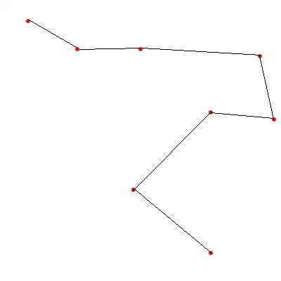
So I'm working on a project that requires me to graph the cummulative amount of days a certain record has spent in each of it's life cycle stages. The tricky part is, the relationship between parent and child records cause the data to branch out like a tree as one moves through the process. I'm trying to figure out the best chart type to visualize this data. Currently I have the parent and child records in separate charts, both stacked bar charts. Is there a way to make a chart that works like a stacked bar chart for it's pieces but grows like a tree as a whole? See diagrams below. In a sense, it is a an overly complicated Gantt Chart where each record is a sub-project.
Asked
Active
Viewed 125 times
0
-
What have you tried? do you have a JS library to do this? which one? or are you creating this from scratch? – Urielzen Feb 11 '16 at 20:56
-
My current version is actually built in Salesforce using their official visualforce charting components. However, their charting components do not allow for anything more complex than a stacked bar chart. For the next version of this, I'm implementing it as an AngularJs application. I haven't started rebuilding the charting components and figured I'd get some ideas for a better chart before starting. I saw some tree charts in D3 but it looks like those only show relationships and not the stacked days component that I'll need. – Andrew Bettke Feb 11 '16 at 21:00
-
I see, I know sometimes its difficult to find something that fits exactly to your needs. You may have to be a pioneer on this one and create it yourself. – Urielzen Feb 11 '16 at 21:11
-
I best go grab my Christopher Columbus hat then. Figured I ask and see if anyone had any crazy new ideas first – Andrew Bettke Feb 11 '16 at 21:34

