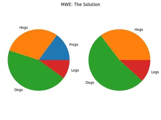
I'm trying to create pie charts with matplotlib in which the colour of each category is fixed.
I've got a function which creates a pie chart from sets of value and category data. Here's one example:
Category     Value
TI           65
Con          43
FR           40
TraI         40
Bug          38
Data         22
Int          15
KB           12
Other        8
Dep          7
PW           6
Uns          5
Perf         4
Dep          3
The problem is that the data differs from one instance to another, and that in turn changes the order of the categories. Thus, each category gets labelled a different colour each time I generate a chart. I could sort the data alphabetically every time, but that causes two problems: some categories are missing from some datasets, and I'd prefer it sorted by size anyway so that the smallest wedges are oriented horizontally.
How can I set matplotlib to assign colours depending on, say, the index of a pandas.Series?
Here's the code that I'm using to generate a pie chart:
import matplotlib.pyplot as plt

slices = [62, 39, 39, 38, 37, 21, 15,  9,  6,  7,  6,  5,  4, 3]

cmap = plt.cm.prism
colors = cmap(np.linspace(0., 1., len(slices)))

labels = [u'TI', u'Con', u'FR', u'TraI', u'Bug', u'Data', u'Int', u'KB', u'Other', u'Dep', u'PW', u'Uns', u'Perf', u'Dep']

fig = plt.figure(figsize=[10, 10])
ax = fig.add_subplot(111)

pie_wedge_collection = ax.pie(slices, colors=colors, labels=labels, labeldistance=1.05, autopct=make_autopct(slices))

for pie_wedge in pie_wedge_collection[0]:
    pie_wedge.set_edgecolor('white')

titlestring = 'Issues'

ax.set_title(titlestring)
EDIT: I forgot to explain the autopct function, it's for adding value and percentage labels:
def make_autopct(values):
    def my_autopct(pct):
        total = sum(values)
        val = int(round(pct*total/100.0))
        return '{p:.2f}%  ({v:d})'.format(p=pct,v=val)
    return my_autopct

