Background
In general, I'd advise, just using the ContentDisplay on buttons and having the button manage the layout of items inside the button on your behalf. But that approach will not work for your particular use-case.
Sample Solution
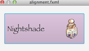
Put both the text and the image in the graphic inside your own layout manager (for example an HBox). This way you have the flexibility to apply a custom layout to the button, allowing you to situate the text and image exactly as you wish.
In the sample solution I add a Pane between the text and the graphic with a hgrow constraint of always, so that the pane will act as an expandable invisible spacer between the the text and the image, pushing them as far apart from each other horizontally as is possible (within the constraints of the overall button size).
<?xml version="1.0" encoding="UTF-8"?>

<?import javafx.scene.text.*?>
<?import javafx.scene.image.*?>
<?import javafx.scene.control.*?>
<?import java.lang.*?>
<?import javafx.scene.layout.*?>

<StackPane maxHeight="-Infinity" maxWidth="-Infinity" minHeight="-Infinity" minWidth="-Infinity" prefHeight="150.0" prefWidth="300.0" xmlns="http://javafx.com/javafx/8.0.40" xmlns:fx="http://javafx.com/fxml/1">
   <children>
      <Button contentDisplay="RIGHT" mnemonicParsing="false" prefHeight="98.0" prefWidth="259.0" style="-fx-base: thistle;">
         <graphic>
            <HBox alignment="CENTER" maxHeight="1.7976931348623157E308" maxWidth="1.7976931348623157E308" mouseTransparent="true">
               <children>
                  <Label text="Nightshade">
                     <font>
                        <Font name="Papyrus" size="24.0" />
                     </font></Label>
                  <Pane HBox.hgrow="ALWAYS" />
                  <ImageView>
                     <image>
                        <Image url="@Potion-icon.png" />
                     </image>
                  </ImageView>
               </children>
            </HBox>
         </graphic>
      </Button>
   </children>
</StackPane>
