0

I have a macro which generates a Chart from a range of data. See data below:

2015/08/01 12:49.002

2015/08/01 00:41.600

2015/08/02 00:27.198

2015/08/03 01:05.600

2015/08/03 01:30.599

2015/08/04 02:29.799

2015/08/05 01:40.199

2015/08/06 01:36.199

2015/08/07 02:16.998

2015/08/07 00:43.401

The first Column represents the date and then second is a time frame from that date.

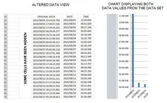
NOTE the original data i found in the sheet is cells which have been merged. See screen shot below for more info.

enter image description here

The problem is that the Chart only displays the greater number allocated for that date.

See code below.

Option Explicit
Public Declare Function GetTickCount Lib "kernel32.dll" () As Long

Sub CreateChart()

    Dim DateRange, TimeRange As Range
    Dim lastRow As Long
    Dim StartRow As Long, columnIndex As Long
    Dim DataWorkSheet As Worksheet
    Dim DataFileFullPath As String, DataFileName As String, SheetName As String
    Dim Index As Long, Index2 As Long
    Dim t As Long
    Dim tt As Long
    Dim Chart1 As Chart


'    'Disable Screen Updating
'    Application.ScreenUpdating = False
'    Application.Calculation = xlCalculationManual


    StartRow = 20
    columnIndex = 3

    'Put Full File Path for your demo/test file here
    DataFileFullPath = "C:\Users\................."

    Index = InStrRev(DataFileFullPath, "\")
    DataFileName = Right(DataFileFullPath, Len(DataFileFullPath) - Index)

    Index2 = InStrRev(DataFileName, ".")
    SheetName = Left(DataFileName, Index2 - 1)

    Set DataWorkSheet = Workbooks(DataFileName).Sheets(SheetName)


    t = GetTickCount

    With DataWorkSheet

        With .UsedRange
            'Getting the last Row
            lastRow = .Rows(.Rows.Count).row - 1
        End With

        'The DataStartRow is set to the ORiginal Time from the T3000
        Set DateRange = .Range(.Cells(StartRow, columnIndex + 1), .Cells(lastRow, columnIndex + 1))
        Set TimeRange = .Range(.Cells(StartRow, columnIndex + 2), .Cells(lastRow, columnIndex + 2))

    End With

    Set Chart1 = Charts.Add

    With Chart1

        .ChartType = xlColumnClustered
        .SeriesCollection.NewSeries

        With .SeriesCollection(1)
            .Values = TimeRange
            .Name = SheetName & " " & "Synch Time"
            .XValues = DateRange
        End With

        .Name = SheetName & " " & "Synch Time Chart"
        .Axes(xlValue).MaximumScale = 0.0104166667 ' 15 mins / 50 / 24
        .Axes(xlValue).MajorUnit = 0.0006944444 ' 1 mins /60 / 24
        .Move After:=Sheets(2)

    End With
    tt = GetTickCount - t
'    'Enable Screen Updating
'    Application.ScreenUpdating = True
'    Application.Calculation = xlCalculationAutomatic
End Sub

Is there an element of Chart1that I need to include to not omit a second data value from a specific date?

Jean-Pierre Oosthuizen
  • 2,653
  • 2
  • 10
  • 34

2 Answers2

1

If you want to repeat the day on the X axis, you need to add:

.Axes(xlCategory).CategoryType = xlCategoryScale
Rory
  • 32,730
  • 5
  • 32
  • 35
  • Thanks for that. What I forgot to mention is that the original data set is merged so for the first 2015/08/01 it is actually taking 8 Cells. Which you answer then make 8 individual entries. I did forget to mention the merge in the Question. I will add it now – Jean-Pierre Oosthuizen Jan 13 '16 at 12:56
  • what I found is that if I Hide all the rows, except the first row, of a specific day (say 2015/08/91) the Chart will then only display the data from the rows which are not hidden on the Sheet. – Jean-Pierre Oosthuizen Jan 13 '16 at 13:08
  • How do you expect them to be displayed if not adjacent to each other? If you want them added up, you need a pivot chart not a regular chart. – Rory Jan 13 '16 at 13:34
  • What I want is for there to be data in the chart for every Value in the time column with its asociated date reference. Regardless if there is two values on the same day. Not sure how pivot charts work, but definitely don't want to tally the times up – Jean-Pierre Oosthuizen Jan 13 '16 at 13:40
  • Then I suggest you don't use a column chart since a larger value ocurring after a smaller one for the same day will naturally obscure it from view. Otherwise you'll have to use a combination of transparent fill and varying colours by point. – Rory Jan 13 '16 at 13:48
0

Using the answer from @Rory I saw that all the rows were displayed.

After doing some searching I saw that in the Chart, by default, only the data in displayed cells(ie not hidden) will be visible in the Chart.

I then just incorporated a Range(Rows(x), Rows(y)).Hidden = True into the script which gave me the Merged Cells for a specific time period.

Image below represents the final product.

enter image description here

You can see the dual entries for 2015/08/01 in the Chart

The .Axes(xlCategory).CategoryType = xlCategoryScale basically set the Hosrizontal Axis Type to "Text axis" as referred to in the Excel Pop up Menu when right clicking the axis

Any other suggestions as to using a different type of Chart as Rory mentioned in his answer is welcomed.

Will leave this Question unanswered for the time being.

Jean-Pierre Oosthuizen
  • 2,653
  • 2
  • 10
  • 34