I'm trying to create Tabbed Contents with some border and shadows.
This is slightly different from on questions in that I'm trying to create shadows. Additionally, the whole area of the tab should be clickable. Basically a complex div inside an anchor tag in a li
Attempt 1 Used a square box and rotated it with two border widths visible.
What I have now:

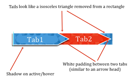
What I am wishing to obtain when a tab is opened/active (using CSS only):

Attempt 2 Used a right pointing triangle after every li element. Positioned it just before next li element Failed at the white padding in between (that could be fixed with margin between two li) but could not find a possible solution for shadow.
Attempt 3 Positioned colored right pointed triangle after an element Positioned white triangle behind it and :before the next li element. Shadows scared me this time.
So basically the problems are the tail of next li element and the shadow of the chevron of current element.
Demo of Attempt in Stack Snippets
.my-tabs {
  width: 100%;
  margin: 10px 0 !important;
  display: flex;
  overflow: hidden;
  position: relative;
  z-index: 100;
  padding-top: 10px;
}

.my-tabs li a {
  padding: 15px 20px 15px 50px;
  background: #ff5050;
  display: block;
  height: 56px;
}

.my-tabs li {
  display: block;
  width: 20%;
  font-size: 1.1em;
  margin: 0;
}

.my-tabs li:last-child:after {
  border-top: 28px solid #fff;
  border-left: 28px solid transparent;
  margin-right: 0;
  border-style: solid;
  border-right: 0;
  border-bottom: 28px solid #fff;
  content: '';
  height: 0;
  float: right;
  margin-top: -56px;
  transform: none;
  width: 0;
}

.my-tabs:after {
  border-left: 40px solid #ff5050 !important;
  margin-top: 1px;
  margin-left: -2px;
}

.my-tabs li:after {
  margin-right: -7px;
  border-style: solid;
  border-width: 4px 4px 0 0;
  border-color: white;
  content: '';
  height: 43px;
  float: right;
  margin-top: -43px;
  transform-origin: center top;
  transform: rotate(45deg);
  width: 43px;
}

.my-tabs li.active:after {
  -webkit-box-shadow: 8px 0px 4px -3px #090A09;
     -moz-box-shadow: 8px 0px 4px -3px #090A09;
       -o-box-shadow: 8px 0px 4px -3px #090A09;
          box-shadow: 8px 0px 4px -3px #090A09;
}

.my-tabs li.active {
  border-bottom: 8px solid white;
}

.my-tabs li.active a {
  -webkit-box-shadow: 0px 8px 4px -3px #090A09;
     -moz-box-shadow: 0px 8px 4px -3px #090A09;
       -o-box-shadow: 0px 8px 4px -3px #090A09;
          box-shadow: 0px 8px 4px -3px #090A09;
}
<ul class="my-tabs">
<li id="gtab0" class=""><a href="javascript:void(0)">tab1</a></li>
<li id="gtab1" class=""><a href="javascript:void(0)">tab2</a></li>
<li id="gtab2" class="active"><a href="javascript:void(0)">tab3'</a></li>
<li id="gtab3" class=""><a href="javascript:void(0)">tab4</a></li>
<li id="gtab4" class=""><a href="javascript:void(0)">tab5</a></li>
</ul>