What I'm doing and have spent many hours attempting today is add a class to an element when the window is resized using the value of the viewport.
Basically, I want to add the class as the viewport value in <html> on page load, then change that class as it is resized.
- Page load - add value of viewport as a class to
<html> - Window resize - change the class added to
<html>as the viewport value
Right now I have the first part down and I have the second almost there. It will add the viewport value as a class, then when resized add the new value - but it is just adding never ending new classes and not swapping them out.
Modified code
omitted var $html = $("html");
    if(typeof window.innerWidth!='undefined'){
        viewportwidth=window.innerWidth
    }

    jQuery(window).resize(function(){

        var viewportwidth;

            if(typeof window.innerWidth!='undefined'){
                viewportwidth=window.innerWidth;
            }

        jQuery("html").toggleClass(""+viewportwidth);

    });

    jQuery("html").addClass(""+viewportwidth);
I'm not very experienced with jQuery and JS...
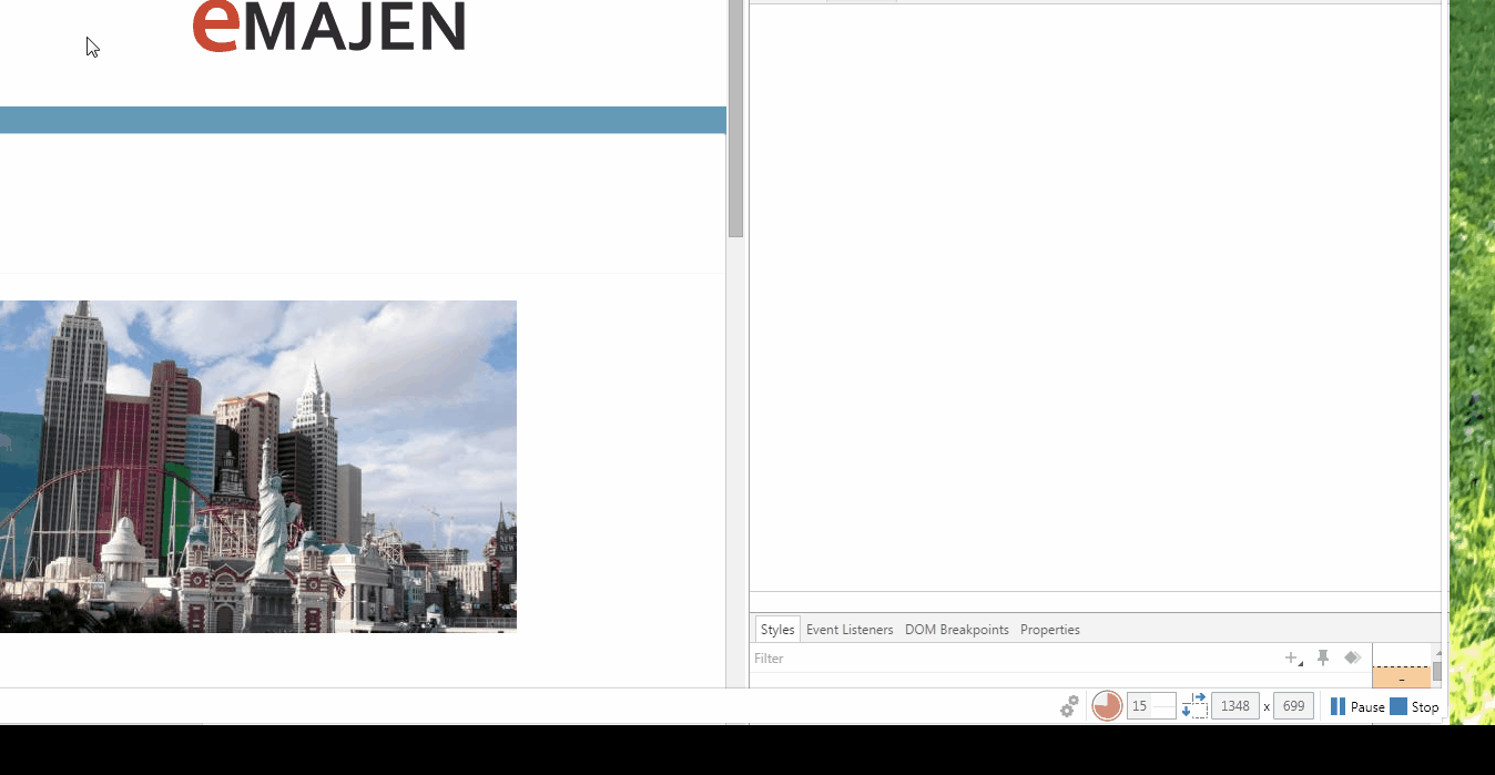
Example - http://sandbox.iemajen.com/
Thanks.
Your question has been identified as a possible duplicate of another question.
Let me try to explain more clearly. I would like to have the current value of window.innerWidth returned as the only class. That is, when the window is resized, the class cycles to the next value replacing the former.