17

I want to change indicator of tablayout from bottom to top.

my code

activity_tab.xml

<android.support.design.widget.AppBarLayout
    android:layout_width="match_parent"
    android:layout_height="wrap_content"

    android:theme="@style/ThemeOverlay.AppCompat.Dark.ActionBar">

    <android.support.v7.widget.Toolbar
        android:id="@+id/toolbar"
        android:layout_width="match_parent"
        android:layout_height="?attr/actionBarSize"
        android:background="?attr/colorPrimary"

        app:layout_scrollFlags="scroll|enterAlways"
        app:popupTheme="@style/ThemeOverlay.AppCompat.Light" />

    <android.support.design.widget.TabLayout
        android:id="@+id/tabs"
        android:layout_width="match_parent"
        android:layout_height="wrap_content"

        app:tabIndicatorColor="#000000"

        app:tabMode="scrollable"
        />
</android.support.design.widget.AppBarLayout>

<android.support.v4.view.ViewPager
    android:id="@+id/viewpager"
    android:layout_width="match_parent"
    android:layout_height="match_parent"
    app:layout_behavior="@string/appbar_scrolling_view_behavior" />

I want this result.

enter image description here

how to do

thx for ask me and sorry for bad english.

Shabbir Dhangot
  • 8,954
  • 10
  • 58
  • 80

9 Answers9

36

Don't use scale = -1 and things like that.

From XML you can use app:tabIndicatorGravity="top"

From code you can use setSelectedTabIndicatorGravity(INDICATOR_GRAVITY_TOP)

  • 3
    underrated, probably because it has been added recently to the standard library, but that's definitely the way to go, thanks for sharing! – Simon Ninon Nov 13 '18 at 23:18
13

It can be done by xml attribute, use android:scaleY="-1" in xml code. The view will flip vertically. Use the same method to correct the text and image used in tab title.

In xml file:

<android.support.design.widget.TabLayout
    android:id="@+id/tabLayout"
    android:layout_width="match_parent"
    android:layout_height="wrap_content"
    android:background="?attr/colorPrimary"
    android:minHeight="?attr/actionBarSize"
    android:scaleY="-1"
    android:theme="@style/ThemeOverlay.AppCompat.Dark.ActionBar"/>

In Java code

tabLayout = (TabLayout) findViewById(R.id.tabLayout);

// Adding the tabs using addTab() method
tabLayout.addTab(tabLayout.newTab().setText("Section 1"));
tabLayout.addTab(tabLayout.newTab().setText("Section 2"));
tabLayout.addTab(tabLayout.newTab().setText("Section 3"));
tabLayout.setTabGravity(TabLayout.GRAVITY_FILL);

TextView tv1 = (TextView)(((LinearLayout)((LinearLayout)tabLayout.getChildAt(0)).getChildAt(0)).getChildAt(1));
tv1.setScaleY(-1);
TextView tv2 = (TextView)(((LinearLayout)((LinearLayout)tabLayout.getChildAt(0)).getChildAt(1)).getChildAt(1));
tv2.setScaleY(-1);
TextView tv3 = (TextView)(((LinearLayout)((LinearLayout)tabLayout.getChildAt(0)).getChildAt(2)).getChildAt(1));
tv3.setScaleY(-1);

Sample screenshot

5

You can achieve this by rotating the TabLayout like this:

tabLayout.setRotationX(180);

Then you must rotate all of its TextView children back, or you can set the TabLayout a custom view, instead of recursively searching for a TextView:

TabLayout.Tab tab = tabLayout.getTabAt(i);
tab.setCustomView(R.layout.layout_tab_view);

layout_tab_view.xml

    <TextView
        android:layout_width="wrap_content"
        android:layout_height="wrap_content"
        android:rotationX="180"
        android:text="HOME"/>

I guess you loose some default functionality if you set a custom view, such as Fragment title naming from PagerAdapter and TextView disabled appearance, but you can bind that somehow together in another way.

enter image description here

box
  • 4,450
  • 2
  • 38
  • 38
4

Unfortunately you cannot do it by setting an attribute or setting it in code. TabLayout has a property mTabStrip of SlidingTabStrip (internal class), which is set as private final

private final SlidingTabStrip mTabStrip;

, so you cannot access it, by extending TabLayout.

So SlidingTabStrip (which extends LinearLayoyut)is a view which overrides draw method

@Override
    public void draw(Canvas canvas) {
        super.draw(canvas);
        // Thick colored underline below the current selection
        if (mIndicatorLeft >= 0 && mIndicatorRight > mIndicatorLeft) {
            canvas.drawRect(mIndicatorLeft, getHeight() - mSelectedIndicatorHeight,
                    mIndicatorRight, getHeight(), mSelectedIndicatorPaint);
        }
    }

So you can see that it draws the rectangle with a top and bottom properties.

May be in future they will have a flag to change it.

Damir Mailybayev
  • 1,031
  • 1
  • 9
  • 14
2

I have a different approach for doing that..

  1. Set the tab indicator color same as the background color of the tab layout (So that you will not see the tab indicator at bottom)

  2. Add a linear layout (horizontal) just above the tab layout containing views (same number as equal to number of tabs).

<LinearLayout android:layout_width="match_parent" android:layout_height="5dp" android:orientation="horizontal" android:background="@color/tab_bg" android:weightSum="3">

<View
    android:id="@+id/view1"
    android:layout_width="0dp"
    android:layout_height="match_parent"
    android:layout_weight="1"
    android:elevation="10dp"
    android:background="@drawable/selector_tab_indicator_white"/>

<View
    android:id="@+id/view2"
    android:layout_width="0dp"
    android:layout_height="match_parent"
    android:layout_weight="1"
    android:elevation="10dp"
    android:background="@drawable/selector_tab_indicator_blue"/>

<View
    android:id="@+id/view3"
    android:layout_width="0dp"
    android:layout_height="match_parent"
    android:layout_weight="1"
    android:elevation="10dp"
    android:background="@drawable/selector_tab_indicator_blue"/>

</LinearLayout>

  1. Now just programmatically adjust the view backgrounds.

    viewPager.addOnPageChangeListener(new ViewPager.OnPageChangeListener() { @Override public void onPageScrolled(int position, float positionOffset, int positionOffsetPixels) {

    }
    
    @Override
    public void onPageSelected(int position) {
        setTitle(getPageTitle(position));
    
        switch(position){
    
            case 0:
                view1.setBackgroundResource( R.drawable.selector_tab_indicator_white );
                view2.setBackgroundResource( R.drawable.selector_tab_indicator_blue );
                view3.setBackgroundResource( R.drawable.selector_tab_indicator_blue );
                break;
    
            case 1:
                view1.setBackgroundResource( R.drawable.selector_tab_indicator_blue );
                view2.setBackgroundResource( R.drawable.selector_tab_indicator_white );
                view3.setBackgroundResource( R.drawable.selector_tab_indicator_blue );
                break;
    
            case 2:
                view1.setBackgroundResource( R.drawable.selector_tab_indicator_blue );
                view2.setBackgroundResource( R.drawable.selector_tab_indicator_blue );
                view3.setBackgroundResource( R.drawable.selector_tab_indicator_white );
                break;
    
            default:
                view1.setBackgroundResource( R.drawable.selector_tab_indicator_white );
                view2.setBackgroundResource( R.drawable.selector_tab_indicator_blue );
                view3.setBackgroundResource( R.drawable.selector_tab_indicator_blue );
                break;
        }
    }
    
    @Override
    public void onPageScrollStateChanged(int state) {
    
    }
    

    });

Use these selectors for customising the views

selector_tab_indicator_white.xml

<shape xmlns:android="http://schemas.android.com/apk/res/android"
   android:shape="rectangle">
<corners
    android:radius="50dp"/>
<stroke
    android:width="1dp"
    android:color="#c4c0c0" />
<solid
    android:color="#fafafa" />

selector_tab_indicator_blue.xml

<shape xmlns:android="http://schemas.android.com/apk/res/android"
   android:shape="rectangle">
<corners
    android:radius="0dp"/>
<stroke
    android:width="1dp"
    android:color="@color/tab_bg" />
<solid
    android:color="@color/tab_bg" />

The Result: enter image description here

Nayan
  • 367
  • 4
  • 18
2

You only need those lines

tabLayout.setRotationX(180);

    tabListed = ((LinearLayout)tabLayout.getChildAt(0));
    for(int position = 0;position<tabListed.getChildCount();position++) {
        LinearLayout item=((LinearLayout) tabListed.getChildAt(position));
        item.setBackground(getDrawable(R.drawable.square_tab));
        item.setRotationX(180);
    }

First tab rotation turn tab layout 180º then you will get all tabs and them turn it 180º. So they be good again.

enter image description here

1

It can't be done by xml attribute, but can be done via setting image in background of tab with filled colour at top and transparent at bottom.

 <android.support.design.widget.TabLayout
          ...
            app:tabBackground="@drawable/bg_tab"
            ...
 /> 

bg_tab.xml

<?xml version="1.0" encoding="utf-8"?>
<selector xmlns:android="http://schemas.android.com/apk/res/android">
    <item android:drawable="@drawable/cap" android:state_selected="true" />
</selector>

cap.png

enter image description here

transparent at bottom

kartikag01
  • 1,539
  • 1
  • 18
  • 36
1

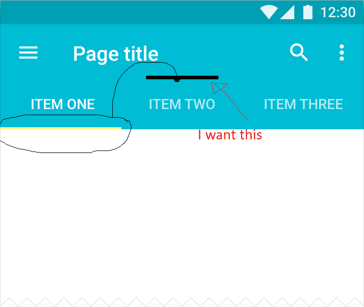
I know this question was asked 2 years ago, but I didn't find any simple solution without using any library (smartTabLayout doesn't have SelectedTextColour property).

invert your tabLayout to get the indicator at the top
android:rotationX="180"
now this will cause the text in that tab to be inverted as well, so to counter that
we'll have to create custom Tab view. Make an xml file eg: layout_custom_tab

<TextView
xmlns:android="http://schemas.android.com/apk/res/android"
xmlns:app="http://schemas.android.com/apk/res-auto"
android:id="@+id/tab.text"
android:layout_width="wrap_content"
android:layout_height="wrap_content"
android:gravity="center"
android:maxLines="1"
android:padding="10dp"
android:rotationX="180"
android:textAllCaps="true"
android:textSize="12sp"
android:textColor="@color/white"
/>

Note: you don't need RelativeLayout or anyting else when there is just one element

create your own TabLayout and set the customView to it.

public class TabLayoutPlus extends TabLayout {

public TabLayoutPlus(Context context) {
    super(context);
}

public TabLayoutPlus(Context context, AttributeSet attrs) {
    super(context, attrs);
}

public TabLayoutPlus(Context context, AttributeSet attrs, int defStyleAttr) {
    super(context, attrs, defStyleAttr);
}

@Override
public void setupWithViewPager(ViewPager viewPager) {
    super.setupWithViewPager(viewPager);
    this.removeAllTabs();

    PagerAdapter adapter = viewPager.getAdapter();

    for (int i = 0, count = adapter.getCount(); i < count; i++) {
        Tab tab = this.newTab();
        View customView = LayoutInflater.from(getContext()).inflate(R.layout.layout_custom_tab, null);
        TextViewPlus tv = (TextViewPlus) customView.findViewById(R.id.tab_text);
        tv.setText(adapter.getPageTitle(i));
        tab.setCustomView(customView);
        this.addTab(tab.setText(adapter.getPageTitle(i)));
    }
 }    
}

your TabLayout in your activity will look like this

<TabLayoutPlus
    android:id="@+id/tablayout"
    android:layout_width="match_parent"
    android:layout_height="36dp"
    android:layout_above="@+id/camera.buttons.layout"
    android:layout_centerHorizontal="true"
    android:background="@color/cardscan.background"
    android:rotationX="180"
    app:tabGravity="center"
    app:tabIndicatorColor="@color/colorPrimary"
    app:tabMode="fixed"
    app:tabSelectedTextColor="@color/colorPrimary"
    app:tabTextColor="@color/white"
    />

if you need to highlight Selected tab text colour

private void setSelectedTab(TabLayoutPlus.Tab tab) {
    View view = tab.getCustomView();
    TextViewPlus tabtext = (TextViewPlus) view.findViewById(R.id.tab_text);
    tabtext.setTextColor(ContextCompat.getColor(this, R.color.colorPrimary)); // color you want to highlight your text with
}

private void setUnselectedTab(TabLayoutPlus.Tab tab){
    View view = tab.getCustomView();
    TextViewPlus tabtext = (TextViewPlus) view.findViewById(R.id.tab_text);
    tabtext.setTextColor(ContextCompat.getColor(this, R.color.white)); // color you want to lowlight your text with
}

Now just add OnTabSelectedListener

tabLayout.addOnTabSelectedListener(new TabLayout.OnTabSelectedListener() {
        @Override
        public void onTabSelected(TabLayout.Tab tab) {
            setSelectedTab(tab);
        }

        @Override
        public void onTabUnselected(TabLayout.Tab tab) {
            setUnselectedTab(tab);
        }

        @Override
        public void onTabReselected(TabLayout.Tab tab) {
            setSelectedTab(tab);
        }
    });
Akshay More
  • 416
  • 4
  • 9
0

I solved using this method

set scaleY="-1" , this will rotate TabLayout to 180 degrees, as a result tab layout rotated reverse with text and rotate your TextView to Horizontally to 180 degrees, that will solve the problem, see the code below

  1. activity.xml

     <RelativeLayout xmlns:android="http://schemas.android.com/apk/res/android"
        xmlns:app="http://schemas.android.com/apk/res-auto"
        android:layout_width="match_parent"
        android:layout_height="match_parent">
    
    
        <RelativeLayout
            android:layout_width="match_parent"
            android:layout_height="match_parent">
    
    
            <android.support.v4.view.ViewPager
                android:id="@+id/viewpager_exp"
                android:layout_above="@+id/tabs_RL"
                android:layout_width="match_parent"
                android:layout_height="match_parent"
                app:layout_behavior="@string/appbar_scrolling_view_behavior" />


            <RelativeLayout
                android:id="@+id/tabs_RL"
                android:layout_alignParentBottom="true"
                android:layout_width="match_parent"
                android:layout_height="@dimen/footer_height">
    
    
                <android.support.design.widget.TabLayout
                    android:id="@+id/tabs"
                    android:layout_width="match_parent"
                    android:layout_height="@dimen/dimen_60"
                    android:background="@color/white"
                    android:clipToPadding="false"
                    android:paddingLeft="0dp"
                    android:paddingRight="0dp"
                    android:scaleY="-1"
                    app:layout_scrollFlags="snap|enterAlways"
                    app:tabGravity="fill"
                    app:tabMaxWidth="0dp"
                    app:tabIndicatorHeight="4dp"
                    app:tabIndicatorColor="@color/dark_pink1"
                    app:tabMinWidth="50dp"
                    app:tabPaddingEnd="0dp"
                    app:tabPaddingStart="0dp"
                    app:tabMode="fixed" />
    
            </RelativeLayout>
        </RelativeLayout>
    
    </RelativeLayout>
    
  2. custom_tab.xml

    <customviews.CusMediumTextView xmlns:android="http://schemas.android.com/apk/res/android"
    android:id="@+id/tab"
    android:layout_width="wrap_content"
    android:layout_height="wrap_content"
    android:gravity="center_horizontal"
    android:textColor="#000000"
    android:textSize="@dimen/dimen_12"
    android:rotationX="180"
    android:textStyle="bold" />
    
  3. MainActivity.class

        tabLayout.setupWithViewPager(viewPager);
    
        tabOne = (CusMediumTextView) LayoutInflater.from(this).inflate(R.layout.custom_tab, null);
        tabOne.setText("Tab1");
        tabOne.setTextColor(getResources().getColor(R.color.light_black));
        tabOne.setCompoundDrawablesWithIntrinsicBounds(0, R.drawable.home_icon, 0, 0);
    
    
        tabTwo = (CusMediumTextView) LayoutInflater.from(this).inflate(R.layout.custom_tab, null);
        tabTwo.setText("Tab2");
        tabTwo.setTextColor(getResources().getColor(R.color.light_black));
        tabTwo.setCompoundDrawablesWithIntrinsicBounds(0, R.drawable.settin_icon, 0, 0);
    
    
        tabThree = (CusMediumTextView) LayoutInflater.from(this).inflate(R.layout.custom_tab, null);
        tabThree.setText("Tab3");
        tabThree.setTextColor(getResources().getColor(R.color.light_black));
        tabThree.setCompoundDrawablesWithIntrinsicBounds( 0,R.drawable.delete_icon, 0, 0);
    
    
        tabFour = (CusMediumTextView) LayoutInflater.from(this).inflate(R.layout.custom_tab, null);
        tabFour.setText("Tab4");
        tabFour.setTextColor(getResources().getColor(R.color.light_black));
        tabFour.setCompoundDrawablesWithIntrinsicBounds( 0, R.drawable.msg_icon,0, 0);
    
        tabLayout.getTabAt(0).setCustomView(tabOne);
        tabLayout.getTabAt(1).setCustomView(tabTwo);
        tabLayout.getTabAt(2).setCustomView(tabThree);
        tabLayout.getTabAt(3).setCustomView(tabFour);
    
Ruan_Lopes
  • 1,381
  • 13
  • 18
Rishi
  • 153
  • 2
  • 15