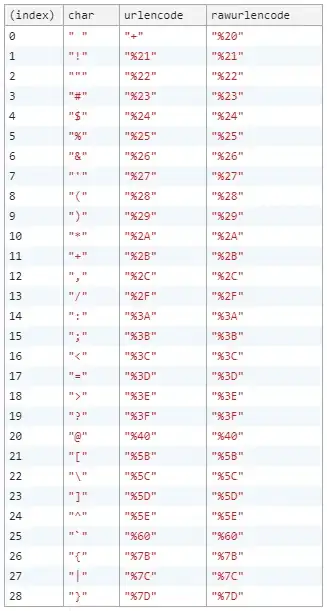
I was curious how Imgur was rendering their upvote/downvote arrows:

I assumed they were images, but I found something that I did not expect:
A custom font that contains glyphs for up and down arrows, mapped to the 'o' and 'x' characters, respectively:


Is this method considered acceptable these days? I have never considered using a custom font for something that doesn't semantically map into an alphabet. This approach is not even on my radar of best practices for web design.
I can imagine the reasons for:
- Your site uses a standard icon set that can be mapped to single-character codes.
- You only need control over foreground/background color for the icons.
- You want icons that scale the same as text.
I want to know any specific reasons against using this method.
In particular, I'm looking for answers that address any of the following:
- browser/platform compatibility
- future maintenance implications
- semantics
- performance
- standards compliance
The only thing I have come up with so far, is that, semantically, it does not make sense to map an upvote icon to the character 'o' and a downvote icon to the character 'x'. And, just to be specific, I'm not talking about keyboard mappings, but rather language mappings, character codes. It seems to me that raster images or SVG are much more preferable alternatives in this case.
I thought of one other possibility: language and encoding compatibility. Would the html lang attribute or character encoding of the page have any effect on the character mappings into the font in the CSS stylesheet (the stylesheet uses 'x' to represent a downvote icon)?
However, I'm certain Imgur has thought all of this through already. So, why am I wrong?