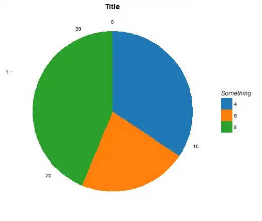
I'm generating a simple pie chart with use of the code below:
data(mtcars)
mtcars$fac_var <- as.factor(mtcars$cyl)
require(ggplot2); require(ggthemes)

# Chart
pie_test <- ggplot(mtcars, aes(x = factor(1), fill = fac_var)) +
  geom_bar(width = 1) +
  coord_polar(theta = "y") +
  ggtitle("Title") +
  theme_pander() +
  scale_fill_tableau(name = "Something") +
  theme(axis.title = element_blank())
The code produces the following chart:
I'm interested in introducing two minor modifications to the chart above:
- I would like to remove the figure 1 visible on the left (highlighted in red in the picture below).
- I would like to make the lines leading to to the figures more strongly pronounced (highlighted in black in the picture below).

