So I have a website that looks like this:
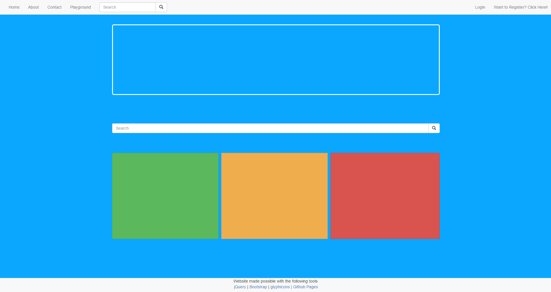
(I censored it a little, it's super secret)
Now in full screen on PC this looks just fine but watch what happens when I shrink it down to Mobile Size:
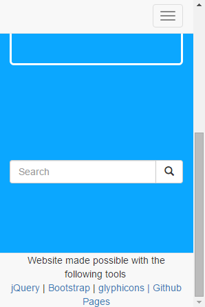
I can no longer reach the bottom and see the three buttons. After experimenting it appears that the buttons shrink down to a very small size and then the bottom navbar overlaps.
<div class="categories-container">
    <div class="container">
        <div class="h1" style="color: #ffffff;text-align: center;">Or Click One of these Core Categories!</div>
        <div class="btn-group btn-group-justified" role="group" aria-label="...">
            <div class="btn-group" role="group" style="padding-right: 10px">
                <button type="button" class="btn btn-success btn-bg" id="category-gameplay-btn"></button>
            </div>
            <div class="btn-group" role="group" style="padding-right: 10px">
                <button type="button" class="btn btn-warning btn-bg" id="category-editor-btn"></button>
            </div>
            <div class="btn-group" role="group">
                <button type="button" class="btn btn-danger btn-bg" id="category-engine-btn"></button>
            </div>
        </div>
    </div>
</div>
<div class="footer-container">
    <div class="navbar navbar-default navbar-fixed-bottom">
        <div class="container" style="text-align: center">
            <span>Website made possible with the following tools</span>
            <br>
            <span>
                <a href="http://https://jquery.com/">jQuery</a> | <a href="http://getbootstrap.com/">Bootstrap</a> | <a href="http://glyphicons.com/">glyphicons | <a href="https://pages.github.com/">Github Pages</a></a>
            </span>
        </div>
    </div>
</div>
This should be the code you need. If you require more let me know.
EDIT
CSS Below:
body {
    background-color: #0ba7ff;
}

.header-container .jumbotron {
    background-color: #0ba7ff;
    border-color: #ffffff;
    border-style: solid;
    color: #ffffff;
    text-align: center;
}

@media (max-width: 767px) {
    .jumbotron.jumbotronic {
        padding-left: 20px;
        padding-right: 20px;
    }
}

.categories-container .btn.btn-bg {
    height: 300px;
    font-size: 60px;
    white-space: normal;
}

@media (max-width: 767px) {
    .categories-container .btn.btn-bg {
        height: 150px;
        font-size: 30px;
    }
}
@media (max-width: 480px) {
    .categories-container .btn.btn-bg {
        height: 75px;
        font-size: 22px;
    }
}
@media (max-width: 360px) {
    .categories-container .btn.btn-bg {
        height: 35px;
        font-size: 15px;
    }
}

/* Base styles for the entire tooltip */
[data-tooltip]:before,
[data-tooltip]:after,
.tooltip:before,
.tooltip:after {
    position: absolute;
    visibility: hidden;
    -ms-filter: "progid:DXImageTransform.Microsoft.Alpha(Opacity=0)";
    filter: progid:DXImageTransform.Microsoft.Alpha(Opacity=0);
    opacity: 0;
    -webkit-transition:
    opacity 0.2s ease-in-out,
    visibility 0.2s ease-in-out,
    -webkit-transform 0.2s cubic-bezier(0.71, 1.7, 0.77, 1.24);
    -moz-transition:
    opacity 0.2s ease-in-out,
    visibility 0.2s ease-in-out,
    -moz-transform 0.2s cubic-bezier(0.71, 1.7, 0.77, 1.24);
    transition:
    opacity 0.2s ease-in-out,
    visibility 0.2s ease-in-out,
    transform 0.2s cubic-bezier(0.71, 1.7, 0.77, 1.24);
    -webkit-transform: translate3d(0, 0, 0);
    -moz-transform:    translate3d(0, 0, 0);
    transform:         translate3d(0, 0, 0);
    pointer-events: none;
}

/* Show the entire tooltip on hover and focus */
[data-tooltip]:hover:before,
[data-tooltip]:hover:after,
.tooltip:hover:before,
.tooltip:hover:after{
    visibility: visible;
    -ms-filter: "progid:DXImageTransform.Microsoft.Alpha(Opacity=100)";
    filter: progid:DXImageTransform.Microsoft.Alpha(Opacity=100);
    opacity: 1;
}

/* Base styles for the tooltip's content area */
.tooltip:after,
[data-tooltip]:after {
    z-index: 1000;
    padding: 8px;
    width: 160px;
    background-color: #000;
    background-color: hsla(0, 0%, 20%, 0.9);
    color: #fff;
    content: attr(data-tooltip);
    font-size: 14px;
    line-height: 1.2;
}

/* Base styles for the tooltip's directional arrow */
.tooltip:before,
[data-tooltip]:before {
    z-index: 1001;
    border: 6px solid transparent;
    background: transparent;
    content: "";
}

/* Horizontally align top/bottom tooltips */
[data-tooltip]:after,
.tooltip:after,
.tooltip-top:after {
    margin-left: -80px;
}

[data-tooltip]:hover:before,
[data-tooltip]:hover:after,
[data-tooltip]:focus:before,
[data-tooltip]:focus:after,
.tooltip:hover:before,
.tooltip:hover:after,
.tooltip:focus:before,
.tooltip:focus:after,
.tooltip-top:hover:before,
.tooltip-top:hover:after,
.tooltip-top:focus:before,
.tooltip-top:focus:after {
    -webkit-transform: translateY(-12px);
    -moz-transform:    translateY(-12px);
    transform:         translateY(-12px);
}

/* Bottom */
.tooltip-bottom:before,
.tooltip-bottom:after {
    top: 100%;
    bottom: auto;
    left: 50%;
}

.tooltip-bottom:before {
    margin-top: -12px;
    margin-bottom: 0;
    border-top-color: transparent;
    border-bottom-color: #000;
    border-bottom-color: hsla(0, 0%, 20%, 0.9);
}

.tooltip-bottom:hover:before,
.tooltip-bottom:hover:after,
.tooltip-bottom:focus:before,
.tooltip-bottom:focus:after {
    -webkit-transform: translateY(12px);
    -moz-transform:    translateY(12px);
    transform:         translateY(12px);
}
Loaded after bootstrap.css