5

The image disappears when zoomed out to 40% on Firefox. Up until zoom 50%, it is fine. However at zoom 40%, it just vanishes: Zoom comparison Firefox

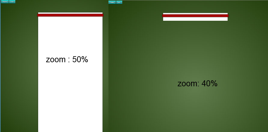
Whereas in Chrome the image is still visible but slightly misaligned, this happens at different levels of zoom: Chrome misalignment

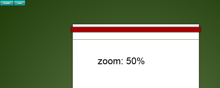
For once Internet Explorer is actually displaying the expected result regardless of zoom!

What is trident doing differently to webkit and gecko, and how can I patch it?

Here is all the relevant code:

body {
  background-color: rgba(31, 59, 8, 1);
}
#main {
  z-index: 1;
  position: absolute;
  top: 113px;
  left: 50%;
  width: 900px;
  height: 100%;
  margin-top: 160px;
  background-image: url('https://i.stack.imgur.com/zZCB2.png'); 
  background-repeat: repeat-y;
  margin-right: -50%;
  text-align: center;
  transform: translateX(-50%);
}
#main:before {
  content: " ";
  position: absolute;
  left: 0px;
  top: -113px;
  background-image: url('https://i.stack.imgur.com/7DE7i.png');
  background-repeat: no-repeat;
  width: 900px;
  height: 113px;
}
#main:after {
  content: " ";
  position: absolute;
  left: 0px;
  bottom: -200px;
  background-image: url('https://i.stack.imgur.com/DVJAq.png');
  background-repeat: no-repeat;
  width: 900px;
  height: 200px;
}
<div id="main"></div>
jaunt
  • 4,978
  • 4
  • 33
  • 54
  • 2
    What versions of Chrome and Firefox are you using? I haven't tried it on Windows but on my Mac on both Chrome and Firefox, it is loading correctly. – loganfarr Oct 25 '15 at 18:40
  • Chrome 43,45,46 and Firefox 38 (and I think it was 32?) have all shown this behaviour on Windows 8.1. These are pretty random versions tbh, I just tested it whenever I updated the browser; I was hoping for a patch but the problem has persisted. – jaunt Oct 25 '15 at 18:47
  • 1
    latest Firefox under w10 doens't replicate your problem. it works just fine. Anyway, even if these days browsers works much better than before, when using px I still try to avoid as much as possible odd numbers. It mess often with layouts (in your case the 113px top value) – Alvaro Menéndez Oct 28 '15 at 15:26
  • 1
    This disappearing issue does not occur on the current versions of Chrome and Firefox on Windows 8. The line in Chrome occurs, because of bad rounding of pixels, when zooming to an odd zoom level. Please take a look a look at ``border-radius`` and ``box-shadow``. All the things you did with images can easily be achieved by using plain css, which is supported by all current browsers. – ssc-hrep3 Oct 30 '15 at 14:30
  • @AlvaroMenéndez Good to know it's been fixed in the newer versions. Ah okay, that makes sense, I'll make it an even number then. Still curious as to why IE, of all the browsers, can display this correctly... – jaunt Oct 31 '15 at 09:29
  • @ssc-hrep3 I already considered this as an option, however it has very poor compatibility with older browsers, and images are much easier to manipulate; `box-shadow` gives different outputs depending on the browser and I'd like a universe look to the website, hence images. – jaunt Oct 31 '15 at 09:32
  • 1
    @jaunt ``border-radius`` and ``box-shadow`` are supported in every browser except IE <8 (http://caniuse.com/#feat=css-boxshadow, http://caniuse.com/#search=border-radius). Nowadays, the rendering is pretty much equal. If you use images, be aware, that high resolution screens will display it blurry, if you do not upload a way too large image (which then affects the page loading time). – ssc-hrep3 Oct 31 '15 at 13:33
  • @ssc-hrep3 Hmm true, which is why I want to keep the image 1px tall and repeat it instead of having a huuggge one. But I guess that won't work with for the header and footer .png's. I suppose an svg may be more practical but considering other features on the website may not be supported by older browsers, this may be the best alternative. Many thanks :) – jaunt Oct 31 '15 at 22:57

2 Answers2

2

Making your body.png image 20px tall or so will fix the issue. 1px repeating images act strange sometimes. Should help with redraw/flickering while the element is loaded as well.

Also, setting the "#main:before" to have a top of -112px instead of -113px got rid of the funky line in Chrome when you zoom in (at least for me).

Hope that helps.

maximo
  • 1,101
  • 9
  • 16
  • While a 20px solution is a great approach, I plan to have vertically growing/shrinking objects on the page and it would not look good to have the page just jump in size. Thank you for the suggestion with the positioning, as the image is 113px tall it would cause a 1px overlap, so instead I'll just change the size of the image. I'm more curious as to why this doesn't happen in IE yet does in the more popular browsers than I am about the actual solution; any fix with an explanation is much appreciated though :) – jaunt Oct 31 '15 at 09:41
1

I am not sure, but i belive if you split the images and make 3 parts: ::before (white top, with bottom shadow) ::header (the red box) ::after (White bottom, with top shadow from the red box)

I hope that this answer helps!

  • Can you have `::before::before`? The header is defined by using an image with the pseudo class selector `::before`, which is preferable because it allows older browsers versions to render it identically to modern browsers. – jaunt Nov 15 '15 at 09:27
  • Sorry for late answer, but i belive that works. Now i am not proffesional when it comes to this :D – Richard Olsen Sandberg Nov 16 '15 at 17:16