Say I have data in the following format:
categoricalVar,  numericVar,  responseVar
           Foo,           1,         TRUE
           Bar,           0,         TRUE
           Baz,           2,        FALSE
       ...
       ...
       ... MUCH MUCH MORE
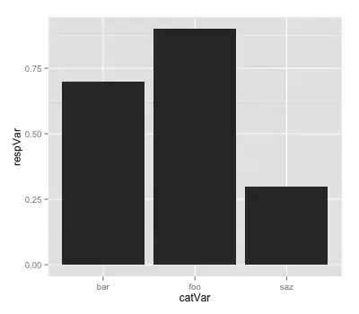
I want to create a bar plot where the X axis would be the 3 different types of categoricalVar, and Y axis would the percentage of them that turned out to be TRUE. A table would work too, like this.
           Foo,   Bar,   Baz
 respPct   0.4,   0.6,   0.9
So out of all the Foos, the percentage of TRUE was 0.4.
The same thing for numericVar would be nice.
             0,     1,     2, ....
 respPct   0.1,   0.2,   0.2
Although I think it makes sense to group the numericVar together, as follows:
           0-5,  5-10, 10-15, ....
 respPct   0.2,   0.3,   0.6
Can someone point me in the right direction?


