I'm have a heat map application and store I store the x,y coordinates of a click and also the viewport width and height. Real data for 2 clicks:
x,   y,   width, height
433, 343, 1257,  959
331, 823, 1257,  959
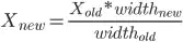
The issue is when I resize the screen on the responsive site, the displayed clicks are now all off. I'm coming up empty on my searches but is there a formula or algorithm to recalculate the x and y coordinates for different resolutions. For example, the first click, if the width goes from 1257 to 990 and the height goes from 959 to 400, how to I recalculate the x and y so they line up in the same spot?
EDIT:
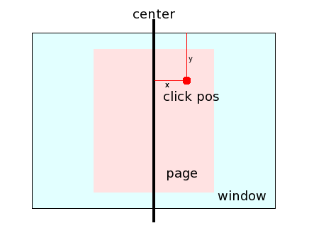
I added 2 fields to the database, width_percentage and height percentage
to store the x percentage of the width and the y percentage of the height. So if x was 433 and the width of the screen was 1257 then x was 35% from the left edge of the screen. I then used the same theory for the height and ran the calculations but it did not scale the click dot to the same spot as I though the percentages would do for scaling resolutions. I testing this by clicking on full resolution 1257 width then reopening at 900 width. See below for code to display click dots at lower resolution.
Ajax PHP
while ($row = mysql_fetch_array($results)) {
  if( $_GET['w'] < $row['width'] ) {
    $xcorr = $row['width_percentage'] * $_GET['w'];
    $ycorr = $row['y'];
  }
}
This uses the $_GET variable, passing the width and height of the screen resolution on page load. Then it gets the click dots from the database as $results. Since I only scale the resolution width from 1257 to 900 I did not put in calculation for height and its the same pixel as the initial click. The new width I multiplied by the percentage and set the dot that percentage margin from the left of the screen. Since the percentage is 35%
the new x coordinate becomes 900 *.35 = 315px from the left edge. It did not work and I'm still scratching my head on head to keep click in the same spot for responsive sites.
