1

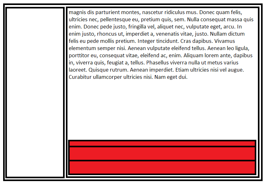
I need to position several div rows to the bottom of a container, similar to the image here:

example

My problem lies in that almost every solution on SO requires either absolute positioning or some method which requires modification every time a new element is added. I tried using a display:table-cell and vertical-align:middle, but this broke my row layout (all rows had display:block;). Is there a way to get this done in a way I can keep adding html rows to the layout and it will grow from the bottom to the top without modifying the CSS?

Edit: The answer NEEDS to still work after adding a new row without modifying any CSS. IE9+ support is highly preferable. CSS ONLY solution is also highly preferred. If no answers with such criteria appear by tomorrow I'll tag the next most useful one as right.

(I'm using foundation in case that helps)

JSFiddle to play with: https://jsfiddle.net/o47xeze7/

<div class="parent">
    <div class="child">abcdfg</div>
    <div class="child">abcdfg</div>
</div>

.parent {
    width: 100%;
    height: 20rem;
    border: 1px solid black;
    display: table;
}
.child {
    border: 1px solid red;
    display: block;
    vertical-align: bottom;
}

UPDATE: I'm an idiot... All I had to do was create a container with absolute bottom positioning and let it grow updwards. When I said no absolute positioned elements I said it because I don't want anything with the likes margin-top: x-pixels, because it requires updating that value every time I add a new row, but doing an absolute bottom placed container doesn't. Sorry guys. Here is the working solution in case anyone wants it. https://jsfiddle.net/b6akcdso/

<div class="parent">
    <div class="bottom-aligned-contanier">
        <div class="child">Lorem ipsum dolor sit amet, consectetur adipisicing elit. Repellendus expedita praesentium aperiam, eveniet in, dolore iusto excepturi quibusdam accusantium delectus aut atque assumenda quaerat recusandae perferendis repellat labore, explicabo maiores.</div>
        <div class="child">Lorem ipsum dolor sit amet, consectetur adipisicing elit. Corporis deleniti minima nostrum, tenetur autem, debitis magni vel facere laudantium incidunt asperiores aliquam cupiditate cum perferendis cumque inventore, dignissimos ad in.</div>
        <div class="child">Lorem ipsum dolor sit amet, consectetur adipisicing elit. Cum impedit deleniti, id voluptatum est! Quibusdam ea fugit obcaecati minima soluta, quis voluptate aspernatur corrupti, minus tempore ipsa adipisci porro. Ab.</div>
    </div>
</div>

.parent {
    width: 100%;
    height: 20rem;
    background-color: lightgray;
    position: relative;
}

.bottom-aligned-contanier {
    position: absolute;
    bottom: 0;
}

.child {
    display: block;
    width: 100%;
    background-color: darkgray;
    color: white;
}

.child:nth-child(2n) {
    background-color: gray;
}

Awarding right answer to the guy that gave me the idea to do this.

sgarcia.dev
  • 5,671
  • 14
  • 46
  • 80

3 Answers3

1

If you can use jQuery, then this solution works. Here is a fiddle: https://jsfiddle.net/o47xeze7/3/

HTML

<div class="parent">
    <div class="bottom">
        <div class="child">abcdfg</div>
        <div class="child">abcdfg</div>
    </div>
</div>

CSS

.parent {
    width: 100%;
    height: 20rem;
    border: 1px solid black;
    display: block;
}

.child {
    border: 1px solid red;
    display: block;
}

.bottom {
    display: block;
    position: relative;
}

jQuery

$(function() {
    var parentHeight = $(".parent").height();
    var bottomHeight = $(".bottom").height();
    var difference = parentHeight - bottomHeight;

    $(".bottom").css("margin-top", difference);
});
9997
  • 1,187
  • 1
  • 9
  • 14
  • That works, but after adding a new row it breaks, and requires the same maintenance an absolute positioned element would (updating a number to make up for the new row). I need something that won't break after adding a new row, – sgarcia.dev Aug 20 '15 at 20:33
  • @sgarcia edited with a jQuery solution. I also added another child div to make sure it works. – 9997 Aug 20 '15 at 20:45
1

flexbox can do that.

.parent {
  width: 100%;
  height: 10rem;
  border: 1px solid black;
  display: flex;
  flex-direction: column;
  justify-content: flex-end;
  margin-bottom: 1em;
}
.content {
  align-self: flex-start;
  margin-bottom: auto;
}
.child {
  width: 100%;
  border: 1px solid red;
  margin: 0;
}
<div class="parent">
  <div class="content">
    <p>Lorem ipsum dolor sit amet, consectetur adipisicing elit. Incidunt ipsam nihil vel doloribus maxime sed animi repellat consequatur, earum, eum sit. Repellendus fugit dolorem dolorum facere quo odit numquam autem, qui commodi accusantium hic. Omnis.</p>
  </div>
  <div class="child">top</div>
  <div class="child">bottom</div>
</div>

<div class="parent">
  <div class="content">
    <p>Lorem ipsum dolor sit amet, consectetur adipisicing elit. Incidunt ipsam nihil vel doloribus maxime sed animi repellat consequatur, earum, eum sit. Repellendus fugit dolorem dolorum facere quo odit numquam autem, qui commodi accusantium hic. Omnis.</p>
  </div>
  <div class="child">top</div>
  <div class="middle">middle</div>
  <div class="child">bottom</div>
</div>

JSfiddle Demo

Paulie_D
  • 107,962
  • 13
  • 142
  • 161
1

If you're ready to ditch support for IE8 and IE9 then this might be the best solution for you since you don't want to use absolute/table-cell positioning.

You can achieve what you're trying to do using flexbox. Here's how it's done in your case:

.parent {
  width: 100%;
  height: 20rem;
  border: 1px solid black;
  display: flex;
  flex-direction: column-reverse;
}
.child {
  border: 1px solid red;
}
<div class="parent">
  <div class="child">abcdfg</div>
  <div class="child">abcdfg</div>
</div>
Fahad Hasan
  • 10,231
  • 4
  • 29
  • 36
  • That's great, any idea for how to replicate that with IE9+ support? – sgarcia.dev Aug 20 '15 at 20:36
  • Almost but it reverses the order of the divs - https://jsfiddle.net/vcag62mq/ ...unless that's what the OP wants of course. – Paulie_D Aug 20 '15 at 20:36
  • @paulie_d OP mentioned about filling the rows from bottom to top so I believe he would like the last `
    ` to appear on top. Not sure though.
    – Fahad Hasan Aug 20 '15 at 20:40
  • 1
    Flexie.js or Reflexie.js can may give you IE9 support for the flex model, as mentioned in [another answer](http://stackoverflow.com/a/26178841/17300). – Stephen P Aug 20 '15 at 20:41
  • I think the OP meant that the stack would grow upwards with each layer being added. Also you haven't addressed the content at the top of the column as shown in the image. – Paulie_D Aug 20 '15 at 20:42