I have data normalised beween 0 and 1 with continuous values inbetween. Is it possible to make a colour map to highlight one particular value? In this case, I want the max value of one to be a custom defined colour and the rest use a normal colour map. I have tried editing the colour map by appending on the desired colour but the plot uses this colour for values close to one as well. Any suggestions appreciated.
function cplotdemo
clc; close all; clear all;
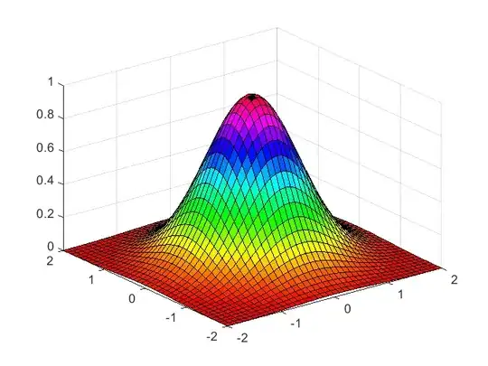
DATA = peaks;
DATA = (DATA - min(DATA(:))) / ( max(DATA(:)) - min(DATA(:)) );
figure,
contourf(DATA)
colormap(jet2)
colorbar
function J = jet2(m)
if nargin < 1
m = size(get(gcf,'colormap'),1);
end
n = ceil(m/4);
u = [(1:1:n)/n ones(1,n-1) (n:-1:1)/n]';
g = ceil(n/2) - (mod(m,4)==1) + (1:length(u))';
r = g + n;
b = g - n;
g(g>m) = [];
r(r>m) = [];
b(b<1) = [];
J = zeros(m+1,3);
J(r,1) = u(1:length(r));
J(g,2) = u(1:length(g));
J(b,3) = u(end-length(b)+1:end);
J(end,:)=[(256/2)/255,(0)/255,(256/2)/255];
I now think this is happening because of the way contourf works. For the example posted there should be only on value equal to one and that is the one I want to use the custom colour with.