0

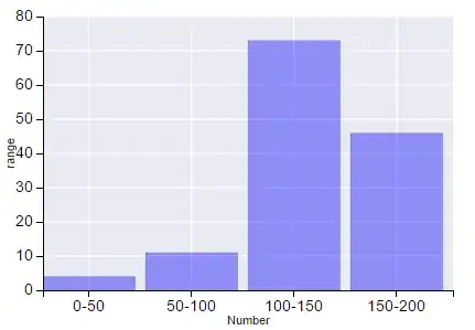
I have a list list = [['0-50',4],['50-100',11],['100-150',73],['150-200',46]] and I want to show it on a histogram using mpld3 in python pyspark. The first part in each element of list is range which will be on x-axis of histogram and the second part is the number of people in that range which will on y-axis. How can I make a bar chart using either matplotlib or mpld3 in pyspark?

UPDATE: I tried below code based on [this] example 1 and it displays the bar chart but the output is visually very bad with lots of grey colored area around the plot boundary. How can I get it look clear and better in terms of visualization?

import numpy as np
import matplotlib.pyplot as plt

list = [['0-50',4],['50-100',11],['100-150',73],['150-200',46]]
n_groups = len(list)

fig, ax = plt.subplots()

index = np.arange(n_groups)
bar_width = 0.35

opacity = 0.4
error_config = {'ecolor': '0.3'}

number = []
ranges = []
for item in list:
    number.append(item[1])
    ranges.append(item[0])

rects1 = plt.bar(index, number, bar_width,
                 alpha=opacity,
                 color='b',
                 error_kw=error_config)

plt.xlabel('Number')
plt.ylabel('range')
plt.xticks(index + bar_width, (ranges[0],ranges[1],ranges[2],ranges[3]))
plt.legend()

plt.tight_layout()
plt.show()
Abraham D Flaxman
  • 2,969
  • 21
  • 39
user2966197
  • 2,793
  • 10
  • 45
  • 77
  • Please include more details on what you have tried so far and where you are stuck. See http://stackoverflow.com/help/how-to-ask http://stackoverflow.com/help/mcve – Abraham D Flaxman Aug 14 '15 at 16:57
  • @AbrahamDFlaxman I modified my above post with my current code. I see the bar chart but the output is visually very bad – user2966197 Aug 14 '15 at 17:43

1 Answers1

0

A secret weapon to make matplotlib plots look good is import seaborn. This overrides the mpl defaults with something nice.

I would also make the bars bigger and move the xticks to the middle of the bars. Here is a slight tweak of your code to do so:

import numpy as np, matplotlib.pyplot as plt, mpld3, seaborn as sns

list = [['0-50',4],['50-100',11],['100-150',73],['150-200',46]]
n_groups = len(list)
index = np.arange(n_groups)

bar_width = 0.9
opacity = 0.4

number = []
ranges = []
for item in list:
    number.append(item[1])
    ranges.append(item[0])

rects1 = plt.bar(index, number, bar_width,
                 alpha=opacity,
                 color='b')

plt.xlabel('Number')
plt.ylabel('range')
plt.xticks(index + bar_width/2, (ranges[0],ranges[1],ranges[2],ranges[3]))

mpld3.display()

Here is how it looks:

enter image description here

And here is a notebook where you can see the interactivity that mpld3 adds (which is basically useless, but a little bit fun).

Abraham D Flaxman
  • 2,969
  • 21
  • 39