0

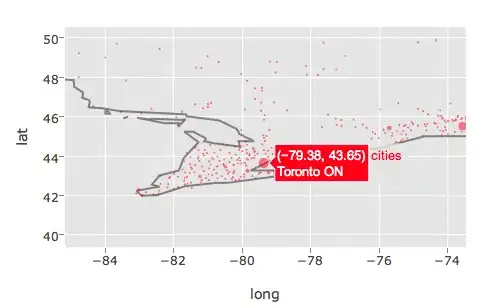
I found the following example for plotting a map with Canadian cities: https://plot.ly/ggplot2/maps/

The R code reads as follows:

library(plotly)
Sys.setenv("plotly_username"="XXXXXXXXX")
Sys.setenv("plotly_api_key"="YYYYYYYYY")

  data(canada.cities, package="maps")
  viz <- ggplot(canada.cities, aes(long, lat)) +
  borders(regions="canada", name="borders") +
  coord_equal() +
  geom_point(aes(text=name, size=pop), colour="red", alpha=1/2, name="cities")

  ggplotly()

I would like to modify the example in a way that the name of the city shows up when hovering with the mouse over the relevant point in the map.

How would I need to modify the above example to implement this?

kanimbla
  • 858
  • 1
  • 9
  • 23
  • Plotly brings over the ggplot2 figure. Can you [add a column](http://stackoverflow.com/questions/7578536/how-can-i-persuade-ggplot2-geom-text-to-label-a-specified-date-in-a-time-series)? You can [edit the tooltip](http://stackoverflow.com/questions/26102941/using-2-legends-from-r-to-plotly-plot-ly) as well. – Mateo Sanchez Aug 11 '15 at 21:23
  • Thanks for your comment! After all, I think I prefer to use another way to produce the map in plotly, here are some nice examples [link](https://testprod.plot.ly/r/choropleth-maps/) – kanimbla Aug 13 '15 at 14:17

1 Answers1

2

This ended up being a bug, so thanks for reporting! I just issued a fix here so try re-installing (devtools::install_github("ropensci/plotly")) and re-running:

data(canada.cities, package="maps")
viz <- ggplot(canada.cities, aes(long, lat)) +
        borders(regions="canada", name="borders") +
        coord_equal() +
        geom_point(aes(text=name, size=pop), colour="red", alpha=1/2, name="cities")
        ggplotly()

Here's a screenshot, with the custom hover text!

custom hovertext with ggplot2 figure

Chris P
  • 2,888
  • 21
  • 22