0

Is there any R package/method/function that provides the functionality to plot a matrix of scatterplots as here (scatterplot.matrix function of the car package, found here) AND to plot x and y errorbars as has been asked and answered here.

An example:

set.seed(123)
df <- data.frame(X = rnorm(10), errX = rnorm(10)*0.1, Y = rnorm(10), errY = rnorm(10)*0.2, Z = rnorm(10))
require(ggplot2)
ggplot(data = df, aes(x = X, y = Y)) + geom_point() + 
  geom_errorbar(aes(ymin = Y-errY, ymax = Y+errY)) + 
  geom_errorbarh(aes(xmin = X-errX, xmax = X+errX)) + theme_bw()

produces the following plot (X vs Y with errorbars): enter image description here

while

library(car)
spm(~X+Y+Z, data=df)

produces a scatterplot matrix such as this: enter image description here

Now my expected output would be such a matrix of scatterplots (any other package than car will be fine as well) where I can also display errorbars. (Note that not all of my variables have errors, e.g. Z does not). Also the fitting etc that is done here by the spm function is a nice gimmick but not necessary for my means.

Community
  • 1
  • 1
mts
  • 2,160
  • 2
  • 24
  • 34

1 Answers1

2

Data

set.seed(123)
df <- data.frame(X = rnorm(10), errX = rnorm(10)*0.1,
                 Y = rnorm(10), errY = rnorm(10)*0.2,
                 Z = rnorm(10))

Code

library(ggplot2)
library(gtools)
valCols <- c("X", "Y", "Z")
errCols <- setNames(c("errX", "errY", NA), valCols)
combn <- permutations(length(valCols), 2, valCols)

mdf <- do.call(rbind,
               apply(combn, 1, function(ind) {
                  df[["NA.Column"]] <- NA
                  errC <- errCols[ind]
                  errC[is.na(errC)] <- "NA.Column"
                  vals <- setNames(data.frame(df[, ind]), paste0("val", seq_along(ind)))
                  errs <- setNames(data.frame(df[, errC]), paste0("err", seq_along(errC)))
                  ret <- cbind(vals, errs)
                  ret$var1 <- factor(ind[1], levels = valCols)
                  ret$var2 <- factor(ind[2], levels = valCols)
                  ret
               }))

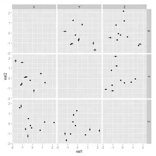
(p <- ggplot(mdf, aes(x = val1, y = val2, 
                      ymin = val2 - err2, ymax = val2 + err2,
                      xmin = val1 - err1, xmax = val1 + err1)) +
         geom_point() + 
         geom_errorbar() + geom_errorbarh() + 
         facet_grid(var1 ~ var2, drop = FALSE))

Explanation

First, you have to transform your data in a way, such that ggplot2 likes it. That is, one column each for your x- and y-axis respectively plus one column each for the error bars.

What I used here, is function permutations from library(gtools), which returns (in this case) all 2 element permutations. For each of these permutations, I select the corresponding column from the original data set and add the related error columns (if existing). If the column names follow a certain pattern for value and error bar columns, you can use regex to determine these automatically like in:

valCols <- names(df)[grepl("^[A-Z]$", names(df))]

Finally, I add the columns var1and var2 describing which variables were selected:

head(mdf)
#          val1       val2        err1        err2 var1 var2
# 1 -0.56047565 -1.0678237  0.12240818  0.08529284    X    Y
# 2 -0.23017749 -0.2179749  0.03598138 -0.05901430    X    Y
# 3  1.55870831 -1.0260044  0.04007715  0.17902513    X    Y
# 4  0.07050839 -0.7288912  0.01106827  0.17562670    X    Y
# 5  0.12928774 -0.6250393 -0.05558411  0.16431622    X    Y
# 6  1.71506499 -1.6866933  0.17869131  0.13772805    X    Y

Having the data transformed this way makes it rather easy to generate the scatter plot matrix. With this approach it is also possible to modify the diagonal panel as shown in the follwing example:

p + geom_text(aes(ymin = NULL, ymax = NULL, xmin = NULL, xmax = NULL), 
              label = "X",
              data = data.frame(var1 = "X", var2 = "X", 
                                val1 = 0, val2 = 0))

Plot

Scatterplot Matrix Scatterplot Matrix With Diagonal Element

thothal
  • 16,690
  • 3
  • 36
  • 71
  • This is a great answer and a very flexible solution! +1 – mts Jul 13 '15 at 14:54
  • I checked your code and I'm pretty sure that it should be `facet_grid(var2 ~ var1, drop = FALSE)` so that the distribution of variables in columns is the same along the x-axis and in rows along the y-axis, which is not the case right now. Please edit if you can confirm. – mts Jul 13 '15 at 15:57
  • Well, the lhs (i.e. y) of `y ~ x` determines the rows and the rhs (i.e. x) the columns. If you switch them, you 'transpose' the matrix. But I am not sure whether I understood your comment properly, can you rephrase? – thothal Jul 20 '15 at 10:58
  • @thotal let's tale the last plot and the lower line of plots: I expect the y-axis to belong to the z variable in both plots and the x-axis to belong to the x variable in the plot in the left and to the y variable in the middle plot. But since both subplots derive from the same dataset I would expect to be able to draw a horizonzal line from each point in the left subplot to the same point (same z value) in the middle plot. This isn't the case here as you can see from e.g. the highest points in both subplots. Instead the lefternmost points in both plots coincide. Is this more helpful? – mts Jul 20 '15 at 11:17