1

I am trying to draw a hexagon shape in CSS but importantly it must be able to stretch to fit the content. Here is where I am using image caps :

Search file with hexagon shape using image caps

The code for this uses images :

#searchfield_wrapper::before {

    display: inline-block;
    content: url("../images/hexCapWhite_left.png");
    position: relative;
    left: 6px;
    top: 1px;
}

#searchfield_wrapper::after {

    display: inline-block;
    content: url("../images/hexCapWhite_right.png");
    position: relative;
    left: -6px;
    top: 1px
}

But as you can see, it doesn't quite work and is very hacky.

I'd love to be able to do this using just div elements and borders. This site is great but the shapes are not stretchable : https://css-tricks.com/examples/ShapesOfCSS/

Hope you can help!

:-)

jbutler483
  • 24,074
  • 9
  • 92
  • 145
Lee Probert
  • 10,308
  • 8
  • 43
  • 70
  • You could use the diamond shape explained [here](http://stackoverflow.com/a/27636658/3436942) – jbutler483 Jun 04 '15 at 09:41
  • You could also have a look at this [elongated hexagon](http://stackoverflow.com/questions/25445118/elongated-hexagon-shaped-button-using-only-one-element/25448974#25448974). – Harry Jun 04 '15 at 09:45

5 Answers5

5

A couple of pseudo elements seem to work just fine.

span {
  display: inline-block;
  position: relative;
  line-height: 1.2em;
  padding: 0 .5em;
  background: orange;
  margin: 2em;
  /* just spacing */
  position: relative;
}
span:before,
span:after {
  content: '';
  position: absolute;
  width: 0;
  height: 0;
  border: .6em solid transparent; /* half line-height */
}
span:before {
  right: 100%;
  border-right-color: orange;
}
span:after {
  left: 100%;
  border-left-color: orange;
}
<span>Short Text</span>
<span>Longer Text</span>
<span>Lorem ipsum dolor sit amet.</span>

It even reacts to font-sizing automatically - JSFiddle

UPDATE: Amended version (same basic technique - 2 pseudo-elements) but now using rotated boxes in order that borders can be added.

Bordered JSFiddle Demo

Paulie_D
  • 107,962
  • 13
  • 142
  • 161
2

You could use perspective in order to allow for a bordered outline. Note however, since I'm using perspective, the angle may change, but should stay as a 'single element'.

div {
  position: relative;
  min-height: 50px;
  min-width: 150px;
  border-top: 5px solid black;
  border-bottom: 5px solid black;
  display: inline-block;
  margin: 10px;
  background: tomato;
  z-index: 5;
  text-align: center;
  vertical-align:top;
}
div:before,
div:after {
  content: "";
  position: absolute;
  background: inherit;
  z-index: -1;
  left: -2px;
  height: calc(50% - 2px);
  width: calc(100% - 4px);
  border: 5px solid black;
}
div:before {
  transform: perspective(50px) rotateX(10deg);
  transform-origin: top center;
  top: -5px;
  border-bottom: none;
}
div:after {
  transform: perspective(50px) rotateX(-10deg);
  transform-origin: bottom center;
  bottom: -5px;
  border-top: none;
}
<div>TEXT</div>
<div>SOME EVEN LONGER TEXT.<br/> WRAPPING TEXT</div>
jbutler483
  • 24,074
  • 9
  • 92
  • 145
2

I wanted to give this ago, so here are the results.

Using :before and :after we can create squares, we then tilt them and use them as the ends. Slap a border on them with a background colour and make them sit under the parent using z-index: -1;.

Pretty simple way of looking at it.

Note: This will only stretch in terms of width (I'm guessing thats what you mean).

div {
  width: 200px;
  height: 30px;
  border-top: 3px solid #000;
  border-bottom: 3px solid #000;
  position: relative;
  margin: 20px;
}
div:before,
div:after {
  content: "";
  width: 22px;
  height: 22px;
  position: absolute;
  background: #fff;
  transform: rotate(45deg);
  z-index: -1;
}
div:before {
  border-left: 3px solid #000;
  border-bottom: 3px solid #000;
  top: 3px;
  left: -13px;
}
div:after {
  border-right: 3px solid #000;
  border-top: 3px solid #000;
  top: 3px;
  right: -13px;
}
<div>Text here</div>
Ruddy
  • 9,795
  • 5
  • 45
  • 66
1

Editing the code from your reference, I came up with this, with some little twirls you should get it working

Css:

#hexagon {
    width:500px; /*the width you want, I see you want a search fields so assumed it's fixed */
 height: 55px;
 background: red;
 position: relative;
    padding:0px 50px; /* This padding makes it nice uniform and an indent so your text never falls of */
}
#hexagon:before {
 content: "";
 position: absolute;
 top: -24px; /*Also edited this, as 25px was rendering a 1px line sometimes */
 left: 0;
 width: inherit; /*edited this */
 height: 0;
 border-left: 50px solid transparent;
 border-right: 50px solid transparent;
 border-bottom: 25px solid red;
}
#hexagon:after {
 content: "";
 position: absolute;
 bottom: -24px; /*Also edited this, as 25px was rendering a 1px line sometimes */
 left: 0;
 width: inherit; /*edited this */
 height: 0;
 border-left: 50px solid transparent;
 border-right: 50px solid transparent;
 border-top: 25px solid red;
}
<br /><br /><div id="hexagon">This text is for testing purposes</div>
JohannesB
  • 1,995
  • 21
  • 35
  • is this not an octagon? – jbutler483 Jun 04 '15 at 10:34
  • Yeah it is, I just took the code of a hexagon on the website he provided and widened it. By doing so I accidentally (without thinking about it) created two new sides, so I should've taken the diamond square I guess. But still, the changes in code stay the same and can be applied to thediamond as well, so I'll let my code stick around for now. – JohannesB Jun 05 '15 at 16:05
1

Folks, I'm going to answer my own question on this but purely because I've spent all day researching everybody's answers above (which I appreciate very much and thank you), and I have come to some conclusions which I'd like to share:

There are issues with all of the techniques used to create shapes in CSS. The main issues are with stretching the content but keeping the triangular caps at the end a consistent size. The other issue was with drawing the shape with borders. The technique I eventually tried with some success was Harry's elongated hexagon link here : http://codepen.io/hari_shanx/pen/tsLza

This worked great for a while (although it did also distort the shape when stretching too). I then started to notice the cracks across different browsers. As we know, transforms cause all kinds of issues and I noticed that the transforms that create this effect were having a huge impact on depth sorting and positionings (I can't even begin to explain how messy it was).

So, I looked into a completely different method for this and ended up using border-image:

.hex_border_40 {

    border: 20px solid transparent;
    -webkit-border-image: url(../images/searchfield_bg.png) 20 stretch;
    -o-border-image: url(../images/searchfield_bg.png) 20 stretch;
    border-image: url(../images/searchfield_bg.png) 20 stretch;
}

The border image looked like this :

border image

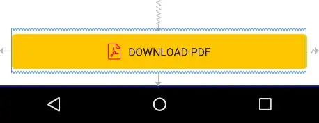
and the result looks like this:

search

There has been a styling change (in my favour) which is why it is now a dark grey background and I need to change the icon to white etc.

The benefits of this technique though is that no matter how much the central section of that element scales the end caps will be ok and not distort. Flash had a thing called 'scale-9' which allowed you to set a 9 cell grid image and choose which areas scaled and which stayed the same. We need something as robust as that for CSS.

Anyway, thanks for listening.

Lee Probert
  • 10,308
  • 8
  • 43
  • 70