1

Using the R Kohonen package, I have obtained a "codes" plot which shows the codebook vectors.

codes plot

I would like to ask, shouldn't the codebook vectors of neighbouring nodes be similar? Why are the top 2 nodes on the left so different?

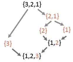
Is there a way to organise it in a meaningful organisation such as this image below? Source from here. Where the countries of high poverty are clustered at the bottom. world poverty map

library("kohonen")

data("wines")
wines.sc <- scale(wines)
set.seed(7)
wine.som <- som(data = wines.sc, grid = somgrid(5, 4, "hexagonal"))

# types of plots

plot(wine.som, type="codes", main = "Wine data")
kklw
  • 858
  • 3
  • 13
  • 28

1 Answers1

1

Map 1 is the average vector result for each node. The top 2 nodes that you highlighted are very similar.

Map 2 is a kind of similarity index between the nodes.

If you want to obtain such kind of map using the map 1 result you may have to develop your own plotting function with the following parameters:

  1. Pick up the most relevant nodes or the most different ones (manually or automatically). Then, you have to attribute a color to each of these nodes.

  2. Give a color the the neigbours nodes using the average distance between the center of each node from the selected nodes. Shorter distance = close color, higher distance = fading color.

To sum up, that's a lot of work for nearly nothing. Map 1 is better and contains a lot of informations. Map 2 is nice looking...

ePoQ
  • 434
  • 3
  • 18
  • 1
    The codebook vector for the 2 nodes i highlighted is different right? The left node has very high weight for non-flav. phenols and col int. While the right node has high weight for alcohol, malic acid, non-flav. phenols, col int and col. hue. Is my understanding wrong? – kklw May 21 '15 at 09:28
  • the real difference between those nodes is the level of ash – ePoQ May 21 '15 at 09:40