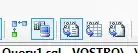
How can I draw something like this:
What type of series would I need to use?
How can I draw something like this:
What type of series would I need to use?
That's an open-high-low-close (OHLC) chart. It's frequently used with financial data like stock prices. In that context, a stock has an opening and closing price at the start and end of a time period, and also a highest price and lowest price during that period. The vertical bar is the highest and lowest value for the time period; the horizontal bar on the left is the open, and the bar on the right is the close.
OxyPlot doesn't appear to have an OHLC series, but the candlestick series is a similar method of displaying OHLC data.