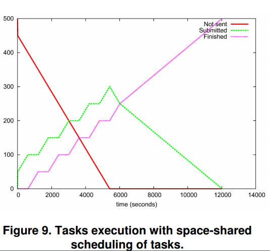
First of all, to understand the meaning of these graphs you have to make sure you understood the concepts of space-shared and time-shared allocation the authors present in section 3.2.
On both graphs, the red line represents the amount of tasks that have not been submitted yet. As tasks are submitted, it decreases linearly until it hits the horizontal axis, which is the point in time when all tasks have been submitted. The green line represents the amount of tasks that have been submitted, but are not yet finished. Notice that it keeps increasing while there are tasks to be submitted (represented by the red line). Once there are no tasks left to be submitted, the green line reaches its peak. This is why on both graphs the green line's peak has the same abscissa value as the point where the red line hits the horizontal axis. Finally, the pink line represents the amount of finished tasks. Since there are 500 tasks in total, when the pink line reaches the 500 tasks value, the green line reaches the horizontal axis. It simply means that all tasks have finished and the experiment is over.
With that in mind, let's explore each of the graphs.
Figure 9 presents tasks being allocated with space-shared policy. In this case, every task gets dedicated access to processing cores. The result is that every task takes approximately the same amount of time to complete. The pink line starts with a ladder effect because once all processing cores get one task to execute, new tasks need to wait in line for execution (that's the whole point of space-shared allocation). Once new tasks stop arriving, no waiting time is required anymore and the pink line increases linearly.
On the other hand, Figure 10 presents tasks being allocated with time-shared policy. That means no wait-in-line times, so all tasks are allocated immediately and share the processing cores while being executed. As a result, the pink line starts increasing linearly for the first 50 tasks, when no sharing is needed yet. Once processing cores starts being shared, they get overloaded and the pink line remains constant because no task is getting finished. When new tasks stop arriving, the processing cores finally start getting tasks finished and the pink line increase is nearly exponential.