I'd to like to fit GPD to a dataset and then plot a double-log chart showing all the using data points with a trend line showing asymptotic GPD. I have the code to fit my data using VGAM package but don't know how to get the desired plot. The code is:
library("VGAM")
gdata <- data.frame(V1 = rexp(n = 3000, rate = 2))
fit <- vglm(V1 ~ 1, gpd(), data = gdata, trace = TRUE)
Coef(fit)
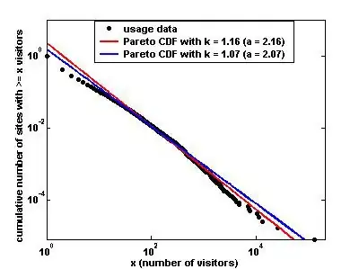
I want to get a diagram similar to this explained here