0

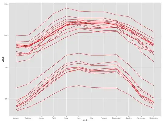
I have average bioclim values for temperature and precipitation at 28 locations, (like the dataset below) and I want to plot lines that connect the average values of each month for each data point (i.e. one line for each location across all months).

This gives me one vertical line across all points at each month:

tmean_t <- data.frame(tmean_t)

row.names(tmean_t)
colnames(tmean_t) <- c(1:28)

tmean_t$month<-factor(month.name,levels=month.name)
tmean_t.long<-melt((tmean_t),id.vars="month")

ggplot(tmean_t.long,aes(month, value)) + 
  geom_line(color="red")

****I found this to be the most straight forward solution.

group <- prec.long$variable
ggplot(prec.long,aes(month, value, group = variable, colour = group)) + 
  geom_path(alpha = 0.5) +
  #geom_point(color="variable")  +
  scale_y_continuous(breaks=seq(0, 450, 25), name="Precipitation (mm)")

            1   2   3   4   5   6   7   8   9  10  11  12  13  14  15  16  17  18  19  20  21  22  23  24  25  26  27  28
January   181 183 182 169 185 181 175 175 175 185 200 187 185 190  89  88  83  93 182 186  97  87  87 117  81 168 158 171
February  183 185 182 173 180 183 171 171 171 180 201 187 185 191 103 100  94 109 183 184 107  99  97 124  87 170 162 173
March     193 195 195 184 185 193 177 177 177 185 217 200 193 205 118 117 113 127 197 194 121 117 112 138  96 189 179 190
April     202 205 210 195 194 202 187 187 187 194 235 216 203 222 134 134 129 141 213 206 137 132 127 153 108 207 202 207
May       218 221 220 211 205 218 198 198 198 205 244 226 217 231 148 148 142 156 223 216 153 146 142 169 118 216 210 217
June      218 221 221 211 211 218 205 205 205 211 239 225 220 228 151 150 146 160 222 219 156 149 147 172 121 223 217 225
July      215 218 220 208 212 215 205 205 205 212 238 224 219 228 146 144 141 154 221 219 153 145 143 169 118 219 211 222
August    212 215 220 205 214 212 208 208 208 214 238 225 218 228 148 145 140 157 221 220 153 145 143 169 117 220 212 222
September 213 216 217 207 213 213 208 208 208 213 233 221 219 223 149 147 143 159 217 218 154 148 143 170 117 222 216 224
October   210 213 207 201 199 210 191 191 191 199 230 213 210 217 130 128 127 138 209 207 138 131 127 154 107 209 200 212
November  200 202 196 188 190 200 180 180 180 190 217 201 197 206 106 105 102 112 197 196 115 106 104 133  93 184 174 189
December  183 185 185 172 184 183 175 175 175 184 206 191 187 195  96  95  90 101 186 188 102  94  92 121  85 170 159 174

1 Answers1

2

I created a data frame from what you provided in your question. Your data is called mydf. First, I added rowname in the data using add_rownames(). I then reshaped the data using gather(), which makes the data stay in a long format. This is similar to melt(). Months are in character, so I converted them to factor in mutate(). In the ggplot part, I think you want to use group so that you can draw 28 lines. I hope this will help you.

library(dplyr)
library(tidyr)
library(ggplot2)

mydf %>% 
add_rownames() %>%
gather(location, value, -rowname) %>%
mutate(month = factor(rowname, levels = month.name)) -> mydf2

ggplot(data = mydf2, aes(x = month, y = value, group = location)) + 
geom_line(color = "red")

enter image description here

DATA

mydf <- structure(list(X1 = c(181L, 183L, 193L, 202L, 218L, 218L, 215L, 
212L, 213L, 210L, 200L, 183L), X2 = c(183L, 185L, 195L, 205L, 
221L, 221L, 218L, 215L, 216L, 213L, 202L, 185L), X3 = c(182L, 
182L, 195L, 210L, 220L, 221L, 220L, 220L, 217L, 207L, 196L, 185L
), X4 = c(169L, 173L, 184L, 195L, 211L, 211L, 208L, 205L, 207L, 
201L, 188L, 172L), X5 = c(185L, 180L, 185L, 194L, 205L, 211L, 
212L, 214L, 213L, 199L, 190L, 184L), X6 = c(181L, 183L, 193L, 
202L, 218L, 218L, 215L, 212L, 213L, 210L, 200L, 183L), X7 = c(175L, 
171L, 177L, 187L, 198L, 205L, 205L, 208L, 208L, 191L, 180L, 175L
), X8 = c(175L, 171L, 177L, 187L, 198L, 205L, 205L, 208L, 208L, 
191L, 180L, 175L), X9 = c(175L, 171L, 177L, 187L, 198L, 205L, 
205L, 208L, 208L, 191L, 180L, 175L), X10 = c(185L, 180L, 185L, 
194L, 205L, 211L, 212L, 214L, 213L, 199L, 190L, 184L), X11 = c(200L, 
201L, 217L, 235L, 244L, 239L, 238L, 238L, 233L, 230L, 217L, 206L
), X12 = c(187L, 187L, 200L, 216L, 226L, 225L, 224L, 225L, 221L, 
213L, 201L, 191L), X13 = c(185L, 185L, 193L, 203L, 217L, 220L, 
219L, 218L, 219L, 210L, 197L, 187L), X14 = c(190L, 191L, 205L, 
222L, 231L, 228L, 228L, 228L, 223L, 217L, 206L, 195L), X15 = c(89L, 
103L, 118L, 134L, 148L, 151L, 146L, 148L, 149L, 130L, 106L, 96L
), X16 = c(88L, 100L, 117L, 134L, 148L, 150L, 144L, 145L, 147L, 
128L, 105L, 95L), X17 = c(83L, 94L, 113L, 129L, 142L, 146L, 141L, 
140L, 143L, 127L, 102L, 90L), X18 = c(93L, 109L, 127L, 141L, 
156L, 160L, 154L, 157L, 159L, 138L, 112L, 101L), X19 = c(182L, 
183L, 197L, 213L, 223L, 222L, 221L, 221L, 217L, 209L, 197L, 186L
), X20 = c(186L, 184L, 194L, 206L, 216L, 219L, 219L, 220L, 218L, 
207L, 196L, 188L), X21 = c(97L, 107L, 121L, 137L, 153L, 156L, 
153L, 153L, 154L, 138L, 115L, 102L), X22 = c(87L, 99L, 117L, 
132L, 146L, 149L, 145L, 145L, 148L, 131L, 106L, 94L), X23 = c(87L, 
97L, 112L, 127L, 142L, 147L, 143L, 143L, 143L, 127L, 104L, 92L
), X24 = c(117L, 124L, 138L, 153L, 169L, 172L, 169L, 169L, 170L, 
154L, 133L, 121L), X25 = c(81L, 87L, 96L, 108L, 118L, 121L, 118L, 
117L, 117L, 107L, 93L, 85L), X26 = c(168L, 170L, 189L, 207L, 
216L, 223L, 219L, 220L, 222L, 209L, 184L, 170L), X27 = c(158L, 
162L, 179L, 202L, 210L, 217L, 211L, 212L, 216L, 200L, 174L, 159L
), X28 = c(171L, 173L, 190L, 207L, 217L, 225L, 222L, 222L, 224L, 
212L, 189L, 174L)), .Names = c("X1", "X2", "X3", "X4", "X5", 
"X6", "X7", "X8", "X9", "X10", "X11", "X12", "X13", "X14", "X15", 
"X16", "X17", "X18", "X19", "X20", "X21", "X22", "X23", "X24", 
"X25", "X26", "X27", "X28"), class = "data.frame", row.names = c("January", 
"February", "March", "April", "May", "June", "July", "August", 
"September", "October", "November", "December"))
jazzurro
  • 23,179
  • 35
  • 66
  • 76