4

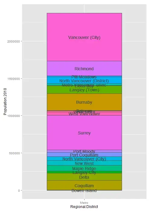
I'm trying to create a labeled stacked bar chart where there is only ever 1 bar. My stacks are not always large enough to fit text so I would like to have leader lines that point to the label just to the right of the stack for the labels that can't fit in the stack. Alternatively, it is okay if all the labels are all to the right of the stack with leader lines.

My data.frame looks something like this:

Regional.District   Municipality Population.2010        mp
Metro               Bowen Island            3678    1839.0
Metro                  Coquitlam          126594   66975.0
Metro                      Delta          100000  180272.0
Metro               Langley City           25858  243201.0
Metro                Maple Ridge           76418  294339.0
Metro                   New West           66892  365994.0
Metro     North Vancouver (City)           50725  424802.5
Metro             Port Coquitlam           57431  478880.5
Metro                 Port Moody           33933  524562.5
Metro                     Surrey          462345  772701.5
Metro             West Vancouver           44058 1025903.0
Metro                 White Rock           19278 1057571.0
Metro                     Anmore            2203 1068311.5
Metro                   Belcarra             690 1069758.0
Metro                    Burnaby          227389 1183797.5
Metro             Langley (Town)          104697 1349840.5
Metro                  Lions Bay            1395 1402886.5
Metro      Metro Vancouver-uninc           24837 1416002.5
Metro North Vancouver (District)           88370 1472606.0
Metro               Pitt Meadows           18136 1525859.0
Metro                   Richmond          196858 1633356.0
Metro           Vancouver (City)          642843 2053206.5

This is what I currently have working: current bar chart

This is what I'd like to get working: potential future bar chart

Here is my code:

library(ggplot2)
ggplot(muns, aes(x = Regional.District, y = Population.2010, fill = Municipality)) +
    geom_bar(stat = 'identity', colour = 'gray32', width = 0.6, show_guide = FALSE) +
    geom_text(aes(y = muns$mp, label = muns$Municipality), colour = 'gray32')

Is this possible to automate? I am okay with not using ggplot2 to accomplish this. Thanks!

jazzurro
  • 23,179
  • 35
  • 66
  • 76
hailes
  • 125
  • 9

1 Answers1

4

Here is one possibility. I think this work does need some manual work although you can automate some processes. I initially investigated which labels have to stay outside of the bar. Then, I saw some labels were overlapping one another. My solution was to move some of the labels on the left side of the bar. Anmore was a tricky one. I manually shifted its y position a bit higher so that it does not overlap with White Rock.

gg1 is the base graphic. You have labels inside the bar. gg2 is created to get labels which should be added on the right side of the bar. In dan, I looked into the data which ggplots used and modified x values (i.e, x = 1.35). I also removed three places here. Similar works are done for the three places in emo and dan2. In gg3, I added the labels. The final work is to add segments. I created three new data frames to draw segments.

library(dplyr) # I use the dev version (dplyr 0.4)
library(ggplot2)

# as_data_frame() is available in dplyr 0.4
mydf <- as_data_frame(list(Regional.District = rep("Metro", times = 22),
                           Municipality = c("Bowen Island", "Coquitlam", "Delta",
                                            "Langley City", "Maple Ridge", "New West",
                                            "North Vancouver (City)", "Port Coquitlam", "Port Moody",
                                            "Surrey", "West Vancouver", "White Rock",
                                            "Anmore", "Belcarra", "Burnaby", "Langley (Town)",
                                            "Lions Bay", "Metro Vancouver-uninc",
                                            "North Vancouver (District)", "Pitt Meadows",
                                            "Richmond", "Vancouver (City)"),
                           Population = c(3678, 126594, 100000, 25858, 76418, 66892, 50725,
                                          57431, 33933, 462345, 44058, 19278, 2203, 690,
                                          227389, 104697, 1395, 24837, 88370, 18136, 196858,
                                          642843),
                           mp = c(1839.0, 66975.0, 180272.0, 243201.0, 294339.0, 365994.0,
                                  424802.5, 478880.5, 524562.5, 772701.5, 1025903.0, 1057571.0,
                                  1068311.5, 1069758.0, 1183797.5, 1349840.5, 1402886.5, 1416002.5,
                                  1472606.0, 1525859.0, 1633356.0, 2053206.5)))


# Get label for places which has more than or less than 60,000 people

ana <- mutate(mydf, foo = ifelse(Population > 60000, Municipality, NA))
bob <- mutate(mydf, foo = ifelse(Population > 60000, NA, Municipality))


# Plot with places which have more than 60,000 people
gg1 <- ggplot(mydf, aes(x = Regional.District, y = Population, fill = Municipality)) +
       geom_bar(stat = "identity", colour = "gray32", width = 0.4, show_guide = FALSE) +
       geom_text(aes(y = ana$mp, label = ana$foo), colour = "gray32", size = 3)

# Plot with places which have less than 60,000 people
gg2 <- ggplot(mydf, aes(x = Regional.District, y = Population, fill = Municipality)) +
       geom_bar(stat = "identity", colour = "gray32", width = 0.4, show_guide = FALSE) +
       geom_text(aes(y = bob$mp, label = bob$foo), colour = "gray32")

# Label for right
dan <- na.omit(ggplot_build(gg2)$data[[2]]) %>%
       filter(!label %in% c("Belcarra", "Metro Vancouver-uninc", "Anmore")) %>%
       mutate(x = 1.35)

# Label for left
emo <- filter(ggplot_build(gg2)$data[[2]],
              label %in% c("Belcarra", "Metro Vancouver-uninc")) %>%
       mutate(x = 0.65)

# Special label for right
dan2 <- filter(ggplot_build(gg2)$data[[2]], label == "Anmore") %>%
        mutate(x = 1.35, y = 1098312)

# Add labels
gg3 <- gg1 +
       annotate("text", x = dan$x, y = dan$y, label = dan$label, colour = "gray32", size = 3) +
       annotate("text", x = emo$x, y = emo$y, label = emo$label, colour = "gray32", size = 3) +
       annotate("text", x = dan2$x, y = dan2$y, label = dan2$label, colour = "gray32", size = 3)


# Create data frames for segments
# right seg
r.seg <- data.frame(x = rep(1.2, times = 9),
                    xend = rep(1.25, times = 9),
                    y = dan$y,
                    yend = dan$y) 

# left seg
l.seg <- data.frame(x = rep(0.76, times = 2),
                    xend = rep(0.8, times = 2),
                    y = emo$y,
                    yend = emo$y)

# Anmore seg
a.seg <- data.frame(x = 1.2,
                    xend = 1.25,
                    y = 1068312,
                    yend = dan2$y)

# Draw the segments                                        
gg3 +
annotate("segment", x = r.seg$x, xend = r.seg$xend, y = r.seg$y, yend = r.seg$yend) +
annotate("segment", x = l.seg$x, xend = l.seg$xend, y = l.seg$y, yend = l.seg$yend) +
annotate("segment", x = a.seg$x, xend = a.seg$xend, y = a.seg$y, yend = a.seg$yend) 

enter image description here

jazzurro
  • 23,179
  • 35
  • 66
  • 76