0

I am trying to plot quite large and dense networks (dput here). All I end up with is a bunch of overlapping dots, which does not really give me a sense of the structure or density of the network:

library(sna)
plot(data, mode = "fruchtermanreingold")

enter image description here

However, I have seen plots which utilizes fading to visualize the degree to which points overlap, e.g.:

enter image description here

How can I implement this "fading" in a plot of a graph?

histelheim
  • 4,938
  • 6
  • 33
  • 63
  • If you want illustrations of how coloring code works in R you should post a _small_ example. First line(s) should be `library(....)` – IRTFM Jan 01 '15 at 17:31
  • I'm not sure what you mean - I have posted exactly what I'm doing included the data in a `dput`. Are you wondering which SNA library I'm using? – histelheim Jan 01 '15 at 17:34
  • That was not a small example and I still do not know what package is being used. I suppose I could ferret it out by scrolling to the end to figure out what class name is at the end of the object but why should I need to? – IRTFM Jan 01 '15 at 17:38
  • Perhaps all you are asking for is whether to use [alpha](https://en.wikipedia.org/wiki/Alpha_compositing) (i.e., partial transparency). In that case, try using something like `plot(..., col='#ff000080')`; the color string is `#RRGGBBAA` where each pair is a hexademical value for red, green, blue, and alpha, and an alpha of 0x80 is 128/255 =~ 50% transparency. (Since you haven't provided any reproducibility -- and `sna` does not appear to directly reference "fruchtermanreingold" -- I'm unable to help any more than this.) – r2evans Jan 01 '15 at 19:22

1 Answers1

4

Here's one way:

library(sna)
library(network)

source("modifieddatafromgist.R")

plot.network(data, 
             vertex.col="#FF000020", 
             vertex.border="#FF000020", 
             edge.col="#FFFFFF")
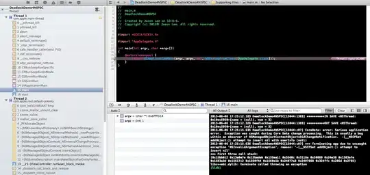
enter image description here

First, I added a data <- to the gist so it could be sourced.

Second, you need to ensure the proper library calls so the object classes are assigned correctly and the proper plot function will be used.

Third, you should use the extra parameters for the fruchtermanreingold layout (which is the default one for plot.network) to expand the area and increase the # of iterations.

Fourth, you should do a set.seed before the plot so folks can reproduce the output example.

Fifth, I deliberately removed cruft so you can see the point overlap, but you can change the alpha for both edges & vertices (and you should change the edge width, too) to get the result you want.

There's a ton of help in ?plot.network to assist you in configuring these options.

hrbrmstr
  • 77,368
  • 11
  • 139
  • 205