I have a data set like this:
final.Df
       X1     X2        X3
1  event1 event2 event5.n1
2  event1 event2 event5.n1
3  event1 event2 event6.n1
4  event1 event3 event6.n2
5  event1 event3 event7.n2
6  event1 event3 event7.n2
7  event1 event4 event7.n3
8  event1 event4 event7.n3
9  event1 event4 event8.n3
10 event1 event4 event8.n3
(Original data could potentially include a maximum of 200 rows (aprox) and a maximum of 10 columns. I use this reduced data set to illustrate the problem. From this data set I use the following code to plot a flow-Chart (or tree-Chart) using the package igraph in R (the code below is partially based on Creating treechart from tabbed text in R ):
##create edges
edges <- rbind(na.omit(final.Df[1:2]),
           do.call('rbind',
                   lapply(1:(ncol(final.Df)-2), function(i)
                          na.omit(setNames(final.Df[(1+i):(2+i)],
                                           names(final.Df[1:2]))))))

##remove duplicated edges.
rm.ind <- c()
for (i in 2:nrow(edges)){
    if (edges[i,1] == edges[i-1,1] & edges[i,2] == edges[i-1,2]){
        rm.ind <- c(rm.ind, i)
    }
}
edges <- edges[-rm.ind,]

## create graph
require(igraph)
g <- graph.data.frame(edges)
E(g)$curved <- 0
E(g)$label <- rep(1, nrow(edges))
plot.igraph(g, vertex.size=0, edge.arrow.size=0 ,
                  layout=-layout.reingold.tilford(g)[,2:1])
The resulting plot is attached to this post. 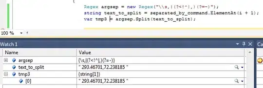
Using this reduced data set the plot looks ok. However, when a larger data set is used, the events (event5, event6, etc) start to "pile on top of each other" and the chart becomes hard to read. Therefore, I was wondering if there is a way for me to control the location or separation of the edges. Also the reader will notice that the labels (all number 1 in this case) fall on top of the edges. Ideally, I would like the labels to fall above the edges (I have read that some use the package qgraph, but I am assuming it will be possible to do all using igraph(?))
I tried using tkplot, since you seem to be able to control the size of the resulting plot, but I obtain the following error:
tkplot(g, canvas.width=450, canvas.height=450, vertex.size=0, edge.arrow.size=0 ,
                   layout=-layout.reingold.tilford(g)[,2:1])
Loading required package: tcltk
Error in structure(.External(.C_dotTclObjv, objv), class = "tclObj") :
  [tcl] expected integer but got "font266".
I read here at stackoverflow that this error might have to do with some remnant tcl/tk 8.5 installation (TCLK error when I run 'validate' from the rms package), but I have checked and it is not my case (so no idea of how to solve this error.)
At this stage, I need some expert help to control the aesthetics of the graph plot. To summarize:
1-How can I control the location and/or angle between the edges in the plot shown here? Another option would be using better the whole surface of the quartz plotting window.
2-How can I control the location of the labels associated to the edges?
3- and less important, where does this tkplot error message comes from?
Thanks in advance