UPDATE: After looking at your screen shots again I realized that you want to display the button to the right of the product images. I'm not sure if this is a good idea, because this theme is meant to be responsive.
But if you really, really, really want to do this then you may try to add the following <CSS> to your custom.css file:
@media only screen and (min-width: 768px) {
    .products-grid .actions {
        margin: 0;
        position: absolute;
        top: 100px;
        right: -25px;
    }
    .owl-wrapper {
        z-index: 1;
    }
    .slider-arrows1 .owl-controls .owl-buttons .owl-prev, .slider-arrows1 .owl-controls .owl-buttons .owl-next {
        z-index: 2;
    }
}
This will work as you can see in the screen shot below, when hovering the button.
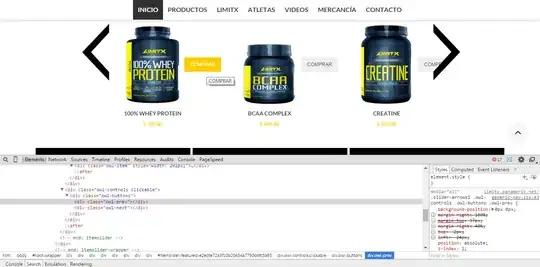
I have added @media only screen and (min-width: 768px) because of the responsive nature of the theme. Otherwise, when the browser viewport gets smaller, the buttons would overlap the image. You may want to play a little with this setting and should test it on some mobile devices too.
To learn more about this see this question.
EDIT: I'll leave my original answer below, just in case this may
helpful to someone else in the future...
I see that you use Infortis Ultimo theme, which is a great choice. I don't think you should use <CSS> to move the button. It is better to move the entire <div class="actions"></div> to the top.
The result will look like this:
You can do this by making some changes to the following file:
app/design/frontend/ultimo/default/template/catalog/product/list.phtml
Somewhere around lines 273 to 289 (depending on the themes version) you will find the code for this:
<div class="actions clearer<?php echo $actionsClasses; ?>">

    ....

</div> <!-- end: actions -->
Note: It is best to first copy the entire list.phtml file to your own sub-theme
and make the changes there.
In your sub-themes list.phtml file just cut the section I mentioned above and move it up to somewhere around line 216 of the file.
Paste it right after the beginning of the <list class="item"> element and before the <div class="product-image-wrapper"....>, just like this:
<li class="item">

    <!-- PUT THE CODE HERE -->

    <div class="product-image-wrapper" style="max-width:<?php echo $imgWidth; ?>px;">
Also don't forget to add this in your custom.css style sheet:
.products-grid .actions {
    margin: 0 0 10px;
}
This should do the trick for you!