36

Has anyone noticed this behavior? I'm trying to write a script that will trigger upon a resize. It works fine on normal browsers, works fine on iPhone, but on iPad, will only trigger going from horizontal to vertical viewport, not vice versa.

Here's the code:

$(window).resize( function() {

    var agent=navigator.userAgent.toLowerCase();
    var is_iphone = ((agent.indexOf('iphone') != -1));
    var is_ipad = ((agent.indexOf('ipad') != -1));

    if(is_iphone || is_ipad){
        location.reload(true);
    } else {     
        /* Do stuff. */
    };
});
dclowd9901
  • 6,756
  • 9
  • 44
  • 63

7 Answers7

47

If I understood you correctly, you want to do something when the user tilts the iPad. Here you go:

window.onorientationchange = function(){

    var orientation = window.orientation;

    // Look at the value of window.orientation:

    if (orientation === 0){

        // iPad is in Portrait mode.

    }

    else if (orientation === 90){

        // iPad is in Landscape mode. The screen is turned to the left.

    }


    else if (orientation === -90){

        // iPad is in Landscape mode. The screen is turned to the right.

    }

}

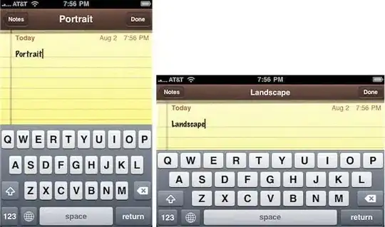
The left picture shows portrait mode, the right one landscape mode

Drew Gaynor
  • 8,292
  • 5
  • 40
  • 53
Vincent
  • 3,965
  • 2
  • 22
  • 30
  • I chose your answer because it was most concisely the correct answer. As a point of notation, though, the solution I went with incorporated none of the `if` checking. It simply ran code (namely a page reload) when the orientation was changed. – dclowd9901 May 17 '10 at 14:29
  • 1
    @dclowd9901 Yes, I thought so, I just wanted to provide some extra information :) – Vincent May 17 '10 at 14:54
  • 2
    You forgot when `orientation === 180`. It's when the iPad is turned upside-down. – Alexandre Khoury Jun 18 '12 at 13:53
  • 1
    7 years later and this answer still rescues me. thanks a lot. – Gabbax0r May 04 '17 at 12:11
  • @Gabbax0r Wow, that's crazy. I wrote this when I was still a teenager! Glad I could help. – Vincent May 04 '17 at 12:15
  • thats nice. dont know why ipad still doesnt trigger .resize() from vertical to horizontal. – Gabbax0r May 04 '17 at 12:30
  • 1
    Of note is that the onorientationchange event is fired BEFORE the dimensions of the screen are actually changed, so if you print out height/width, you will get the numbers for the orientation you just left. – GreySage Jul 21 '17 at 18:04
14

I think what you want would be to use the iPad Orientation CSS, which looks like this:

<link rel="stylesheet" media="all and (orientation:portrait)" href="portrait.css" />
<link rel="stylesheet" media="all and (orientation:landscape)" href="landscape.css" />

Also, the orientationchange event fires when the orientation is changed, according to iPad web development tips.

Together, that should give you tools enough to deal with the change.

artlung
  • 33,305
  • 16
  • 69
  • 121
7

This includes all orientations.

Here are two options:

window.onorientationchange = function() {

    var orientation = window.orientation;

    // Look at the value of window.orientation:

    if (orientation === 0) {
    // iPad is in Portrait mode.

    } else if (orientation === 90) {
     // iPad is in Landscape mode. The screen is turned to the left.

    } else if (orientation === -90) {
     // iPad is in Landscape mode. The screen is turned to the right.

    } else if (orientation === 180) {
    // Upside down portrait.

    }
}    

or

// Checks to see if the platform is strictly equal to iPad:
    if(navigator.platform === 'iPad') {
            window.onorientationchange = function() {

            var orientation = window.orientation;

            // Look at the value of window.orientation:

            if (orientation === 0) {
            // iPad is in Portrait mode.

            } else if (orientation === 90) {
             // iPad is in Landscape mode. The screen is turned to the left.

            } else if (orientation === -90) {
             // iPad is in Landscape mode. The screen is turned to the right.

            } else if (orientation === 180) {
            // Upside down portrait.

            }
          }       
        }
user1149756
  • 71
  • 1
  • 1
1

The only thing I could find from apple:

Safari on iPad and Safari on iPhone do not have resizable windows. In Safari on iPhone and iPad, the window size is set to the size of the screen (minus Safari user interface controls), and cannot be changed by the user. To move around a webpage, the user changes the zoom level and position of the viewport as they double tap or pinch to zoom in or out, or by touching and dragging to pan the page. As a user changes the zoom level and position of the viewport they are doing so within a viewable content area of fixed size (that is, the window). This means that webpage elements that have their position "fixed" to the viewport can end up outside the viewable content area, offscreen.

I understand the "works on the iPhone" part...but maybe it doesn't anymore? This could be a change in OS/mobile Safari since the latest public iPhone OS release shipped (the above documentation is from March 2010).

I'm going to re-tag this question adding iPhone to it, maybe one of the guys with the developer 4.0 OS release can test this? If it is the case it's been removed, this should be a bug filed/fixed before it goes live...I'm not sure on how the procedures are on this with Apple are though.
Nick Craver
  • 623,446
  • 136
  • 1,297
  • 1,155
  • Thanks for looking it up and adding the tag. To compound my confusion, I'm no Javascript zen master, so I wasn't even sure if I was putting the code together correctly. – dclowd9901 Apr 30 '10 at 14:26
  • @dclowd9901 - The code looks alright, just an extra `;` after the `if` there :) Just curious, why do you need to reload when the page resizes? – Nick Craver Apr 30 '10 at 16:41
  • I have functionality in a slideshow plugin that I wrote that gives it fullscreen viewing with a parameter. Users brought it to my attention that lack of accommodating window resizes was an oversight. I tried to write a bandaid before I release a new tested version, but came across the issue about which I posted. – dclowd9901 Apr 30 '10 at 23:51
1

You want this fix for the orientation bug on iphone and ipad. read about it here: http://www.blog.highub.com/mobile-2/a-fix-for-iphone-viewport-scale-bug/

github newest version here: https://gist.github.com/901295 use the second version on the page.

B-Money
  • 1,040
  • 10
  • 12
0

Check your version of iOS.

The "orientationchange" event does not work in iOS 3.*, but it does in 4.*

JoeDuncan
  • 367
  • 3
  • 8
0
  1. do a nice check if your platform is iPad,
  2. handle the iOS specific event orientationchange by catching window.onorientationchange

    if(navigator.platform == 'iPad') {
        window.onorientationchange = function() {
            // handle orientationchange event
            // (here you can take advantage of the orientation property
            //     - see the good answer above by Vincent)
        }       
    }
    
Steak Overflow
  • 7,041
  • 1
  • 37
  • 59
  • 2
    I think it'd be better to check for `window.orientation` then explicitly check for the device in most situations. – alex Sep 19 '11 at 00:08