I have the represented independently these two plots using R:
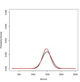
#PLOT 1
    x<-250:2500
    #Hsap. Northern European
        a<-dnorm(x,1489,167)
    #Hsap. South African
        b<-dnorm(x,1472,142)

    plot(x,a, type="l", lwd=3, ylim=c(0,1.2*max(a,b,c)), ylab="Probability Density", xlab="Microns")
    lines(x,b, type="l", lwd=3, col="Red")
PLOT 2
    #CUSPAL ENAMEL FORMATION TIME
    x<-0:800
    #Hsap. Northern European
        a<-dnorm(x,447,37)
    #Hsap. South African
        b<-dnorm(x,444,33)

    plot(x,a, type="l", lwd=3, ylim=c(0,1.2*max(a,b,c)), ylab="Probability Density", xlab="Days")
    lines(x,b, type="l", lwd=3, col="Red")
![enter image description here][2]
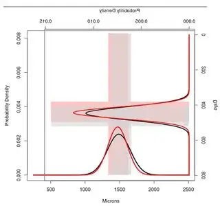
I would like to merge both using R and obtain an image similar to that shown below. It is interesting to say that I would like as well to stand out the intervals of +- 1SD, to see the overlapping area in the two plots.
Which is the exact code in R to get into success my purpose?
UPDATE
Now, with my data I get the next figure:
As you can see, the overlapping standard deviations are not in the best place. I'd like these overlapping areas were above the normal distributions placed at the X-axis. In this way I could see clearly them.
So the question is, can you write some examples and in that way I learn how I can move these scales to avoid that situation?
In my example I would like to move upwards the right-normal distributions (Y-axis).
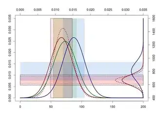
x1<-30:200
a1<-dnorm(x1,87,15)
b1<-dnorm(x1,89,13)
c1<-dnorm(x1,92,16)
d1<-dnorm(x1,104,15)

x2<-000:1600
a2<-dnorm(x2,724,66)
b2<-dnorm(x2,724,50)
d2<-dnorm(x2,835,117)

scale<-range(pretty(range(a1,a2,b1,b2,c1,d1,d2)))

remap<-function(x, to, from=range(x)) {
    (x-from[1]) / (from[2]-from[1]) * (to[2]-to[1]) + to[1]
}

plot(NA, NA, xaxt="n", yaxt="n", type="n", xlim=scale, ylim=scale)
rect(remap(87-15, scale, range(x1)), scale[1],
     remap(87+15, scale, range(x1)), scale[2], col="#ff606025", lty=1)
rect(remap(89-13, scale, range(x1)), scale[1],
     remap(89+13, scale, range(x1)), scale[2], col="#ff606025", lty=2)
rect(remap(92-16, scale, range(x1)), scale[1],
     remap(92+16, scale, range(x1)), scale[2], col="#3dae0025", lty=0)
rect(remap(104-15, scale, range(x1)), scale[1],
     remap(104+15, scale, range(x1)), scale[2], col="#005ccd25", lty=0)

rect(scale[1], remap(724-66, scale, range(x2)),
     scale[2], remap(724+66, scale, range(x2)), col="#ff606025", lty=1)
rect(scale[1], remap(724-50, scale, range(x2)),
     scale[2], remap(724+50, scale, range(x2)), col="#ff606025", lty=2)
rect(scale[1], remap(835-117, scale, range(x2)),
     scale[2], remap(835+117, scale, range(x2)), col="#005ccd25", lty=0)

lines(remap(x1,scale), a1, col="darkred", lwd=3)
lines(remap(x1,scale), b1, col="darkred", lwd=3, lty=3)
lines(remap(x1,scale), c1, col="darkgreen", lwd=3)
lines(remap(x1,scale), d1, col="darkblue", lwd=3)

lines(scale[2]-a2, remap(x2,scale), col="darkred", lwd=3)
lines(scale[2]-b2, remap(x2,scale), col="darkred", lwd=3, lty=3)
lines(scale[2]-d2, remap(x2,scale), col="darkblue", lwd=3)


axis(2); axis(3)
axis(1, at=remap(pretty(x1), scale), pretty(x1))
axis(4, at=remap(pretty(x2), scale), pretty(x2))
Thanks
