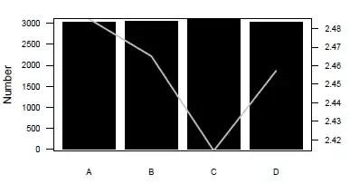
Say that I want to produce a barplot for the following data (counts):
 A     B     C     D
3030  3049  3104  3018
But I also want to put a line plot overlapying the bar plot of the following data(lg):
A 2.485294117647059
B 2.465160980297934
C 2.414123006833713
D 2.457267020762916
This has been my code so far:
b<-barplot(counts,col='black',border=FALSE,axes=FALSE,cex.names = 0.75)

left.axis.pos<-c(quantile(counts))
axis(2,at=left.axis.pos,labels=left.axis.pos,las=2,cex.axis=0.75)
mtext("Number",side=2,line=3,cex=1)

right.axis.ticks<-c(quantile(as.numeric(lg[,2])))
axis(4,at=right.axis.ticks,labels = right.axis.ticks,las=2,cex.axis=0.75)
mtext("ratio",side=4,line=2,cex=1)

lines(lg[,1],as.numeric(lg[,2]), col='grey',lwd=2)
dev.off()
However, the y-axis is either too far up (on left) or too far down (on right).

The original PDF is also available on Dropbox.