4

I've been trying to fix this for a few hours already, and I just can't seem to find the problem.

I have this HTML email signature that has to wrap properly on low resolution devices.

This is a mockup with how it should look on large-screen devices: enter image description here

And this is a mockup with how it should look on small-screen devices: enter image description here

This is the markup:

<!DOCTYPE html PUBLIC "-//W3C//DTD XHTML 1.0 Strict//EN" "http://www.w3.org/TR/xhtml1/DTD/xhtml1-strict.dtd">
<html xmlns="http://www.w3.org/1999/xhtml">

<head>
</head>

<body>
  <table width="100%">
   <tr>
    <td>

      <!-- TEXT CELL -->
      <table align=left width=160>
       <tr>
        <td>
          <p>
            <span style='font-size:12.0pt;font-family:"Times New Roman","serif"; mso-fareast-font-family:"Times New Roman"'>sep</span>
          </p>
        </td>
      </tr>
    </table>

    <!-- TEXT CELL -->
    <table align=left width=160>
     <tr>
      <td>
        <p>
          <span style='font-size:12.0pt;font-family:"Times New Roman","serif";
          mso-fareast-font-family:"Times New Roman"'>ult</span>
        </p>
      </td>
    </tr>
  </table>

  <!-- TEXT CELL -->
  <table align=left width=160>
   <tr>
    <td>
      <p>
        <span style='font-size:12.0pt;font-family:"Times New Roman","serif";
        mso-fareast-font-family:"Times New Roman"'>tur</span>
      </p>
    </td>
  </tr>
</table>

<!-- TEXT CELL -->
<table align=left width=160>
 <tr>
  <td>
    <p>
      <span style='font-size:12.0pt;font-family:"Times New Roman","serif";
      mso-fareast-font-family:"Times New Roman"'>ura</span>
    </p>
  </td>
</tr>
</table>
</td>
</tr>
</table>
</body>
</html>

The problem is with the web clients. For some reason, there's always an extra HTML element appended next to each one of those 4 tables: enter image description here

And these are the results:

MS Outlook 2007 (properly displayed): enter image description here

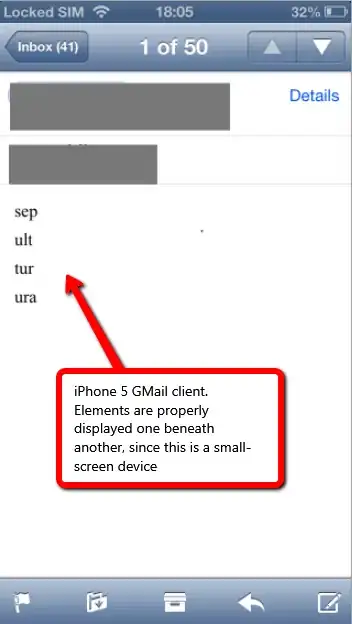
Apple GMail client (properly displayed and wrapped, since it's small-resolution screen): enter image description here

Outlook web (there's an extra HTML element that breaks the layout, details in the pic): enter image description here

GMail web (somehow similar to the Outlook web): enter image description here

I'd also like to mention that I tested these with Litmus and all looked good. I'm not sure why things are different in these let's say "real-world" situations.

Could be related to my process of putting the HTML signature:

  1. Open the HTML page containing the signature
  2. Select all the content within that page (ctrl+A)
  3. Copy all the content (ctrl+C)
  4. Open MS Outlook 2007
  5. go to Tools -> Options -> Mail Format -> Signatures
  6. New signature -> Paste the content into the textarea -> Save the newly created signature.
Zubzob
  • 2,653
  • 4
  • 29
  • 44

2 Answers2

2

I'm pretty confident what you are asking for can not be done in Outlook '07 in a signature.

This is because Outlook '07/'10/'13 use the Microsoft Word engine and add their own junk after send (the p msoNormal tags). Because it is added after send, you can not use inline CSS. In html email design, often designers will add styles to the style tag to zero out these unwanted tags in anticipation of Outlook doing it's thing. This wouldn't work for you because you are are using a signature only. You can try including a <style> tag in the signature html, but I'm doubtful it would work.

The best suggestion I have to mimic this kind of behavior is with &nbsp;. Very hack way, but it may be the only option you have for "floating" if sending from Outlook '07. Example:

<table width="100%" border="0" cellpadding="0" cellspacing="0">
  <tr>
    <td>
      Text&nbsp;1&nbsp;&nbsp;&nbsp;&nbsp;&nbsp;&nbsp;&nbsp;&nbsp;&nbsp;&nbsp;&nbsp;&nbsp;&nbsp;&nbsp;&nbsp;&nbsp;
      Text&nbsp;2&nbsp;&nbsp;&nbsp;&nbsp;&nbsp;&nbsp;&nbsp;&nbsp;&nbsp;&nbsp;&nbsp;&nbsp;&nbsp;&nbsp;&nbsp;&nbsp;
      Text&nbsp;3&nbsp;&nbsp;&nbsp;&nbsp;&nbsp;&nbsp;&nbsp;&nbsp;&nbsp;&nbsp;&nbsp;&nbsp;&nbsp;&nbsp;&nbsp;&nbsp;
      Text&nbsp;4&nbsp;&nbsp;&nbsp;&nbsp;&nbsp;&nbsp;&nbsp;&nbsp;&nbsp;&nbsp;&nbsp;&nbsp;&nbsp;&nbsp;&nbsp;&nbsp;
    </td>
  </tr>
</table>

Something like this might also work, (definitely a lot neater) but I haven't tested it:

<table width="100%" border="0" cellpadding="0" cellspacing="0">
  <tr>
    <td>
      <span style="width:150px;">Text 1</span>
      <span style="width:150px;">Text 2</span>
      <span style="width:150px;">Text 3</span>
      <span style="width:150px;">Text 4</span>
    </td>
  </tr>
</table>
John
  • 11,985
  • 3
  • 45
  • 60
  • Thanks, this one is close to solving my problem. Funny thing is that if I try to add a small image within each span (an icon next to the text), Outlook will again act up and place everything next to each other, such as .., causing low-res devices to separate the text (per line) from it's corresponding image. This is so frustrating. – Zubzob Mar 11 '14 at 11:34
  • 1
    Are you using `display:block;` on your images? In this case you would have to remove it. – John Mar 11 '14 at 13:05
  • This is what I'm doing: http://jsbin.com/neveg/2/edit but the result looks something like this: http://jsbin.com/xuzob/2/edit (try resizing the output pane to properly see the problem) – Zubzob Mar 11 '14 at 16:58
  • 1
    @Zubzob that was the same link twice. Also, it acts differently on different browsers, so you'll need to explain what is happening (unless the image you meant to link does) – John Mar 11 '14 at 17:37
  • It might look like it's the same link, but it's different. I've updated the tags with some non-broken links. Try re-sizing the output pane, see how the text and image wrap in the second link. First link is the desired behavior, but sadly Outlook turns it in something resembling the second link :(. The problem there is that on low-screen devices I might have the second image on the same line as the first text, instead of next to its corresponding text (second). – Zubzob Mar 12 '14 at 01:26
  • @Zubzob both URLs are the same. You needed to clone the first one so that the changes would take affect and create a new URL for the second example. I assume you are talking about how the sections pop down one at a time as the size becomes too small, but because your mobile width is big enough for the second image, it remains on the first line. Try putting your images inside the spans. This will make a larger block to bump down, and will keep the images with their corresponding text. – John Mar 12 '14 at 14:00
  • ...They will still bump down, as that is the expected behavior, but you are creating bigger "blocks", basically telling it where to make the line splits. – John Mar 12 '14 at 14:00
  • http://jsfiddle.net/t5pfJ/1/ I've updated it within a fiddle. You can see both examples :) – Zubzob Mar 13 '14 at 09:54
  • So the span didn't work as I expected, which I assume is why you put the `white-space: nowrap;` on it. I added an example with aligned tables, that should work nicely in Outlook. http://jsfiddle.net/bk4wC/ If you want bigger gaps between the items just add something like `width="80"` to your table tags. With widths added it won't let you resize the view in JSFiddle, but it will work nicely in email clients. – John Mar 13 '14 at 12:43
  • The result is similar to my initial problem: gets "cascaded". I think I'll just give up. – Zubzob Mar 20 '14 at 12:37
1

You could easily accomplish that layout using a single <table> and making each of those items a column, instead of having 4 separate <table> elements.

Make sure your CSS is all inline, and try to use tables for layout as much as possible (HTML e-mails is the only time this advice is acceptable). Additionally, try to only use CSS that is compatible with Outlook.com. Note that Outlook.com actually replaces some of your HTML with its own and takes any inline CSS and replaces that with a class/id that it places in its stylesheet at the top of the converted e-mail (hence the .ExternalClass resets).

Also, you may want to look at the Mailchimp reset, for fixing various issues encountered with e-mail providers such as Outlook.com.

Alex W
  • 37,233
  • 13
  • 109
  • 109
  • "Don't wrap your text in

    elements **because they are block-level elements**" - this is *false*. `Div`s are block-level elements and will not break the layout.

    – ANeves Mar 10 '14 at 17:10
  • Hello Alex W and thanks for your reply. I've tried your suggested fix but things are not any different. Even if I do not include those paragraphs within the s, outlook will still somehow generate them in the web clients. I don't think I can manipulate that. I've also removed them manually from the DOM(with developer tools), but there's no improvement. The things that break the layout are related to those extra paragraphs inserted after each (displayed in the screenshot). How can I prevent their insertion ?
    – Zubzob Mar 10 '14 at 17:28
  • @Zubzob Try using the Mailchimp reset I mentioned in my edit and see if you still experience issues. – Alex W Mar 10 '14 at 18:34