I work as part of a sales organization that is implementing a new initiative. Essentially, we are testing whether sending an email to a potential customer makes them more likely to show up and view a 'demo' of our product. My data is comprised of ~26,000 observations of interactions with a potential customer, some of which have had a 'demo reminder' (the term for the email) sent and some which have not. Each row of data also has columns breaking down the data further (how long was the call? how many calls did the salesperson make? did the call result in a demo being successfully held? etc.).
I've generated a generalized linear model in R using the data and it appears to be a good fit. Then, using the data that had no reminders sent, I plotted a predicted graph about what would have hypothetically happened had they sent one.
Here's what my code looks like:
library(car)
library(ggplot2)
#data
demo.reminder.data <- read.csv("demo mo mixed aggregate raw.csv")
#model
demo.glm.final <- glm(Demos_Held ~ Rep_Channel + Demo_sent + Contacts + Opportunities + Vertical + Total_calls_bucket + Rep_Location, data = demo.reminder.data, family = binomial(link = "logit"))
#null model and goodness of fit
demo.null <- glm(Demos_Held ~ 1, data = demo.reminder.data, family = 'binomial')
AIC(demo.null)
AIC(demo.glm.final)
#data with no demo reminders
demo.reminder.data.none.sent <- demo.reminder.data
demo.reminder.data.none.sent$Demo_sent <- "No Demo Reminder"
#data with demo reminders
demo.reminder.data.all.sent <- demo.reminder.data
demo.reminder.data.all.sent$Demo_sent <- "Demo Reminder"
#predict probability of hold with no reminder
demo.reminder.data$none.sent.pred <- predict(demo.glm.final, newdata=demo.reminder.data.none.sent, type="response")
#predict probability of hold with reminder
demo.reminder.data$all.sent.pred <- predict(demo.glm.final, newdata=demo.reminder.data.all.sent, type="response")
demo.reminder.data$abs.lift.pred <- demo.reminder.data$all.sent.pred - demo.reminder.data$none.sent.pred
#plot 1
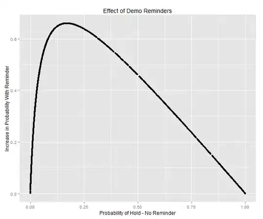
qplot(none.sent.pred, abs.lift.pred, data=demo.reminder.data) + xlab("Probability of Hold - No Reminder") + ylab("Increase in Probability With Reminder") + ggtitle("Effect of Demo Reminders")
#plot 2
qplot(demo.reminder.data$none.sent.pred, demo.reminder.data$all.sent.pred, data = demo.reminder.data)+ xlab("Probability of Hold - No Reminder") + ylab("Increase in Probability With Reminder") + ggtitle("Effect of Demo Reminders")
Question/Problem: When I plot this data it looks way too perfect. It essentially shows something like a 65% increase in likelihood to show up to a demo for anything under 25% of initial likelihood and my gut tells me that one email does not have this kind of power. I suspect the problem is that I'm just plotting points to the fitted model and that's why I'm seeing this perfect log curve (would attach picture but given that this is my first post, my reputation isn't high enough). I imagine that the actual data would be more diffuse with a lot more of the points being under the curve (and some above the curve).
Is there a way for me to plot around the model to show what things would actually look like?
And more importantly, I suppose, is this methodology correct? I believe it is, but I could be missing something very obvious.
Thanks in advance!
edit: got enough points to post a picture of the plot